Wednesday, August 30, 2017

MACRO

I have been playing around with the macro settings on my camera in an effort to try to capture details and effects that can easily escape detection in an average photo. In doing so, I turned once again to a Kon Chiharu Shigaraki tsubo that is on displayed on a bookshelf as it doesn't have another home, in other words, the box is missing but in some future shots I will use a wonderful Tsukigata Nahiko chawan that I recently studied and photographed. In this photo I tried to capture a close up of two rich, emerald green bidoro drips both with long and pronounced trails all the way back to the face of the pot and I think I was able to show the intensity of both. Like small, magical jewels, effects like these make for a rich keshiki landscape on wood fired pots and treasured high lights of Shigaraki and Iga pottery. This is another one of those examples I can point to when asked what it is about wood fired pots that I love so much and diversity is all I need answer.

"The details are not details. They make the design." Charles Eames


Monday, August 28, 2017

AMBER DRIP

Illustrated is yet another slip teabowl out of the last glaze firing. On this teabowl I used a thick porcelain slip over the stoneware and once bisque it was glazed in two different glazes. The way the slip was combed has engineered avenues for the glazes to run and pool in which has created a depth and variety to the surface that helps animate the bowl a bit. I attached a photo of an area which has an area of hanging slip which is now host to an intense and rich amber drip suspended for the lifespan of the pot, hopefully for quite some time to come. I enjoy the wide array of effects that come about through the use of teabowls as tests, each one has just a little something different to say.

Friday, August 25, 2017

IMPRIMO

Of very simple design, execution and glazing, adroitly thrown and a constant reminder of what it is that makes Kawai school mingei work both popular and significant, this chawan was made by Kawai Takeichi (Bu'ichi). Using a slightly coarse clay as seen in the rough quality around the foot there is a texture created by a piece of chamois dragged on the surface while still throwing the wet clay, the impressed design was added a bit later using a turning roulette creating this effective and tactile decoration. For Kawai Kanjiro and his students and followers, the pots were kept simple, the superfluous is both unnecessary and unwanted, the "beauty born of use" a motto that helped create these pots where it is more about form and function than the concept of beauty for beauty's sake and Kawai Takeichi has left quite a body of work that typifies these qualities. 
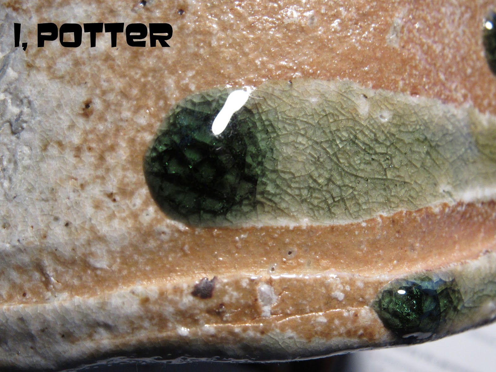
Once decorated this chawan was glazed over in a single ame-yu, amber glaze which highlights the piece and allows the various throwing effects and tooling to show through giving the user an understanding of how the pot was made. I am a huge fan of pots like these; stripped of ego, purposeful, functional and certainly without pretense, this chawan could have been made in 1780 or 1980 with only the box and bio to tell us otherwise.

Wednesday, August 23, 2017

HAKU-ENYU REVISTED

I took a moment and put together a rather short slideshow video of the haku-enyu chawan by Iwabuchi Shigeya that I had here for a short while and is now at home across the pond. Though it is not what you immediately think of as an "exciting" chawan it was a real pleasure to handle and study as it possessed a rather comforting and honest sensibility that made for a rather pleasurable conversation, even if it was short. I truly enjoy the way Iwabuchi handled clay and I hope that this video may give a glimpse in to the heart of the bowl.


Monday, August 21, 2017

EMPTY SHELVES

Another Monday and the beginning of another cycle and as I start setting up, the empty shelves seem to call me, time to get cracking. The shelves are a pair of old doubled IKEA utility shelves that I picked up years back and can usually hold more than enough for several kiln firings which is the current plan. The course of action at the moment is to make a group of v-bowls, covered serving bowls, high sided serving bowls, wall bowls, pasta bowls, plates and a few teabowls, about 60+ pieces or so this week. This group of eight 2.5lb v-bowls is the start and will take the shelves from being empty to at least looking like something is going on in the studio making it more inviting tomorrow. Without sounding overly dramatic, sometimes the beginning of a cycle is a bit difficult, you enter the studio to a sense of stillness and silence and need to get things going, like stoking an old steam engine. I turn on the music, something peppy and most likely 80s, set up the wheel for throwing with fresh water and bats at hand if called for, get the right set of tools, in this case for terra cotta, start wedging and with a little luck within 15 minutes of so I am throwing. The studio goes from static to active in just a few moments and things all settle back in to that normal rhythm that I love. Once the throwing is done for the day, off to make several slips, it may be Monday and the beginning of another cycle, but I am always happy to get back to work even if only a weekend has held me up.

Friday, August 18, 2017

RED FISH

Illustrated is a large, porcelain charger decorated using a clear glaze, black and red overglaze enamel and a small amount of sgraffito to help detail the highly animated fish. Though best known for his aspara like sprites in various stages of undress, Hasegawa Sojin (b.1935) is well known for a large vocabulary of designs that he used through out his career with a number of detailed study drawings, paintings and scroll show up now and again. This particular design is often seen  and the layout is carefully constructed for use on plates and bowls of various sizes in such a way as to create a well articulated and animated space that is both inviting and refreshing to the viewer. As an heir to the Ko-Kutani and Kutani based traditions, Hasegawa has spent his career dedicated to making iro-e style porcelains that come from a new style that was put forth by several post-war potters like Tokuda Yasokichi I and Kitade Tojiro who I suspect has strongly influenced his works. Though this platter has very traditional elements in the decoration and form it is easy to see that it stands as a more modern creation in the bold portrayal of the subject matter and crisp, fresh and energetic nature establishing that distinctive edge that Hasegawa Sojin is so well known and admired for.

Wednesday, August 16, 2017

SUNSET

A while back I was watching a Japanese jidaigeki film from the 1950s and in one of the scenes was this distinctive painted backdrop of a cloud streaked sunset sky. I found this visual very intriguing and decided at that moment to set about trying to capture its essence as a backdrop on pottery and this is where the pursuit has taken me. Marrying together some elements of t'su d'zu, slipware and galena glazed potteries, this teabowl has the background of layered slips that come through with thick black additions painted over and carved through to the clay. The thick black slip has bled a little together with the banded surface background helping to add some motion to the bowl. As may be apparent, the whole surface created on greenware was done rather quickly without any chance to go back and fuss with it as was the carving of the flower heads and leaves. I find that the more time I take the more stiff and contrived the piece will look and though this is not exactly the epitome of Zen spontaneity, it is about as close as I can get while still working with a preconceived notion in my head.

Monday, August 14, 2017

MEMORIAL

Mindy and I made our way from central NY through Vermont to Burlington yesterday to attend the Unitarian memorial service of Bill Klock. It was a fairly large gathering of family and friends with his wife Anna and three sons, Ian, Eric and Bill Jr. together with their families. It was great to hear various remembrances of Bill from family and friends that helped paint a fuller picture of my remembrance of him as teacher, mentor, optimist and friend. It was easy to see why so many were in attendance to celebrate Bill as he made friends easily enough though discerningly and kept those around him for a lifetime. Mindy and I knew Bill for nearly thirty years but we learned even more about him and his willingness to share, engage, support and defend the land and property he held dearly at Klock Hollow. Though I will miss Bill and his "Hello, Craig Bird" every time we met or spoke there was a great comfort in knowing how many people he touched and now carry him with them moving forward with their lives. Thanks again Bill.

Illustrated is a Shino mishima teapot made by Bill Klock soon after arriving home from sabbatical in South Korea studying the mishima and Onggi traditions. I have always thought the Korean influenced mishima on an English teapot under an American Shino glaze summed up Bill and how he thought about pottery and its making.

Friday, August 11, 2017

DIVIDED ATTENTION

Known for his Iga and Kuro and Aka-Raku pottery, this particular chawan is right on target for the veteran potter, Konishi Heinai II. Though taking many of his cues from his two masters, Konishi Heinai I and Kawakita Handeishi, this classic Raku inspired chawan is all about a potter who has divided his attention between two of the most classical and feudal traditions out there, both Iga-yaki and Raku yet neither has suffered from any lack of thorough mastery. The shape has an nobility and elegance to it as it seems to thrust off the foot and taper seductively inviting one to hold and admire the form in hand. The rich iron to black-brown surface has a serene texture to it that is punctuated by a well placed tong mark where the bowl was plucked out of the fire to cool quickly to lock in the color and atmosphere of the glaze and to this end, Konishi has quite earnestly succeeded.

Wednesday, August 9, 2017

HAKU-ENYU CHAWAN

Broad yet inviting, this snowy white haku-enyu chawan was made by Iwabuchi Shigeya at the height of his pottery making career. Thrown and covered in a thich, crackle slip, sometimes combed, wax resisted or otherwise decorated, this surface was left undisturbed making it a perfect candidate for the wood fueled salt firing that the pot was subjected to. The landscape of the pot is certainly activated by all of the cracking and crackling and held taut by the richly blushed lip that encircles the chawan. The occasional gohonde spot and the dark, iron rich spots punctuate the form where the bowl was held while dipping the piece in slip adding to the simple appearance of this classic Twentieth Century Kyoto chawan.
And just because it is Wednesday;

Monday, August 7, 2017

TOP OPTIONS

It is certainly a simple enough idea but since I first started making pots with two lids, mostly with varying knobs, I have been surprised at how often an order comes in and the two-lid option is asked for. In theory and practice there is usually very little difference in the two lids but I have also been aware what a different look can be achieved by just the difference in the knob and in the case of this pot the thrown in knob  and the to be attached ring knob will finish each respective lid. In other examples the lids can vary quite a bit more with the creation of a concave lid and a convex lid for the same pot or for cap lids a pair with and without a knob. As I said it is a simple enough concept but there is something pleasing about altering the conversation you are having with a pot and this may be the easiest way to do so.

Friday, August 4, 2017

EXOTIC CAMOUFLAGE II

Barely two weeks after I posted up a chawan by Sasaki Yuzuru this mizusashi showed up and though difficult as heck to photograph it is the same technique as the former. I am not sure how to classify such occurences; coincidence, happenstance or serendipity but this does seem to happen with some regularity and the logicical side says, someone saw the original post and decided it was a good time to conitue on the path of downsizing. This particular lobed yuteki mizusashi appears to be mostly dark with hints of yellow peeking out but with every turn the yellow shows up through its dusted and spotted surface of dark iridescent spots giving it a real three dimensional appearance and looking just as much like exotic camouflage as the chawan. I will admit this is not exactly a great photograph but it is as good as I could get and hopefully lets the viewer glimpse in to how the pot appears in person as it is nothing short of amazing. Like the previous piece there is truly no doubt who made this mizusashi and the skill and sensitivty it takes to pull off such a noble pot.

Wednesday, August 2, 2017

REVISITED TEXTURE


At this point it may come as no surprise that I like texture and using it to help articulate and animate a pot. This particular revisited texture seen as  both greenware and "green ware", is something that I first tried my hand at way back at Cleveland State. I really like the sense of geological layering that it resembles and it truly has its own unique feel in the hand, every layer, crack and separations speaks to the hand as well as the eye. In this particular case I used the iron based stoneware that I have been making up in small batches and glazed it in one of my Oribe variants to allow the clay to speak through the glaze without any interruptions. As you can see the interior is as smooth as ever and unimpeded from the intent of the bowl but the exterior is as great a contrast as I can remember in recent memory.