Friday, December 31, 2021

LAST POT OF 2021

Illustrated is the last pot that arrived here for 2021, it has been here for a short while and given the date and time, I sincerely doubt there will be another. This simple, almost quiet Bizen vase was made by Masamune Satoru in 2000 and is somewhat typical, classic even of how he works with clay from the form, marks, posture and applied lines. What perhaps distinguishes this particular animated pot from the rest of the pack is the firing which has ash moving in two distinct directs, vertically and horizontally while it was stationary and waiting its final fitting in the kiln. Initially the ash was swept by the form horizontally building up streaks moving from the pot facing the flames toward the rear as the firing went on ash began to build up on the face and finally began to melt and cascade down the piece from top to bottom. Obviously this is not a rare occurrence but it does trick the eye and add a dimension to the piece which otherwise would have been a nice pot of good character, strong form and a proper firing but let's face it, the ash moving in two directions brings more movement and articulation to vase that has benefited from the experience of the potter and the serendipity of the ash and flame. Several other features not to be overlooked are the strong, sturdy and practical lugs placed on opposing sides of the form, the lush ash build that helps define the mouth, a rather deceptive volume contained in the form, one of those rare pots that arrives and present the feeling of being much larger than the dimensions imply and lastly the great shell impressions left on the base of the pot where it was set to keep it from adhering to the shelf.  All in all when you add up all these enjoyable features it translates in to quite a nice package.

Wednesday, December 29, 2021

IDEAL ASTRAY

What could be less complicated and incredibly complicated at the same time than an Ido style chawan? Little else springs to mind where all the elements, lines, posture, curve and kodai all need to work in absolute harmony to create a flawless and near perfect form. Perhaps perfected in anonymity in Korea in the 16th century the potters of Japan especially down south have been fixed on the form idolized by both commoner and lord alike for the elegance and simplicity of form and presentation. In my mind, the Ido bowl is the absolute distillation of creating function with unmatched aesthetics where the beauty is that simplicity, grace, nobility and at its core utility.     

One modern Japanese potter that has spent a lifetime dedicated to an ideal and archetype is Tsujimura Shiro and this chawan is a classic example of stripping a utilitarian form to its barest necessities of wall, lip, pool and foot with some glaze thrown in for good measure and ease of use and with the ideal astray he crafts his own vision of modern Ido-wan. In this example Tsujimura has strayed slightly from the purest Ido ideal to create a triadic style wari-kodai where the glaze has curdled a bit creating a wonderful texture in more ways than one. Perhaps one of the more interesting features of this chawan is the combination of a static bowl shape with a lip and foot that are animated and in motion creating a visual like the bands of atmosphere circling some gas giant a light year away, this is where Tsujimura excels and with any luck will hit upon the perfection he seeks the next time he sits at the wheel.

Monday, December 27, 2021

RYU-KORO

Back a cycle (?) ago or so when I was resurrecting my old appliqué mold, the T'angish Dragon, I made a couple of other pots out of the sandy porcelain that I made up. One of the pots was a small covered jar and a slope sided koro with a pierced lid. Obviously this is the koro form with a set of four dragons guarding the four elemental directions and pierced with a total of eight holes to fulfill the duty of any good koro. The tapering form has a good amount of visual texture from the sand in the clay with just the right amount of variation within the glaze to keep the piece on its toes. The lid fits snug and should only allow the smoke to rise out via the pierced squares and the knob gently mimics the form of the pot tying, I hope, the pieces together. The pot was finished by tooling a somewhat tall pedestal foot that is a bit coarse due to the exposed inclusions and owes more than a bit to Kawai Kanjiro for being a major "influencer" on my work. These were fun to make and it makes it clear that I need to find the dozen or so other press molds I had or start thinking about buying some plaster and setting about making a new series of designs because there is more to imagine than dragons when making pieces of this style and technique.

Friday, December 24, 2021

SEASON'S GREETINGS

"Six turtle doves", well they are doves, not sure what kind but thought the timing was great and beyond coincidence. Just wanted to wish one and all our sincerest Season's Greetings and Happy New Year. Times have been trying but take a moment to embrace family, friends and pets as the year comes to a close and if I may suggest this is of course best done with a handmade cup or mug in hand!

Wednesday, December 22, 2021

PLOVERS AND WAVES

It is crystal clear as you look at this chawan the influences of the past on the decoration; there are elements of the Rimpa masters starting off with Ogata Korin and Kenzan with hints of Sakai Hoitsu and Suzuki Kiitsu a century later. The use of the lyrical waves, waterwheel and playful plovers conjures up the atmosphere of Rimpa during the 18th and 19th centuries in Kyoto where decoration and poetic inspiration reigned supreme and the style was known as "the aesthetics of the capital". This chawan made by Enyu specialist, Ajiki Hiro has that blended presence of Kyo-yaki and Rimpa influenced pottery despite being made in rather modern times. This chawan is large but light with an inviting presence that is made all the more so through the playful and wispy decoration where the plovers flitter about the surface of the clay canvas. The clever use of slip over clay makes for a bright canvas where the majority of the brushwork decoration takes place and the naked clay acts as a framework for the painting. The chawan is glazed in a soft appearing clear glaze that doesn't obscure any of the original art work on the bowl and only acts to enhance and preserve it like a fine and well applied varnish on an oil painting's canvas where all is balanced on a casually yet sturdy tooled foot. Though not illustrated the other part of this narrative is laid out across the wood box that is extensively painted carrying on the theme and revolving around the pair of plovers, more pictures at another day.

Monday, December 20, 2021

CUM SENEX IN CUM NOVO

Everything that needs to be done is done at this point for the holidays and end of the year though I fired one last kiln yesterday and packed up some pots and needed to get them shipped out today. The last firing, likely to be the last firing of the year was a loose terra cotta kiln with a variety of B&W slipware, snowberries, a few still lives and a group of tebori carved slip pieces, about two dozen pieces in all with a few teabowls thrown in for good measure. This "landscapeman" v-bowl was photographed just after it was carved where you can clearly see the ink layout to orchestrate the overall design on the bowl. Dried, glazed and fired these pieces present a fun, hopefully joyful appearance that is deep rooted in the past, a bit like carved steles, Nazca lines and cave painting imagery and much more all jumbled together to become these "landscapeman" designs. I thought it fitting that this bowl was the last piece made, other than a few test pieces to process, seemingly celebrating; out with the old and in with the new (cum senex in cum novo).

Friday, December 17, 2021

LOST IN THE LIGHTING

Illustrated is a rather vivid and compelling Shino henko that is just about lost in the lighting. When I had this in hand I took a number of pictures, including enough for a future slideshow video but I managed to take a good solid group of more creative pictures using sun and shadow and various other techniques. I think this one conveys some of the emotion, presence and topography of the henko that a full on, well lit photo may not capture showcasing the casually applied swipes of Shino glaze that Matsuzaki Ken applied around the form as well as the indiscriminate ash that has landed here and there bringing ones focus to the shoulder and neck that truly needs our attention. Despite a slight loss of the details of the piece it is clear that this henko has a strong form that has movement and a degree of verticality and is clearly the recipient of all of the best qualities of the bones of the pot, the quality and application of the glazes and the narration and process of the firing. The next photo I put up of this pot will be a more formal portrait but for the time being, I hope this static photograph has captured some of  the movement and dimension of the pot and I think that is about as much as I could hope to achieve with the limited photography skills that I have.

Wednesday, December 15, 2021

THEN & NOW (SHINO EDITION)

In some respects, the arrival of this rather nice Tamaoki Yasuo Shino chawan is a trip down memory lane. I doubt I had mentioned this previously but when preparing for our first trip to Japan, I had limited printed material to go by with the exception of a handful of catalogues so I was eager to see and/or visit  potters in Shigaraki, Mino and Bizen and at the top of the list was Tamaoki Yasuo. Though I had written Yamaoki prior to our trip we had never back and once there had the hotel call to try to make an appointment but he was away when we would have been able to visit. We were both a bit bummed by this setback but truthfully there was no shortage of pots to see and handle and after several days we said good-bye to Gifu Prefecture. Our last stop was to be Osaka-Nara-Kyoto while staying in Kyoto proper and on our first day there we ran in to a gallery that had four chawan by Tamaoki Yasuo including the rich Aka-Shino bowl that I posted about previously* as well as three Shino pieces so in the end, it really is all's well that ends well.     

Over the years I have handled quite a few pots by Tamaoki  who was, way back when considered one of the five great hopes of Mino whose work has moved the Mino tradition in a modern directions with his innovative forms, creative use of Shino glazes all the while blending modernism and tradition in to his tea ceremony pieces of which this chawan is a classic example. Relying on a good strong and practical form and a Shino that can be distinguished from that of many of his contemporaries, this chawan displays a rich and varied landscape ever so reminiscent of old Momoyama ink painting though quite a bit less monotone in its brushwork, so to speak. In many respects this is a classic bowl from the 1990s by Tamaoki, being carefully crafted, it is one of several chawan forms in his oeuvre relying on archetypes that came before him from the Momoyama era through the mid-Showa period that reflects his vision of modern Mino and modern chadogu. I have to admit what appeals most to me is the simplicity of the bowl and the fact that his chawan rarely appear like they have been forced, fussed with or overly manipulated, they have that freshness of form that looks like a potter threw a bowl and then casually lifted off the wheelhead and this is what you end up with and in my opinion that is truly one of the attributes of a really good chawan.

(* https://albedo3studio.blogspot.com/2015/03/iam-constantly-amazed-at-how.html )

Monday, December 13, 2021

CAN I GET A FOOT WITH THAT


For the most part I have been using four different hump molds to make this shape in three different sizes and it has become a staple in terra cotta, stoneware and occasionally porcelain. This square tray form and a mate to it are a bit different in that I was asked to put a raised foot rim around the usually square, flat base which took about two minutes to figure out the best way to do that. I rolled out and cut a square the size of the base, cut most the interior of the square out and then luted it to the bottom and well, there you have it, a raised foot on the piece. made of stoneware this is glazed in my temmoku and medieval green with decoration under the glaze in two of the quadrants. The process only added a few minutes to the whole thing but I will admit I was a bit surprised when the email asked; "can I get a foot with that?". 

(Sorry the rear photo is a bit over-exposed it was the only way I could light it up. )

Friday, December 10, 2021

NOT HAMADA

Quite a long while ago a collector friend of mine sent me this faceted bottle which he had concluded was by Hamada Shoji. It was sent to me with the intention that he wished to sell it but when it arrived I had to inform him that it was not Hamada, though it was a Mashiko pot and had a small impressed mark now well obscured by thick temmoku glaze. Once he heard the news he decided to just abandon the piece at my doorstep and that is how I came to own this pot which I have enjoyed all this time after all a nice pot is a nice pot whether it is fully identified, has a box or any associated provenance. As you can see it is very competently made and has excellent facets to complete the sturdy form covered over in temmoku and tessha glazes that flourish in Mashiko. In this case it is all the small details and special effects of the glaze that captivate the eye, the richness and depth of the surface makes me think of a number of potters but I have yet to identify exactly by whom. In the back of my mind I am keenly aware that there is an eventuality to uncovering the maker, it is always about time and the possibility the identity is only one random click of the mouse away. Anyone have any thoughts?    

"What one man can invent another can discover."  Sherlock Holmes (Sir Arthur Conan Doyle)

Wednesday, December 8, 2021

SUNLIT SUBTLETIES

Illustrated is a simple, subtle mizusashi made by Furutani Michio back in the late 80s to early 90s. The exterior of this classic Shigaraki pot is a puzzle like blend of hi-iro fire color and sandy, drift like patches of ash that made its way past other pots in front of this mizusashi to land haphazardly on the surface presenting a distant and solemn landscape that evokes emotion and a certain amount of pathos. Made using the coil and throw method, this form is a standard for Furutani Michio with casual lid to accompany the form and a functional and not overly thought out knob. As with most of his pots, there is a looseness, rhythm and honesty to this piece that is only decorated with sparingly applied marks of the potter and the eloquent serendipity of where the pot was placed during the firing making each piece even in series rather unique and as individual as possible. Now I realize that this sun and shadow portrait doesn't quite tell the full picture but what it does do is focus one's attention to the surface and truthfully to the atmosphere that this mizusashi presents with or without the lighting effects. I'll be sure to put another, differently lite overall shot of this Furutani Michio Shigaraki mizusashi up at some point in the future that coupled with this photo should give a fuller understanding of the piece or at least the best that a static secretive image can convey.  

"A picture is a secret about a secret, the more it tells you the less you know."  Diane Arbus

Monday, December 6, 2021

SILHOUETTE(S) III

It has been a while but every now and I again it is enjoyable to make some more playful pots and the silhouette pieces fit that bill. Illustrated is a pair of silhouette tebori covered jars made of terra cotta, covered in black slip and then hand carved to various effect. In this case the subject matter is of Woof the dog both of which are accompanied by large silhouette knobs of  Woof to stand in as knobs for the pieces. There is not much different between the normal lids with tooled knobs and these exaggerated handles that are also slip covered and carved to match thematically with the rest of the pot beyond the addition of a cut out slab and ten minutes additional working time. As is easily imaginable the possibilities are endless and also mired in corny aphorisms but they are meant to be playful so why not commit 110%.

Friday, December 3, 2021

F.R.T.

I think there are times when you look at a pot and just think, "classic" and this is one of those times, a pot that has that medieval presence but is modern in its creation. Perhaps it is the combination and balance of simplicity, honesty and the natural surface that makes this a classic pot where the distillation of vision, technique and surface speak volumes without the superfluous detail to interfere with the experience. This is one of those pot photos that came by way of a fellow Northern collector, large, elemental and positively medieval in appearance made by Nishiura Takeshi this pot is spotlighted by sunlight showing off many of the characteristics of modern Echizen. 

This full round tsubo has a powerful form that has a coating of somewhat carburized greyish ash together with rich areas of brown tamadare running down the surface adding movement and animation to the piece as it moves through varying other areas of the ashy surface while the ever so slightly meandering lip creates a tranquil and casual focal point. This landscape makes a rich contemplative environment and one can only envision the number of locations both real and imagined that arise as the viewer moves around the pot. It is clear from this photo that the sun certainly adds to the conversation with this Nishiura tsubo which clearly is classic in almost every sense of the word.

Wednesday, December 1, 2021

AKI-HENKO II

I put up a blog post back on 10/22/2021 regarding this fall themed Rimpa influenced Aka-Shino henko by Hori Ichiro and finally got around to putting together a quick video slideshow of the pot. I had taken quite a few pictures of this piece along with a number of detail shots and distilled them down to this 3:14 video that I show off the piece well enough to give a clearer sense of the presence and volume of the henko without having the opportunity to sending it around to everyone that would like to handle it after all the postage costs would accumulate rather quickly. As I mentioned in my previous post this pot as with most by Hori Ichiro is a combination of the element of fire, air, earth and water but I may have forgotten one of the most essential and overlooked, that of curiosity and creativity of which this potter has in abundance. Enjoy the video.


Monday, November 29, 2021

"OF TWO COLORS"


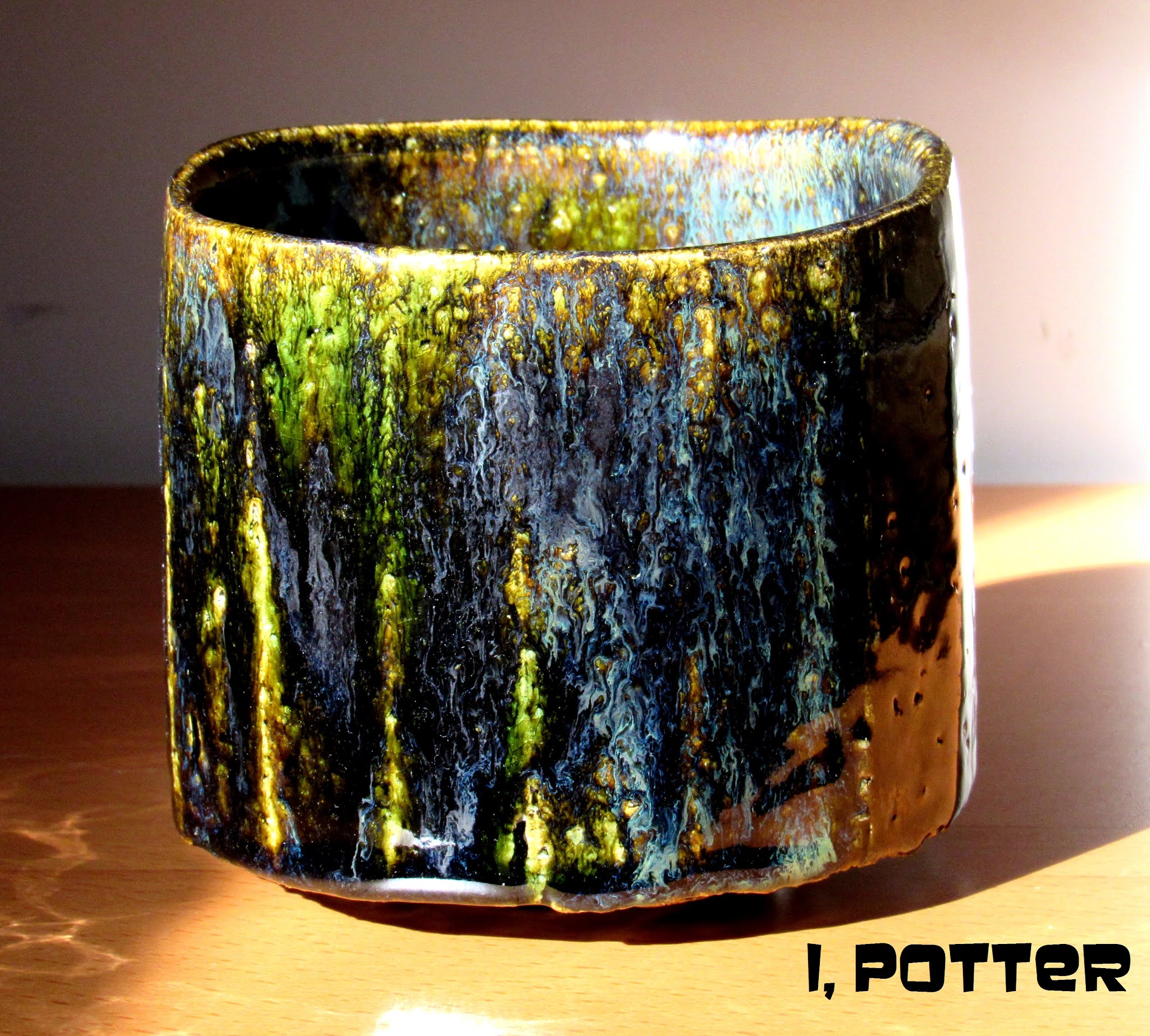
I am not sure that the term dichroic applies to this faceted Kuro-Oribe style surface but it definitely has two rather distinct appearances and a few others depending on the light source creating a different vision of the work. In this first picture utilizing only natural sunlight the green is quite easy to see showing off the wonderful clay texture underneath with areas of flowing blue, black and white all cascading down the surface complete with dramatic built up areas of glaze at high points further accentuating the varying effects. In the second photo this bowl takes on an entirely different demeanor and presence where the tungsten light source has turned the green into a rich deep amber with areas of almost black with swirled blue-white residing within.    

I should also mention that there is actually a third appearance which is quite interesting, if the bowl is resting on a particular shelf just before sundown, the surface starts out as a visible green but as the sun sets and the incandescent lighting takes over the bowl slowly shifts from green to the amber tone. With my limited skills I have tried photographing this effect to zero success, the camera either reads it as all green and shadow or amber and shadow but to the eye it is both. So my conclusion is this is a dichroic effect where the different light wave lengths are interfered with by the surface of the glaze and/or dispersed differently causing  two distinct yet related appearances, one showing off the copper and the other making full use of the iron. I am reasonably sure this is what is happening but if somebody that has an indepth knowledge of this principle feels otherwise, please let me know.

 "Vision is the art of seeing what is invisible to others." Jonathan Swift

Friday, November 26, 2021

CHISELED

Over the years it has been fascinating to watch the works of Matsuzaki Ken change, even mature from how he sees form, decoration and especially the firing process. This wood fired, chiseled surface henko falls in to the end of his second phase of pottery making where form and firing are married for maximum effect. Dating to 2004, this henko was coil built creating a slightly thick form that was then "decorated" by using a chisel to create the visual texture of the piece that once wood fired was  both softened a bit yet further accentuated by ash for a dramatic effect. There is a wide array of surface effects on this henko and I choose this side to showcase as it is the side illustrated in Andrew Maske's book, KEN MATSUZAKI; Burning Tradition, I should also note that this is illustrated in an exhibition catalogue from the same year (2004) in Japan. As for the form, it has a primal appearance, elemental and rather stoic that makes the mind work for all the various associations possible; simple form, excellent execution and perfect surface, the pottery trifecta.

Wednesday, November 24, 2021

JUST "BEING"

Illustrated is a whimsical, playful set of katakuchi and guinomi made by Kowari Tetsuya. I was contacted by a fellow collector in Europe regarding our shared interests in Japanese modern pottery and Kowari Tetsuya in particular and as we started sharing photos back and forth I received a treasure trove of photos, most of pots that I had never seen and was thankful for the opportunity. This particular pairing is of a vivid Shino glazed katakuchi tokkuri pouring vessel and a dancing guinomi both showing areas of iron and of course all natural ash deposited during the intense process of wood firing. As with most of Kowari's work both pieces are casually thrown with a spirited defiance to convention and perhaps a slight disregard for all that gravity has to offer. However you respond to Kowari's work, I find the slightly eccentric nature of his pieces to be warm, genuine and welcoming and in this case, each seems to bid the viewer to participate in the "being". Enjoy the whimsy, freedom and spirited nature of these pieces which at the end of the day it is all of these attributes that make Kowari's pots stand out in a crowd.

Monday, November 22, 2021

T'ANG DRAGON

It has been quite some time since I have used any of my appliqué stamps which took some searching as they were hidden away in a box in bubble wrap and buried on a seldom accessed shelf with small bags of chemicals stacked in front. Once recovered I decided on making some pieces loosely based on a T'ang style dragon, by way of a Danish skonvirke brooch to be applied on to a coarse and sandy white stoneware clay body of my own formulation. The picture shows the end result where I tried to create a T'ang sancai effect on each of the medallions while the remainder of the teabowl was glazed in a clear and my AO+ glaze. The teabowl has three medallions around the almost straight sided form that has its surface broken up by the small pits and sand punctuating the surface while the medallions are made of the same clay body minus the sand and small stones. In the end for a quickly rendered piece among a group of five or so pieces used with glazes not even tested for this technique the first group came out surprising well and none of the appliqué medallions exploded off the pots which is a plus in my book.

Friday, November 19, 2021

PERFECT

Now admittedly, I don't really drink a lot of sake, my palette tends to run more towards good whiskeys and bourbons but that being said, I have long considered this pot to be a perfect tokkuri. Undoubtedly, every collector and sake aficionado believes they have or know of the perfect one but this one is mine, this tokkuri was made by Koyama Fujio back in the 1960s and was a gift from a dealer that I have had a long relationship with and was a very welcome surprise when it arrived. Broadly speaking this piece is Shigaraki in style and it is clear to see that it embodies the very essence of feudal pottery, the archetypes that Koyama was so keen to study and emulate during his days divided  between being a part-time potter and one of the foremost pottery authorities on Japanese and world ceramics and despite his skill level with clay, his knowledge of what was what in terms of pottery was second to none. Though there is really no such thing as a perfect tokkuri I have drawn my conclusion based on a number of factors all blended together to make this little pot; thoughtful form, well considered size, aesthetic appeal, ideal volume, purposeful form and mouth, utilitarian at its core and just a joy to hold and use. Perfect is certainly a high bar especially for some rough, wood fired irregular little pot but it is how we decide to see things that ultimately make the decisions as to how we qualify an object and I have no problem saying this imperfect tokkuri is just perfect for me.  

"Almost all powerful ideas in history go back to archetypes."  Carl Jung


Wednesday, November 17, 2021

ANOTHER ECHIZEN TOKKURI

Illustrated is another Echizen tokkuri  a classic yuteki-temmoku piece shrouded in shadow and basking in bright sunlight perhaps bearing a classic Chinese glaze surface while being distinctly Japanese in origin and purpose. This sunlit tokkuri was made by Echizen potter, Sasaki Yuzuru, pupil of Kimura Morikazu who specializes in iron glazes of a wide variety including the oilspot technique with a yellow background that I have posted up previously on my blog. This yuteki temmoku tokkuri is stout and solid with a friendly demeanor and a rather utilitarian form including the neck and mouth that make it easy to grasp and pour from. As for the surface, the background is a dark, almost intense bluish black covered over in varying size spots that are like small rings or halos within even more composed of several colors and looking a bit like electrons circling the nucleus of some as yet unidentified atom. What I end up taking away from seeing a number of pots by Sasaki Yuzuru may sound cliché but form really does follow function in totality and the surface is never a secondary consideration from the moment he puts the clay on the wheel.  


Monday, November 15, 2021

STARTING WITH THE BONES

In a recent series of email exchanges regarding teabowls (chawan) with a fellow collector and tea person, I started thinking about getting back to basics, simplifying the form and starting with the bones without considering the glaze surface. In an effort to try to get the lines of the form right, I decided to use an Edo period Raku chawan as a jumping off point  to create a rather practical form and size bowl. I opted for a rather low foot with just enough lift to animate the bowl and create a suggestive shadow line and the piece(s) were softly thrown to allow the lip to undulate naturally and finished with a simple foot that is stable and like the bowl, simple in execution.    

Once set up, the teabowl(s) were tooled  allowing the surfaces of the clay to be dealt with by using faceting to better define the form while creating movement and decoration at the same time. The secondary purpose of the faceting is that it opens the clay exposing the texture and sand to good effect once glazed adding more dimension to the finished, fired work with the right choice of glazes. Though still quite wet, once bisque the plan is to go with the Kuro-Oribe style surfaces to accentuate the facets and vertical quality of the bowls and still give an intimate picture in to the clay texture underneath. I only threw two teabowls in this style, having other things to do and wanting to see what the fired results end up like but I think they came out the way I saw them in my mind and now need to wait and see what the end results end up like.

Friday, November 12, 2021

NATURAL FLOW

In some respects I am reminded of the stacked "chimney pots" of American potters like Peter Voulkos and Don Reitz as I look at this wood fired Tamba piece but this form pre-dates the 20th century and finds its inspiration sometime in the Edo period of pre-modern Japan. Made by a member of the extended Ichino family of Tamba, this vessel was made by Ichino Genwa and shows a clear understanding of a thoughtful use of clay and flame. Though not particularly large this form has a large presence and the firing created a unique landscape on the face where the pot laid face down during the process allowing the ash to reach around like some alien grip  which terminate in a series of drops now frozen as part of the narrative. 

When surveying the other side of the form it is easy to conclude that this is a somber piece but as you following the movement to the face that initial impression gives way to one of contemplation and a sense of animation, a reminder of the connection of pottery and humanity through the millennium. It is this wonderful quality of wood fired pots that I find so attractive, opposite surfaces from front to back uniquely created that despite their difference there is a natural flow in to one another in a continuous and natural manner creating a landscape that changes as you navigate the piece. This is another one of those "simple" pieces but of a good purposeful and strong form combined with a well fired surface and though I may ask this way too often, what more can you ask from a pot?


Wednesday, November 10, 2021

MUKUNOKI CELADON

When I think of Mukunoki Eizo what first comes to mind is the modern palette of Kawai Kanjiro with surfaces of Hamada and Mashiko slipped in for good measure. I rarely think of Chinese influenced celadon (or other glazes) for his work but I really need to remember that Kawai Kanjiro started his pursuit of pottery in testing and also using Chinese glazes for his work in the 1920's and 1930's. If you thumb through any book on Kawai you will run in to masterworks using Chinese glazes and techniques as well as celadon pieces as part of his early work.   

In this respect it is only fitting that Mukunoki Eizo would turn his attention to similar glazes during his career making pots, both influenced by his master and seeing the benefit of such surfaces to accentuate and bring his ideas to life. Turning his attention to seiji style glazes among others, this is a classic example of his work, thrown out of a white stoneware filled with feldspar inclusions the teabowl has been decorated with a florid sliptrail design around the entirety of the pot under a glaze of various thickness and fractures at times being rather thick and presenting a rather exotic appearance. This chawan is quite sturdy in posture, purpose and throwing with the glaze giving it a lighter appearance than it has in hand. Like his master, I am really rarely surprised by the form or surfaces that Mukunoki Eizo comes up with presenting a focused blend of the past and present as well as the master and disciple.

Monday, November 8, 2021

STEP 2 , PART 2

From a late September (2021) firing, illustrated is what I consider to be the best of the recent saffron and Hagi white glaze tests stepped up from pod to yunomi and to teabowl, you have to learn to crawl before you can walk. Though I actually tried out this glaze combo on a slightly larger jar, for whatever reason, the glaze and surface really popped on this waisted style teabowl with a wide array of effects that I am beginning to expect from this style. The secondary saffron, iron yellow glaze runs just enough to create a nice sense of movement adding a bit to the vertical nature of the piece with a nice palette of hues and textures scattered about the surface like a nice autumn landscape right down to the coloration with the inclusions in the clay adding even more visual punctuation.   

I have to admit that I am liking this surface and the activities it presents especially over the small batch clay that I am making with mixed sand in it. That being said the clay is a bit rough to throw but I am getting used to it and even with the inclusions it has a good degree of plasticity and certainly stands up rather well. I have become rather addicted to texture over the last handful of years and this clay with this surface or even my Oribe or Kuro-Oribe is perfect for the task. I have managed to find a source of good clean small stone that I may try mixing in to the clay body but I wonder at what point is enough, enough? I am thinking for the time being I may actually "hold fast' exactly where I am.

Friday, November 5, 2021

SCENIC OVERVIEW

There are advantages to living in central NY State, the Mohawk Valley that out way some of the things you can miss out on living a distance from a large city by the view is not one of them. We live way up on the northern slope of the valley which gives us a wonderful view in to the valley and on clear days you can see for miles and miles south, all painted by white in the winter, lush green for the better part of spring and summer and the dazzling medley of colors during fall. Not far from our house is a small pull off on the route, a scenic overview that allows one to stop and peer out into "our" valley, this view makes it much easier to make pots than one would think.   

Now to the point and how I got here, recently I was able to photograph this piece and what sprung to mind was any number of scenic overviews I have seen over the years. The is a wonderful balance of lushness and dramatic movement that appears more like a living thing than a static object but you can see the narration of material, glaze and fire all laid out like some captivating landscape viewed from a chosen strategic vantage point. The pot in the spotlight is a mostly snowy white Oni-Shino vase by Tsukigata Nahiko covered over in a thin coat of all natural green ash that adds a slight tint to the surface. The vase is accompanied by a nice rich, royal blue shifuku and a signed box and with any luck I will photograph the piece with a bit more time and depth in the coming months which will make for a nice road trip and my type of scenic overview.

Wednesday, November 3, 2021

TETSU-KUMO

Looking like dark, ominous tetsu-kumo, clouds of iron, Ikai Yuichi comes to his use of ash and iron in his glazes quite naturally having studied with Shimizu Uichi, Juyo Mukei Bunkazai for Tetsuyu-toki (Iron glazed pottery). Instead of just mimicking his master, Ikai has used his ash and iron to their fullest effect to reflect his inner vision, his voice for haiyu and tetsuyu in these modern times. The soft appearance of the ash glaze over the iron rich clay is interrupted by wild flourishes of iron creating Rorschach style imagery just likes the imagination interprets a wide array of imagery as clouds float by. The form of this chawan is practical and very usable, devoid of pretense while presenting a great canvas for the surface made permanent by experience and fire.   

I should note that though his master specialized in iron based glazes, Ikai has made his specialization ash glazes though the two are intertwined. In the case of this chawan, both surfaces are in fact iron glazes though separated by only the percentage of the ingredient in each; in the ash glaze an exceedingly small amount while in the iron splashes perhaps ten to twenty times more. Together with creating his ash glazes, comes the choices and preparation of ash for the glazes relying on rice husk, various straw types and red pine, rendering them by fire the unifying element of every potters work. In the end there is a simplicity and contemplative nature to his work even when surfaces are brought to life by should "loud" punctuations, akin to a Zen brush hitting paper at full force, it is as much about the space that surrounds these marks as the marks themselves and this is always good for some long term conversation.

Monday, November 1, 2021

UPDATED AO+

I seems like it has been quite some time since I have posted up any of my AO+ pieces and since some just came out of the kiln a while back I thought I would post up a piece. I had been procrastinating making up more of the glaze as about an inch was left in the bucket and that was not going to be enough to glaze anything with the exception of some chopstick rests. This quickly faceted teabowl was thrown out of the new white stoneware mix that I have been making up in 10 and 20 pound batches that has the sand mixed in as well which can be a bit abrasive during the initial mixing of the clay as well as the throwing of the pots. Thrown just a bit heavier than normal this bowl was quickly faceted and then had the form corrected a bit, especially the mouth as the process gets the pot out of round rather quickly. Once bisque the bowl is brushed off vigorously to dislodge any of the sand that is not firmly attached and dipped in a thin coat of clear prior to having the interior poured and the outside dipped in the AO+ glaze.    

What you see is one of a small group of bowls and covered pieces that were fired and because of the nature of the glaze it is easy to see all of the nooks and crannies as well as each mark made by the faceting process. I have to admit I am liking making up these small batches of clay, they have qualities that boxed clay doesn't have especially in regards to throwing/ drying as well as the physical appearance once fired. I am beginning to wonder about making up 50 or 100 pounds of clay at a time but for the time being I'll stick to mixing up 20 pounds (dry), turning it into a thickish slip and drying it out on plaster for now, maybe when I get my second wind I'll move on to more ambitious amounts.

Friday, October 29, 2021

テクスチャ

I have noticed over the past hand full of years that I am more and more drawn in to pots with eccentric and heavily textured surfaces. These surface create a dramatic, other worldly topography that compliments and in many cases makes the forms underneath exactly what they are. This heavily textured pot is just one of those surfaces that I am intrigued by where the potter, Kato Yoshiaki has used a thick Shino style feldspar glaze and crafted it to form a crackled, pebbled sharkskin glaze seemingly under a fair degree of tension. Once glazed these pots are wood fired and natural ash builds up and coats various parts of the pot and at times creates enough of a coating to melt and run down the exterior adding even more to the animated pot.    

This particular vase is one I have seen quite a few of over the years, it would seem to be a classic staple of his kiln intended as some bamboo form with heavy spatula work around the body and culminating in a flared neck. Though I have seen at least a dozen or more, each one is unique in exactly how it is thrown with proportions be adjusted on the fly and the termination of the piece resulting in a variety of differing necks and mouth making each pot, part of the series but mostly unique. As in this vase, most are thrown with a slightly flared foot matching the mouth and then are rather "rudely" lifted off the wheel creating this distinct indented set of finger marks around the base. I realize the Kato Yoshiaki is not exactly a household name but the more I see of his work, the more I appreciate the textures and forms and the simple honesty of his pottery that creates that meaningful dialogue between potter, pot and its owner(s).

Wednesday, October 27, 2021

THE CHOICE

A couple weeks back I noticed that Jeff Oestreich was having a sale off his website and since I have been looking for a couple of yunomi for a while, it seemed to be excellent timing. My wife and I each choose one and just received two very nice thrown and altered yunomi, made square and additionally faceted giving each piece quite a bit of movement and verticality. Illustrated is the yunomi I choose having a rather tall and simple form, the slight flare, purposeful facets and elegant slip hakeme just drew me to the piece. As you add in the simple device displayed proudly front and center and its orientation to the pierced foot make a rather tranquil and thoughtful vessel and as a bonus the misty, cloud like flashing brings more depth to the surface which is alive with subtleties and visual texture. I realize this is a humble and simple yunomi but the amount of effort and thoughtfulness that has gone in to this functional vessel elevates the pot and makes it all the more rewarding in its use and quite possibly others may agree and say; "you chose wisely".

Monday, October 25, 2021

FLANGE BOWL

I have been making flange bowls like this for some time now and was reminded, "if it ain't broke, don't fix it". This form lends itself to a wide array of sizes from four inches to sixteen of so and the flange with slight alterations makes a really good surface to hold on to with bare hands or kitchen mitts. I have been making this form for almost over two decades now and each and every one is enjoyable to throw, alter and tool though as you can see in the picture I normally have to go in and clean up the edges and "sharpen" the altered depressions. The altered depressed waves certainly help add a sense of movement to the bowl which seems to be in perpetual motion whether filled with mashed potatoes of not. On top of being a rather versatile style of bowl this also lends itself to almost every glaze and glaze combination that I use, in this case likely to be medieval green and temmoku where some combos may be better than others this together with the saffron and the Oribe surfaces are among my favorites. Admittedly this is another simple  bowl form with simple decoration but it does everything I intended it to do from function to just looking good with some fruit or detritus from the day collected all in one place.  

I can dream; "We are what we repeatedly do. Excellence then, is not an act, but a habit."  Aristotle

Friday, October 22, 2021

AKI-HENKO

Perfect for the season, this flattened grasses henko converses rather naturally about fall with its deep rich red tones and somewhat mysterious qualities the results of fire and a hand full of other essential elements; water, earth and air. This evocative henko was made by Mino potter, Hori Ichiro how relies on the wood fired experience to add layers of qualities to his pottery, a task at which he has more than excelled. The pot was first thrown and then paddled flat to create the form and with some simple iron slip and Shino glaze of varying thickness, Hori has painted a rather Rimpa-esque pot that would as easily sprung from the 17th century as it did from the 21st. As you can easily see, there is a distinct moodiness to this piece, it reminds me of the atmosphere from a Japanese ghost movie as set up by Mizoguchi Kenji balancing mystery and pathos in this case on the three dimensional form.    

This somber fall henko (aki-henko) is rather typical of the "decorated" works made by Hori Ichiro relying on slip decoration using carving or resist to bring the design to life under his various Shino surfaces and using layering of the glaze to create various effects and moods that turn each piece in to a three dimensional storyteller. On a side note, I took quite a few pictures of this piece quite a while back but didn't check them while I still had access, some of the images are slightly out of focus but I think I have more than enough to put together a video slideshow at some point in the future. More latter?

Wednesday, October 20, 2021

THE ORIGINAL CLAY

In some respects, this is a simple form and surface, both honed through trial and error, practice after all makes perfect. Made out of a highfire stoneware clay, the bowl was constructed to be double-walled, hollow to define the recessed pool area creating the Fujiyama silhouette and creating this unique look. The vessel was then glazed in a wonderful ash glaze and fired where the final process created an evocative surface of reflective and refractive rich crackled green with streams pouring into the recess accumulating in to an otherworldly pool of pure gem like glass all finished off with a handmade, custom wood lid. Completing this mizusashi is a Rimpa influenced narration of time and space with mountain, sea and moon creating both mood and connection to a viewers experience, a tether from past to present. As I said, seems simple enough but if you consider the basic idea, the construction, careful drying, glazing, firing and then the addition of the gold sickle moon and the creation of the custom form fitting mizusashi lid and matching ceramic knob. I think it clear that the use of the term simple is quite the misnomer in regards to all that is involved from concept to completion. It should be noted that none of the above doesn't even consider the idea, the genesis of form which is no easy task, from beginning to maturity, there is nothing simple in that line of development and the number of pieces created through trial and error to get to its current manifestation.      

Seeing this piece, I have to admit, my mind easily conjures up visions of some  Rimpa or Nihonga painting or even some old waka or haiku poem in which a deep pool reflects the majesty of Mount Fuji. In this case, the small sea or deep pool is created out of clay and covered in an emerald coating of ash (haiyu) in which the silhouetted vision of Fujiyama is hidden until the lid is removed. In fact in a brief email exchange with Kato Koji I asked him about the inspiration behind his closed form vessels and mizusashi and he confirmed my thoughts; "The water jar is a work that has been made with the motif of the impression of looking into the sea or river" and in this case reflecting perhaps the most iconic image from Japan, Fuji-san.          

In my communications with Kato-san I was able to understand more about his work and approach to pottery that would seem to center around having a tremendous reverence for the traditional and local materials of Gifu Prefecture and the Mino tradition. The clays are blended for maximum effect  which includes local "mountain" clays and he has developed a palette of glazes that best suit his needs to express his thoughts regarding the traditions he works in even where they are oriented to a rather modern sense. Currently he is engaged in experimenting with new clays to help lighten the weight of pots that are increasing in scale that continue to work well in the fierce environment of the anagama and still work well with existing and potentially future glazes which he uses. It is also clear to see that there are elements of influence that have trickled in to his work from his master, Kato Kozo as well as the adventurous works of Kamoda Shoji and Kuriki Tatsusuke, two potters that he discussed as further influences to his work.         

Beyond Kato's creative vessels and objects, his roots go back to traditional Mino pottery including a wide array of "using" pots and chadogu where he also produces strong Oribe works using a variety of styles from Ao-Oribe to Narumi-Oribe. His chawan are highly regarded and he has won a number of awards for his chawan including the Grand Prize for his work at a chawan exhibition in 2007 with several other awards along the years. Despite his affinity for these modern vessels and forms that push at the boundaries of Mino tradition Kato Yoji is well entrenched in his "inheritance" from generations working before him at his family kiln which he now runs and makes use of both a traditional wood fired anagama and gas kilns, each chosen for specific needs and objectives be they traditional chadogu or modern vessels.     

If you look at Kato Yoji's departure from the age old qualities of the tradition and his kiln, the work shows an outside the box thinking that infuses bits and pieces of what has already transpired together with a modern understanding or what clay can do and say, its potential having only the limitations of its plasticity, technology, physics and creativity. Admittedly  some contemporary pots seem to defy what Newton and Einstein thought immutable Kato Yoji's works seem to be rather grounded in a somewhat conservative vessel orientation though beset by desiccation, antiquity and the very cycle of nature from birth, decay and rebirth . Interestingly enough, for some of his works, the surfaces and construction seems as if it can be changing before your very eyes with areas missing, decaying and creating vast negative space where all of this just adds more to the objects and vessels and gives them an edge forged from old traditions but looking distantly in to the future.

  I thought it would be remiss of me if I didn't mention Kato Yoji also has a rather impressive track record for both exhibitions and shows  including in China as well as juried and invitational exhibitions all around Japan where he has won a number of awards for his chadogu and vessels. Collected throughout Japan and abroad, his works are also published in a number of catalogues including but not limited to the following;   

CONTEMPORARY CERAMICS IN MINO; Old Gives Rise To New (1997) Aichi Prefectural Ceramic Museum   

MINO CERAMICS NOW 2004, Museum of Modern ceramic Art, Gifu    

MINO, The 30th Anniversary Directory of the Mino Ceramic Art Association  (1992)   

In conclusion it is probably best to let Kato Yoji sum up his simple philosophy in a single sentence;    

"I use the technique of Yakijime and Haiyu, which bring out the character of the raw material: the original clay, which is infused with the power of nature, Japan's history and culture, and the realities of the present." . ( Kato Yoji  from the MINO DIRECTORY 1992)  

(The first illustration is of the Fujiyama mizusashi, a somewhat eccentric piece but functional none the less, the second illustration is of a more natural, modern vessel that was illustrated in CONTEMPORARY CERAMICS IN MINO; Old Gives Rise To New (1997) and is not my picture but I thought it worth showing the two varied approaches.)


Monday, October 18, 2021

IT TAKES TWO

This is a simple project that started with an email and then several more, it takes two people to get a project started and for me it takes two to get the exact right feel that I am after. Admittedly, neither look all that interesting at the moment but hopefully when fired it will be a different story. The idea for this jar was a small illustration from a comic book of all places and is intended as a gift and the customer is still considering the surface which will be one of four possible glaze combinations, hopefully the first try will be the charm. If the first jar works out than I will have the second jar to  glaze in a different surface at some future point and if you never see these again, well I bet you can guess the outcome! I like these odd out of left field projects, nothing all that complicated and I do like to throw and getting a commission to come right together from concept to completed piece is its own reward even if this doesn't allow me to buy a remote island somewhere near Fiji.    

"It takes two to make a thing go right, It takes two to make it outta sight...." Rob Base


Friday, October 15, 2021

UNUSUAL ENCOUNTER

I have to be perfectly honest, I am not very inclined to use the term "rare" and when exactly it should come in to play, instead I think it safe to say that this particular pot is unusual and encounters may be few and far between. Over the years I have seen  a handful of this particular style of Oni-Hagi by Tsukigata Nahiko where the glaze is thick and white in certain respects much like that of the Late Miwa Kyuwa and Miwa Kyusetsu XI, the pots were a couple of chawan, a few cylindrical vases, a mizusashi and this geometrically inclined te-oke hanaire.       

Looking a bit like the form was hacked out of a block of clay kurinuki style, this pot was thrown and then worked squared, faceted and had texture and a handle applied to finish off the study, stoic and potent pot completed with a carefully and painterly applied coating of this thick, luscious Oni-Hagi glaze. As you can see the use of bare clay and slight texture adds a dimension of casualness to the pot while the heavy, curdled and crawled texture of the white glaze compliments the form and adds dimension, topography that animates the vase. I think I should also point out some of the small details that keep this form fresh and animated from the curved planes at the very top of the pot to the careful and restrained use of texture on portions of the form and the thick and rough clay formed when the pot was faceted which adds considerable stability and visual weight to the vase that likely would be lesser for its omission; all details that help construct the whole. In the end it goes without saying that this pot is an exercise in line and texture, a slight departure from the more curvilinear forms that Tsukigata Nahiko is best known for but well within his ability to see and understand form especially under the weight of thick glazes, a skill at which he had mastered long before this pot was even considered.

Wednesday, October 13, 2021

EDO STYLE

Over the years I have seen a number of bottle forms very similar to the illustrated one from old classic Edo period pieces to their modern interpretations being made in Tamba. The forms and proportions of these ship's tokkuri can vary as well as their scale from small tokkuri size to large pots over 16" in height though this particular one measures a solid 12.5" tall and has somewhat simple lines that manage to result in a rather dramatic presentation. This Tamba bottle was made by Nishibata Tadashi and was dipped in an ash glaze prior to firing letting the natural ash atmosphere take over in completing the overall landscape of the piece. 

There are two distinct types of ash runs on the surface, one a bit dry and olive in nature and the other a glassy green terminating in bidoro drips at various points on the pot. The movement of the ash down the bottle juxtaposed against the purple-red fire color of the clay brings the form to life and makes for a rather rich landscape and gives me the feeling that I am looking at a horizontal style kakejiku scroll made of clay and ash. Though you will have to take my word for it, my wife had actual, real flowers in the vase for a couple of hours the other day and there is a potent completeness to the piece while in use and perhaps a hint of Edo style, I just wish I had taken some photos.

Monday, October 11, 2021

LATITUDE

I am pretty lucky that most galleries I send work to give me a certain amount of latitude in terms of what I send them. There is guidance based on what sells best for them in terms of styles and decoration but the amounts of super-specific items is left to me Admittedly this works out quite well allowing me to build a good rhythm in working and planning out what needs to be decorated while wet and what can wait until it is dry or bisque. This group picture was part of probably two dozen bowls made in three sizes though only two sizes are shown in the photo ranging from 2 to 6lbs with 8 of the bowls being covered in black slip and then carved, tebori style in these XO patterns. By breaking all the bowls in to three groups of eight it makes it easy to work through smaller groups of eight in the abstrakt resist, B&W slip and carved designs all in one sitting and as I have noted before, there is nothing that complicated in this process but it certainly makes for an enjoyable way to map out a cycle. Throwing, tooling and decorating work and then getting pots ready for the bisque concluding in a glaze firing, honestly nothing beats the humbling experience of unloading a kiln with a nearly 100% success rate which happens far less often then I would like to admit.

Friday, October 8, 2021

OUT OF THE FIRE

I always enjoy handling a "new" pot by Mino potter, Mizuno Takuzo, his work is built for function, practicality and for just the right amount of intriguing allure plucked right out of the fire. Having arrived here just today this robust Seto-Guro chawan is no different with a form thrown to capture the movement of the wheel, the slightly curdled surface offers just the right amount of texture to please both hand and eye while the interior is mostly smooth black to make it quite easy on the tea whisk. There are a few semi-dry areas to the glaze as to be expected but the majority has a nice wetness to the surface with a distinct teapool and bare clay exposed where a foot was tooled to complicate the overall piece. This pot was fired to red hot temperatures and then with long-handled tongs it was pulled, hikidashi style from the kiln and after a few moments plunged in to water to lock in the color and texture of the surface. Though Mizuno Takuzo was accomplished at a variety of styles, he was named Intangible Cultural Property of Toki for his exacting dedication to his Seto-Guro technique. If you look carefully you can see the remnants of the tong marks in the very center of the photograph which just adds to the black landscape of this chawan.

Wednesday, October 6, 2021

OLD WAYS

Emerging from the shadows and coated in a nice layer of ash and glass, this Shigaraki chaire reminds me of those antique feudal pieces that you can see in museums, especially in and around Shigaraki. There is as with many of these pieces, a timeless quality, a sense of antiquity where pots had strong, practical and purposeful forms and on a good day a rather well fired surface. This chaire was made by Tani Seiuemon who had for years studied and collected old pots and was dedicated to making Shigaraki-yaki in the "old ways" right down to building an anagama based on old Muromachi period designs. 

Using local Shigaraki clay and woods favored for such uncomplicated surfaces, there are many of the characteristics of the earlier archetypes in Tani's pottery from the way the clay is handled, to posture and the various marks and spatula work. I think it may be safe to say Tani Seiuemon's  works don't have the bold charisma of Tsuji Seimei or the flare and playfulness of Suzuki Goro but when it comes down to simplicity, honesty and practicality his pots are first on my list for use and for adding a magical and solitary sense of antiquity to a shelf in an otherwise modern environment.

Monday, October 4, 2021

STEP 2

Illustrated is step 2 in moving forward on the Hagi style white with my saffron iron glaze over and so far so good. As I previously mentioned this started as a "no expectations" glaze test and I am rather pleased with the results thus far. From this recent glaze firing I pulled out two teabowls and a covered jar and to my eye, the other teabowl is even better than this one (more to follow). The base glaze for this iron glaze is one that I have fine tuned and works with a wide array of alterations and colorants though the ilmenite and rutile additions kind of crashed and burned. Though the glaze was put on as a rather even coat around the surface, parts of the bowl show a deep saffron color and almost obscure the clay texture underneath while the remainder of the pot shows saffron streaking and running making for a rather intriguing and animated surface. As I have said, with no real expectations and not enough experience with the glaze combinations yet, the results have been fine by me and now I am looking at what are the possibilities for its use among different forms and different clay bodies. The bottom line is that more testing is needed and the expectation threshold is raising with each and every firing.

Friday, October 1, 2021

EXPECT THE UNEXPECTED

The box reads simply; MINO-ORIBE HANAIRE but the surface certainly says, this is a bit different then what you should expect but then again, that may sum up the pottery of Tsukamoto Haruhiko to a T. Tsukamoto Haruhiko (b.1959) has been making pots for over three decades originally training with Nosaka Shunsei and Asai Reiji, traditional Mino potters before becoming an independent potter and setting up his own studio in 1985. Since that time Tsukamoto has become quite well known and is exhibited and published throughout Japan having won several prizes along the way. As you can see he has blended elements of tradition with the ideas of modern vessel making that he sees in his mind's eye creating work in which it is always best to expect the unexpected.      

This whimsical Mino-Oribe vase was thrown with a fair amount of texture and throwing marks to the form and then carefully manipulated out of round and to slightly curve the pot from base to mouth with casual but distinct lugs finishing off the piece. There are incised marks on the front and back of the pot that almost mimic the incised signature on the base and these marks draw the eye from side to side and accentuate the slight curve of the form. This vase was glazed in Oribe with an ash glaze over before firing resulting in a vase that shows motion both horizontally and vertically and a rather playful sense of animation skillfully built in to the form. To complete the piece, the landscape presents a rather unexpected color palette for Mino-Oribe or any other Mino pot for that matter also creating a distinct front and back to ponder. I think it is clear that when encountering the work of Tsukamoto Haruhiko that the unexpected is in fact exactly what to expect which adds a new dimension to the modern Mino tradition.