I
received a package from Japan the other day, a rather inexpensive purchase off
of a ubiquitous auction website everyone seems goes to. I think the total of
the purchase with shipping was under $65 but despite that fact, the dealer/
shipper took every effort and thoughtful consideration to insure the contents
would arrive just as they were shipped. As is clear from the photo, once I
opened the box, there was a perfect level of crushed newspaper which peeled up,
fully intact as a single sheet of material though composed of a dozen or more
sheets of paper, the bottom of the package was made in exactly the same manner.
I suspect that once the bottom was laid in, the box was paced in the middle and
then the newspaper buffer was put in with enough care that it can also be
lifted out as a single cube, open on both ends. Once completed, the top panel
was put in and the cardboard box sealed and labeled. As can be seen in the rear
of the box, there is a small crushed area that stood up well due to the
exacting and caring way in which the pot was packed. I know it may seem
trivial to expound on the virtues of good packing but such efforts are not to
be overlooked and as often as I say a good bowl can be ruined by a bad foot, a
good pot can easily be ruined by bad packing. I can say that over the years I
have personally lived through a number of broken pots sent my way, a few that I
shipped, though one large box was actually driven over and I cannot relate the
number of horror stories I have heard, simply put, there is no such thing as
common sense packing, it is a skill and deserves to be applauded. Thanks for
the unique and dedicated packing! (I probably should mention that I
was also very pleased with the contents of the thorough packing, a very fine
chawan that I will put up at some later date.)
In
an ongoing project to convert old 35mm slides to digital images I came across a
group from the very first show of my work in 1992. The exhibition was held at
The Verne Collection in a space that they was provided them at John Carroll
University, a Jesuit institution in the center of University Heights, Ohio. If memory
serves me correctly, I provided approximately 60 pieces which included five or
six large hanging wall platters and a number of tea oriented ceramics such as
teabowls, water jars and vases though other items were also exhibited. Given the
nature of the show, my first exposure to the art scene, everything sold out in
the first two days of the show. In conjunction with my debut, there was great write
up in the Cleveland Plain Dealer, penned by Hellen Cullinan which was
illustrated with several photograph including one of me with a large wall
platter. Illustrated from this show is a Shino and copper red glazed water jar
form from the show under the wonderful "Junko My Love" print by
internationally known artist, Daniel Kelly. Considering the focus of the gallery
was principally 2-D the walls were filled in by famous prints spanning three
centuries, though this was my favorite at the time. It is quite a time warp
seeing the nearly dozen images from the show and remembering various pots that
were brought there and sold of which the large Shino and copper red platter and
this water jar still stand out all these years later. A big thanks to Mitzie
and Michael for the opportunity and to Helen for such a wonderful (and
positive) review.
I am a bit surprised now and
again when a photo and description of a pot are quite different than what the
piece looks like in person whether it is a piece that I visit or a piece that is sent
my way. Recently I received a bowl that looked like a solid temmoku chawan and
to affirm that thought, the box clearly reads; temmoku chawan, nothing more,
nothing less. As soon as I opened the package and box it was obvious that what
I was looking at was no ordinary, monochrome temmoku but rather a surface more
akin to some style of yuteki-temmoku with vivid, if dark spots with luster
surrounds inside and out. I put together this rather short video slideshow of
the temmoku chawan by Kimura Morinobu and as you can see the variety in the
spotting and streaking makes for a rather active, animated surface and
certainly quite distant from a monochrome surface. I will also mention that Kimura
Morinobu's works have interested me since our Japan, Kyoto visits back in the
early 1990s. I have handled a number of his pots and enjoy the way he handles
clay in a no-nonsense and direct manner based on function and created to please
the eye. I hope this short video slideshows gives a glimpse of what the piece
has to say in person.
Quite a while back, on
7/13/2012 to be precise, I wrote a blog post entitled KINTSUGI in which I
illustrated the change a pot had made from being damaged and repaired, taking
on a renewed existence as an altered and possibly even enhanced pot. Having
seen photos of the pot before its untimely incident and then the repaired
version miz 2.0, I can say that though the damaged was rather unfortunate it
would have been even more so if the pot had just been discarded and not brought
back to life with a simple (?) kintsugi repair. Since that time I first posted
the image I have been asked a couple of times what the overall pot looked like
and I finally got around to searching through storage discs to find a photo of the
piece in question and here it is. Made by Oribe specialist, Takauchi Shugo this
Oribe mizusashi has his classic textured, hacked and spatula raked surface to
present a rather powerful and purposeful piece despite its kintsugi repair. The
pot and lid were both originally thrown round and then both were pushed oval
and the lid manipulated a bit but not cut to fit the form and mouth opening.
The rich green that Takauchi used highlights and accentuates the form and vivid
textures that he creates making for a rather potent and unique Oribe pot that
16th century bushi may have enjoyed. It is obvious that once damaged why the
pot just screamed; "repair me and make mine gold!".
Illustrated is a large
serving platter and pasta bowl glazed and decorated in a tin based majolica
based on formula from both Dick Schneider and Linda Arbuckle, both appear to be
based on a recipe known as Batz majolica easily found all over the web. Using
wax resist and several colors, after putting down the wax spirals I painted alternating squares ofcrimson and yellow on the surface and then
went in with copper and black accents to mimic the white resisted spirals as
well as the help animate the overall surface. I should also mention that I add
just a tiny amount of color to the white base glaze to soften it a bit, perhaps
.5%, this presents a white surface without being so white. I like the slightly
muted white surface and finds it works better with the colored washes and
decoration that I tend to use. I know a number of these larger serving pieces
have ended up in the hands of caterers and they stand up pretty well to the
constant use and abuse. I know my wife and I have a few pieces made in the late
90s which look close to new but I think the first pieces of majolica I ever made
were back in 1990 or 1991 and I now wonder how they have fared after all these
years? It may be rather clear by now that I rely quite a bit on
spirals, not only because they are easy and simple to work with but rather because I
have always been interested in the significance of the device. The universal
and spiritual aspects of the spiral and its relationship to culture across the
globe and into the reaches of the universe, think spiral galaxies and beyond,
the spiral is much more than a simple decorative device and can be interpreted
as many things by many people. What better than to use a decorative device that
can say so much with such a simple circular collapsing brush stroke.
Though possibly dated and
perhaps a product of its time, this animated mizusashi was made by Kyoto
potter, Kanzan Shinkai. Richly decorated in thick textured slip, slip resist and
muted oxide coloration this tea piece by Kanzan has an appeal that translates as
easily to today as the period in which it was made, the 1960s or early 1970s.
The simple pattern is well orchestrated with the overglaze coloration and then
is echoed in the custom made lid with triangular knob tying the pieces
together. I am reluctant to say that Kazan is a guilty pleasure as that would
not take in to account the highly influential and important body of work that
he has left behind including his use of paper resist and thick textured slips
and vivid colorations to bring his surfaces alive. This pot though a bit more
sedate than some is a classic example of Kazan's pottery, a potter that Samuel
C. Morse introduced to Carl A. Weyerhaeuser on their modern pottery trips to
Japan in the 1970s, of which a fine bird appliqué bowl is now in the permanent
collection. I should in fact apologize for using terms like "dated"
and instead say, good work istimeless
and just a product of the period in which it was created. Is Kenzan dated? I
certainly don't think so.
Today is one of those, no
throw, no tool, no decorate and no glaze days, rather, I have some pots to pack
and some errands to run. On a day like this what could be better than donuts
which at one time were known solely as "circular perfection", but
times have surely changed. My wife was away for work in the Oregon and Washington
area two weeks ago and she sent me this photo from the well known Portland
hotspot, Voodoo Donuts. Considering she was quite a distance away, I was not
able to share in the donut festivities but let's face it, isn'tit just wonderful seeing these active, yummy
looking and fun edibles? So while I am drudging about doing those tasks that I
am not particularly fond of I will just keep in mind that in one of her trips
to Portland, either I will tag along or at the very least, she will secret away
a donut or two that can make the journey from Portland, Oregon all the way to
Little Falls, New York and not even be considered day olds! "Donuts.
Is there anything they can't do?"Matt Groening
I was in a hurry to
photograph this particular Oribe style vase and rather than use my actual
digital camera which was not at hand, I relied on my "emergency use"
cell phone, basic technology from 2007 if I remember correctly. There is
nothing smart about my cell phone, it has five emergency numbers programmed in
to it and it takes very rudimentary photos at best, a lesson I learned the hard
way and as I look at the phone know and look for a focus app I ask myself, what
focus? Of course I didn't learn how poor quality the photos were until after
the pot was gone and out the door, yet a new lesson learned. This 11" tall
vase was thrown out of stoneware, incised with a thin, sharpened piece of
bamboo and later glazed using my lepidolite Oribe glaze, a glaze which I use
exceedingly sparingly but that is what was asked for. Though I use a number of Oribe
style glazes, this particular one using lepidolite has a quality that I can
just not seem to 100% reproduce without the rare material, especially the
unique iridescence that it produces. Where slightly thicker around the mouth,
the glaze is this intense, deep green pool that is just one of my favorite
effects on pottery and mostly isolated to various Oribe, Iga and Shigaraki
pottery. I apologize for the poor quality of the photo but since I am making
very few pots in this glaze, I thought it may be worth sharing and the lesson
that goes along with it. I wouldn't bother enlarging the photo, it
only gets worse the larger it gets!
I find it quite a unique
experience to be welcomed in to a collectors home to see and experience their
collection. There are a myriad of advantages of peeking into one's collecting strategy
and style from handling more pots, seeing pieces by potters you have not handled
before, being introduced to new potters as well as seeing how ones collection
is displayed and conceived. In this particular instance Mindy and I were
invited to see a collection of a couple who like us, collect as a team with
each piece discussed and vetted as a democratic process and with our
collecting, Khan sometimes casts the deciding vote (in my favor of course). Of
particular note was the way in which a large number of chawan and gunomi/ tokkuri
were on display, well-lit and lined up on shelves that just seemed to float
against the wall creating row after row of pots that just were asking to be
viewed and handled, with permission, of course. I think you can tell a lot
about a collector seeing such a large number of pots, carefully arranged and
displayed from style and firing preference to a taste for particular potters.
it was exceedingly enjoyable seeing this collection with just as many larger
pieces as there were small treasures, a well thought out and balanced
collection that left us eager to visit again at some future date.
Illustrated is a wonderful
little kogo by seiji and seihakuji specialist; Kakutani Hideaki. I posted up a
thrown and altered slip vase glazed over in a seiji glaze a while back and
though just a diminutive piece, there are similarities. This kogo was thickly
thrown out of porcelain and then had a foot tooled in the piece before Kakutani
faceted the sides and top making for an almost polar landscape
covered over in this soft, bluish celadon. I have to say it is a joy to see
this piece in person, small, intimate and animated by the varying cuts making
for a small treasure that fits in the palm of your hand and is easily tucked
away on a shelf near far larger pots, residing in the land of the giants.
Illustrated is a second
generation ash test that I have been working on quite recently. This is a basic
1:2:3 glaze composed of, you guessed it, just three materials of which one is
wood ash. The first tests were very stiff and had a series of issues but I
altered the formula, a basic batch recipe and started off using the glaze much
thinner than in the original tests and went from pots, to rings to this bowl
with the next test waiting on the bisque and another bowl test before moving on
to bigger pieces. Over the years I have become much more careful and judicious
in the testing process trying to keep the cost of materials, energy, clay and
time down to a minimum and yet the biggest problem still remains, when do you
give up on a particular test formula? I can still see the promise in this
surface, especially on all the cuts, facets and angles of this bowl and think
it is worth just a few more tests considering there is still test glaze
available and some bowls just begging to be glazed.
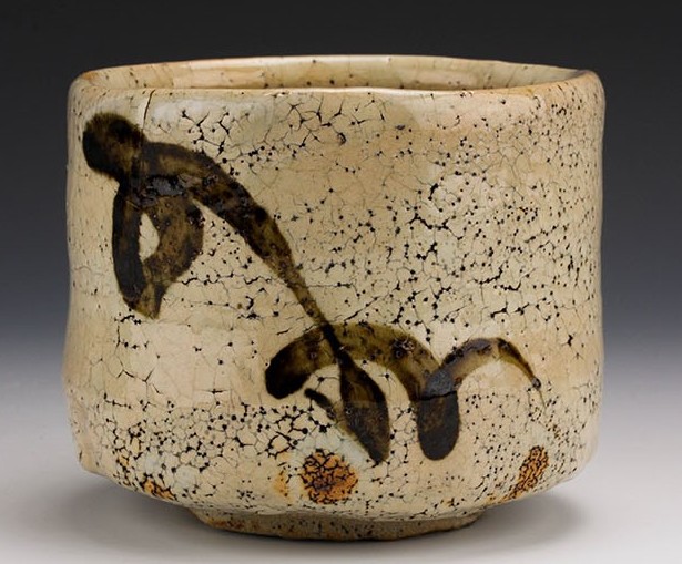
At this point I am not sure
that I would say that I am amazed by the styles and diversity of a number of Japanese
potters but I think it a safe bet to say there are some things that you just
don't associate with specific individuals. In the case of this illustrated chawan
it would seem to be something of a rarity to see actual "decoration"
on the piece with a few fluid and spontaneous brush strokes of iron over this
kohiki style bowl of rather stoic and formal form.It is easy to see the potter, Tsukigata Nahiko
in the form and surface of this pot being a thick, heavily crackled kohiki surface
with an ash based glaze over the piece but what does stand out is the use of
brushed iron decoration on the front of the chawan. Though I have literally
thousands of images of various works by Tsukigata this is the first decorated
pot that I can remember seeing though as a talented calligrapher and painter,
there are a large number of calligraphic tiles done in Shino. Aside from the
tiles, there are a number of pottery pieces that have one form or another of
some calligraphic or abstract decoration in the slip prior to being glazed in
Shino or other glazes (https://albedo3studio.blogspot.com/2014/01/gone-forever.html )
but as I mentioned, this is the first example of actual brushwork that I can
think of. I'll go on record by saying that I am not exactly amazed to see this
piece in Tsukigata's body or work but I will admit to being just a tiny bit
surprised. "Expect nothing. Live frugally on surprise."
Alice Walker


.JPG)