Monday, December 30, 2013

BONJI

Illustrated is a carved wood panel from a catalogue I found circa 1983. The panel was carved by Tsukigata Nahiko and portrays a bonji or an ancient Sanskrit character which originated in Northern Indian and through centuries of transmission made their way in to Japan and were used by a variety of Buddhist sects for mantra(s) and sutra. This is the first bonji I have seen carved by Tsukigata and the choice of wood, style of carving and placement within the panel are just wonderful.

Friday, December 27, 2013

PAINTED SNOW

Illustrated is a casual photo of a superb pot sent to me by a collector friend. Though like the casual photo, the pot is also rich in symbolism and movement with the feeling of being both relaxed and immediate. This horai, iron glazed mizusashi was made by Shimizu U'ichi (1926-2004) and reflects the spirited nature of winter with the balance of the austere black iron and the fluffy white glaze with the quick rendition of the kanji for flower and moon ( and snow just out of view) etched through the white with the finger, like painted snow of a by-gone  and well practiced literati master. Working out of Shiga, originally a native Gojo-zaka potter from Kyoto, Shimizu makes use of clay and materials from the Hira Mountains which divide Kyoto from Lake Biwa and Shigaraki. Beyond creating a unique vision in iron and celadon glazes, the works of Shimizu U'ichi reflect the blend of the rustic,  the cultured and the brevity and serendipitous that is evoked in the environment and pottery that surrounded this 20th century master.

Wednesday, December 25, 2013

HAPPY HOLIDAYS

I wanted to take a moment and wish everyone out there a very Happy Holiday and a most joyous New Year. With family, friends or home alone celebrating alone, I truly hope all are moved and filled with the positive and festive sentiments of the season.

Here are two enjoyable if not entirely tradition Christmas classics;


Monday, December 16, 2013

OUT OF TOUCH

Just a quick note to say that I will be out of touch with both computer and blog for a while. Hopefully you can enjoy looking back through some prior posts and try to keep warm and dry during the last days of fall and the determined and obviously unstoppable arrival of winter.
Illustrated is a quick shot of the Kon Chiharu uzukumaru vase from last week's post, basking in a rare moment of sunlight.

Friday, December 13, 2013

NOT THE DRINK

Illustrated is a pot made in the Tang Dynasty style, though many, many years later. This phoenix-headed ewer is glazed in the sancai style made popular during the Tang period (618-906), the body is a softer earthenware with molded handle and beak spout attached. The ewer has a number of sprigged decorations applied around the body and once glazed, the amber form is further highlighted by copper and cobalt accents which accentuate the details and decorations of the form. Though not a piece made during the Tang Dynasty, it certainly represents the spirit of the time and was crafted in a traditional manner, meant to mimic the original processes of ancient China. The origins of these pots spreads across the old Silk Road trade route, originating in ancient Persian and were quickly imitated in their own unique style in China beginning in the early 8th century. In exchange for silks and spices, the Persian merchants traded luxurious silver, pottery and textiles that were highly coveted by the burgeoning nobility of the period. This ewer is certainly a pleasant enough piece and surely as close to an original as I will ever get, looking rather nice up on a shelf and a good buy from a flea market back in New Hampshire for $10 and no state sales tax!
Old Tang Commercial

Wednesday, December 11, 2013

PHASES

Like the phases of the moon, I assembled this picture to give a 360  panoramic view of the landscape of this Shigaraki vase. Patterned after a classic uzukumaru-gata form pot, this thoroughly modern interpretation is by Niigata resident, Kon Chiharu. Though not a large pot, the manner in which it was made gives it a tall posture which is exceedingly complimented by the intense firing in which the pot was subjected and this bidoro and ash rich surface was expertly crafted. Fired on its side, the landscape has taken on a wonderful array of effects from a sheer sheet of green glass to running ash flows ending in deep green bidoro drips, the most noticeable and evocative hangs, suspended off the lip defying all known principles of reason; but after all, isn't that what wood firing is all about?

"A man always has two reasons for doing anything - a good reason and the real reason." JP Morgan (1837-1913)

Monday, December 9, 2013

JUST ENOUGH SPACE

Illustrated is a small, maybe 7" tall cap jar with ring knob glazed in temmoku and iron red. I made a small group of pots this scale; they are easy to pick up in one hand and have an intimate sense and scale to them. I would think they are rather practical with uses ranging from storing teabags, candy, cat food or sugar. A plus about a smaller jar is that the possibilities are endless as they have just enough space for use and takes much less room than most of the jars that I make, perhaps about as much as a teabowl. It is a bit hard to tell from this photo, but the lid is a richer iron red color with lots of shimmering iron crystals which match up nicely with the crystals that can be seen running down the tendrils of the glaze on the body of the pot. I am pleased with the way the jar came out; simply thrown and simply glazed, this is as close as it gets to making and baking.

Friday, December 6, 2013

TANG POEM

Simple in design, execution and decoration but regal in its bearing, this Tang dynasty influenced melon shaped chaire exudes a sense of luxury and brings to mind the lyrical poetry of that period . As a combination of his father's work, historical archetypes and his own personal expression, this chaire by Kato Kobei VII is a visual gem. The fluted form has rich aubergine tones that define the form vertically while the whole is cloaked in a soft and tranquil amethyst glaze with accents of a stark yellow and green which calls the eye to this sancai influenced pot. Kato Kobei VII has blended not only Chinese and Japanese elements in this distinctly Japanese pot, but has put his own stamp on the style in the manner in which the elements of this chaire were created. Though an amalgam of time and geography, this pot has a sense of being distinctly ancient and modern at the same moment.
"When Cold Mountain (Han Shan) is cold
Ice seals the rocks
Storing mountain-green
The sun shines forth
The ice melts a while
And on this warmth
An old man survives." (An early Tang Dynasty poem by a mostly anonymous poet)

Wednesday, December 4, 2013

WHAT'S IN THE BOX?

When I think of the Japanese art of presentation, I think of this book I have of the work of Rosanjin in use. In one particular picture there is this wonderful table arranged with serving pieces made by Rosanjin with food that was all prepared by some famous chef (sorry, I forgot his name). From simple tempura, sashimi and sushi to elaborate and exquisitely prepared dishes, the presentation is phenomenal. In the case of Rosanjin, the presentation is the completetion of his work, the pottery acts as the canvas and is completed by the food which is presented as the art. It is in the Japanese art of presentation that I am constantly overwhelmed by in both its simplicity and originality. In the art world, how a work of art is presented has many corollaries to that of food. While In Japan I remember seeing a Chojiro chawan in a box from the middle 17th century that was also accompanied by boxes by successive owners including the modern black lacquer box that contained all of the boxes which neatly fit in to one another, 6 in total, like one of those sets of famous Russian matryoshka dolls.
One of the things I admire about Japanese culture is that act of presentation that is seen throughout daily life. From the use of plain to fancy furoshiki wrapping cloth(s) and elaborate mizuhiki knots to the more ceremonial nature of ikebana to the tea room with decorated tokonoma with scroll and flower vase and precisely arranged chadogu; the arts of presentation are alive and well. Specific to pottery, there are pots with multiple boxes, the outer box many times lacquered in a rich black or vermillion lacquer, the kiri boxes bearing the hakogaki or the potter, subsequent owners, dealers, chajin, priests and sometimes ordinary collectors. Together with boxes, many pots have tailored bags, shifuku made of old, rustic or fancy textiles and this practice is obviously not limited to chaire, though it is often times the chaire we most associate with shifuku. Case in point is the illustrated package, a very rich presentation that includes a black lacquer box to house the interior kiri wood box with hakogaki. Inside the kiri box is a wood container, with its own shifuku that houses the chaire within its rich, regal purple crepe silk bag and along with the piece are two shifuku that can be used at various times of year or at differing tea gatherings. All in all a rather luxurious presentation that begs the question, "what's in the box?".

Monday, December 2, 2013

CAN I GET A ROLL WITH THAT, PLEASE?

One of the things that I really like about both old and modern yuteki-temmoku chawan is when the glaze terminates in a thick, gravity defying roll. The glaze roll is both visually pleasing and tactilely engaging adding a definitive characteristic to the area of the kodai.  Illustrated is the kodai of a chawan by Takahashi Wasaburo who I have written about before. Combining his study with iron specialist and Ningen kokuho, Shimizu U'ichi and Shigaraki veteran Ueda Naokata, this chawan is glazed in a thick, dark, rich yuteki-temmoku and the roll of glaze meets up to the wet hi-iro that covers the foot except where the pot was stood on wads during the wood firing. The crisply cut foot fits the chawan well as does the mixture of fat glaze and the effects of the wood kiln to create a unique and well executed kodai that pays tribute to both of his former teachers and his inescapable reliance on tradition.

Friday, November 29, 2013

THE CAT IN THE POT


In truth, not much to say, I put the pot on the floor to dust and turned my back for an instant and Khan decided to help clean the interior.

Wednesday, November 27, 2013

CARVED CADDY

Over the years I have seen a number of these carved, three piece tea caddies, both simply executed and carved to varying degrees. They seem rather prevalent during the Meiji Period and continue to be carved to this very day. Of all the ones I have seen, this one strikes me as a bit unique being heavily carved over most of the form with deep relief flowers with virtually no damage despite the fragile nature of some of the carving. Carved out of a single piece of wood, the caddy is wrapped, seductively, in flowers and leaves that bring the eye entirely around the form and give a rather pleasant feel when held in the hand. I am not sure as to the utility of these particular tea caddies in formal chanoyu, but as an experiment a while back, I placed loose tea inside and put it up on a shelf for nearly two months and the tea that emerged were still fresh and perfectly usable. The combination of beauty and utility makes the piece that much more special and a wonderful object to enjoy on a shelf or on the table ready for tea.

Monday, November 25, 2013

SOMETHING FOR MONDAYS


It has been a rather cold and overcast day here in the central Mohawk Valley. One of those days where it is a bit difficult to get things in motion. It also was a day where I had to get some things packed up with the assistance, or should I say interference of my new helper, Khan. I find days like this a bit challenging and thought what better way to lighten the mood than a musical interlude. Take a moment and enjoy a snippet from  the Richard Lester masterpiece; A FUNNY THING HAPPENED ON THE WAY TO THE FORUM. This will give you an insight in to the potential of hired help.


Friday, November 22, 2013

RISK-REWARD

Drawing on inspiration from both the astrological symbol for Pieces and the Asian yin-yang device, the opposing fish design found its way on to a large serving bowl. Using black, grey and white slip, I roughed out the design over the black slip using ink, sponged on grey slip and then trailed the white to bring the design to life. The clay used is terra cotta and I must admit that I  am very influenced by old English slipware in my work, but where possible I add whatever modern quirks that are possible. Though I  am usually confine myself to black or white slip, over the years I have also used a variety of colors, including; red iron, leaf green, turquoise, bright yellow, blue and a red created out of a German imported stain. Slip work is immediate, there is no time to be cautious, there is no going back if you make mistakes, it is the risk-reward aspect of making slip ware, together with its connection to a technique that is nearly two millennium old that makes it both enjoyable and rewarding.

Wednesday, November 20, 2013

KOH-TSUBO II

I was thinking about the small Kohyama Yasuhisa Shigaraki ko-tsubo that I posted the other day and it got me thinking about my stay with him back in 1993. As I was thinking about my time at his studio and home, I had the feeling that somewhere there was a picture of sensei throwing a similar ko-tsubo and after digging through files, I found the picture in question. Though the ko-tsubo on the wheel is a bit larger at about 8" tall or so, the form and especially the neck/mouth are spot on to the one illustrated. One of the hallmarks of a good design is the ability to create that design in a variety of sizes and this is a skill that Kohyama excels at. Many of his pots vary from small to large though based on a "standard" form or design making for an immediately recognizable style that points directly to the maker; it is quite possible that Kohyama's early study of design with Sakuzo Hineno (1907-1984) has something to do with this, but I think it is also about the years of developing a style and direction that makes fullest use of the Sueki inspiration and his creative voice.

Monday, November 18, 2013

PITFALLS


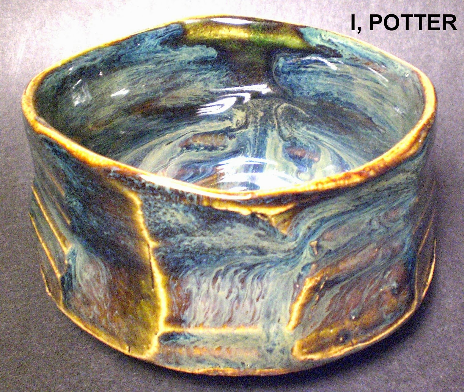
There was a time, back when the internet was new that I used to bid on pots on eBay. Now days, I am reticent to do so for a wide array of reasons including but not limited to; poor packing, pots not as described, photos so muddled you can not make out the details, hidden damages, mis-representation and the occasional unethical seller. I am not saying this is the totality of the market, but how many Not-Hamada, fake Arakawa Toyozo and Kato Tokuro do you need to see to realize the venue is the wild west. Provided you enter the process with a hearty dose of skepticism and a good library, at the very least, you can mitigate some of the pitfalls. I will say however, as all collectors know, despite excellent photos and a great description, you just don't know what the pot will actually look like until you have it in hand.


What brings this up is that, despite my better judgment, I bid and won a pot for what seemed to be a very good price and that was described as and I quote; "FLAWLESSNESS". I make my Paypal payment and four days later, the pot arrives from Japan. Though the packing was not great, it was adequate, but what was not adequate was the description and photos which did not reveal, the pot was chipped in a number of spots. I reported this to the dealer immediately sending along several good photos with the details highlighted. At first, I was told that it must have happened in transport, this is when I point out that a) there was no debris in the packaging and that b) once you knew what to look for, the chips were noticeable in the photos he provided in the auction, next came the gambit. As a Westerner, I just did not understand Shigaraki pottery and this was just part of the "original manufacture" of the vase. I then assured him, that having studied in Shigaraki and collecting Shigaraki and Iga pottery for nearly 30 years, I thought I had an inkling of what was and was not acceptable. What had happened was not a kamakizu or kiln flaw, but rather a good knock to one of the "ears" attached to the vase resulting in said chips. After nearly 20 emails back and forth through differing times zones and all carefully recorded through eBay, the seller finally agreed to refund my money. Though I would have been exceptionally happy to own the pot in pristine condition, I guess at the end of the day, all is well that ends well.

Friday, November 15, 2013

KOH-TSUBO

Illustrated is a rich, little Shigaraki ko-tsubo by pioneer and innovator, Kohyama Yasuhisa. For me, his work never fails to impress, whether older traditionally inspired teaware, shuki or cutting edge "object". This great, little pot at just 4" tall tells a nearly complete story of Kohyama's work; Sueki inspired form, anagama fired, lyrical posture, simply executed and cut decorative lines, rich hi-iro  and just the right amount of traditionally fired surface. Immediately recognizable as his work, Kohyama has spent his life dedicated to the infusion of ancient Sueki pottery with the energy and spirit of the present day. Each pot is a gift from the marriage of earth and fire which Kohyama Yasuhisa officiates over with a lifetime of experience and a very sharply defined aesthetic.

Wednesday, November 13, 2013

KUTSUGATA

Illustrated is a very fine and well fired Iga chawan by Kojima Kenji. This kutsugata chawan was fired on its side, resting on shells which have left permanent impressions on the bowl as ash runs down to what was the bottom of the pot during the firing. The landscape of the teabowl is painted with traditional paddled designs, rich hi-iro, tamadare, bidoro and a face covered in a dark brown to black ash where some charcoal also built up. The lip is banded with wet ash that invites the viewer in to the depths of the piece and the kodai is also covered in a rich coat of dark, wet ash which feels pleasant in the hand. Kojima Kenji rarely fails to please with his pottery and is, in my opinion, one of the most thoughtful and attentive potters dedicated to the traditions and ideals of old Iga pottery.
I realize a lot of my descriptions are very obvious and self explanatory, but the process of acting as narrator helps me to clarify my thoughts on the pots. From this pot, beyond the obvious, what stands out to most is the honesty of the bowl. There are no bells and whistles, it is bare excepting the wrath of the fire, it speaks of the essence of Iga, the harmony between potter, clay and fire. From my perspective, that is as good as it gets.
"Opinions cannot survive if one has no chance to fight for them."   Thomas Mann (1875-1955)

Monday, November 11, 2013

BLUE MONDAY XV

Illustrated is another wonderful, colorful and impromptu painting by master wood-block artist; Munakata Shiko. Munakata's spontaneous painting depicts a  gosu blue molded vase by his lifelong friend, Kawai Kanjiro filled with red camilla branches framing the pot along with a line of line of quickly rendered calligraphy. There are quite a few Munakata prints and paintings that use Kawai pottery as a central theme which is a touching tribute to not only their friendship by their great respect for each other and the mingei craft movement.
"Friendship is neither a formality or a mode; it is rather a life."   David Grayson

Friday, November 8, 2013

LYRICAL PATTERN

A friend sent me this picture that he found somewhere on the web, so I apologize if this is your picture. At first glance it looks like a Kawai school pot, possibly even Ueda Tsuneji, but in fact, it is another Kimura Ichiro molded vase, this time in vivid and active nerikomi patterning. Using his stoneware with oxides to darken it, Kimura made slabs out of the three clays, patterned together to push into a press mold made in the style of his teacher, Hamada Shoji. This bottle shape is very common and it is the subtle nuances that sets the potters apart as much as the decoration and glazing. The bottle, glazed in a thin clear has developed wonderfully lyrical pattern which emphasizes not only the vertical but the horizontal nature of the pot. I love the movement of the pot and once again, Kimura proves the value of two tried and true techniques in molded bottle and nerikomi but succeeds in making a personal statement with his own creative voice within the large body of Mashiko pottery.

"A man's style is his mind's voice. Wooden minds, wooden voices."   Ralph Waldo Emerson

Wednesday, November 6, 2013

GAMEDAY


After my post of the Kimura "cubist" henko, I was asked about the so-called football style henko. First off, the football moniker is entirely mine and it is how I see the piece from the perspective of viewing it straight on. Illustrated is one of these molded football pots that I handled a number of years ago. Once the pot came out of the plaster press mold, it was dipped in slip and once bisque, it was glazed in a transparent ash clear glaze with a rich kaki accent on the mouth and decorations of amber spots with copper squiggles over the whole in an Okinawan (Tsuboya )style. The pot looks very dated as it appears having been made sometime in the late 1950's or 1960's, but when used as a vase, it takes on an entirely different appearance. Ultimately, it is the simplicity of design and decoration and a dependence on the Mashiko tradition that makes exploring the works of Kimura Ichiro so enjoyable.

Monday, November 4, 2013

A BETTER VIEW

Illustrated is a large flared mouth, trumpet style vase with incised decoration of a repeated design around the shoulder of the pot. The vase was glazed first in one Oribe glaze and then dipped again in a thinner version of the same glaze with 1% iron added to the mix leading to wispy tendrils of running glaze effects which are especially noticeable at the bottoms of the grouped incised marks. I decided to add the larger, detailed view so that one could get a better perspective of what the surface actually looks like and how the glaze responds to the incised decoration. An overall shot, from a distance just doesn't give the fuller picture of what the surface has to say.
For more pictures of this recently fired pot, please take a look at the listing;

Friday, November 1, 2013

THOROUGHLY MASHIKO

My first encounter with the work of Kimura Ichiro was back in the very early 1980's, I had acquired a group of exhibition catalogues from a book dealer and among them was one on Kimura from 1976. There was quite the array of pieces from thrown to the molded henko pots and each had a distinctly folk art look of Mashiko-yaki. On our first trip to Japan in 1990 and subsequent ones we were able to see a large number of his pots especially in Mashiko, where his work was displayed in a number of galleries. What became immediately apparent was that while Hamada Shoji was a product of a variety of his experiences and travels, it is safe to say, Kimura Ichiro was a product of Mashiko and the community and lifestyle that Hamada and other Mashiko potters had crafted out of a long standing craft tradition. Kimura Ichiro (1915-1978) studied with Hamada Shoji prior to WW II and after his apprenticeship set up his studio and kiln in Mashiko and fired his first kiln load of pots in1947. Like fellow Hamada students Shimaoka Tatsuzo and Murata Gen, Kimua Ichiro has gone on to be a major fixture of Mashiko pottery and was part of a major exhibit of Mashiko potters in the late 90's. His son, Kimura Mitsuru, continues in his father's footsteps.
Illustrated is a form that appears creatively composed of stacked blocks around a central core; this signature vase by Kimura Ichiro changes with each angle and perspective it is viewed. Having a touch of M.C. Escher in its design, this clearly is one of his best and most well known forms along with his more traditional Hamada Shoji style molded bottle and his quirky "football" style henko. The pot is covered in a yellow ash glaze with red high-lighted quadrants with white and copper accented sprigs of floral decoration on both front and back. This vase is a rather purposeful and resolute piece that has volumes to say about Mashiko-yaki and Japanese pottery of the post-war period; function, design and presence.

Wednesday, October 30, 2013

INTRODUCTIONS, IF YOU PLEASE

At the insistence of my wife and possibly to preserve what tiny amount of sanity I still have, Mindy found me a new studio assistant. His name is Gosu-mezzer-Khan, Khan for short and like most assistants, he will have to be taught the fundamentals which I can only assume will be challenging. Khan is an old style Siamese seal point and I am not 100% he was born, rather created in an evil genius' laboratory as he is equal parts jet engine, cuddly toy, industrial coiled spring and military grade explosives. Like his predecessor, I doubt he will be much help mixing glazes, packing orders or unloading trucks, but his presence and companionship will be welcome none the less.
A very thoughtful internet friend sent the following Kinky Friedman quote from an obituary of his cat in relationship to our loss of Jun, I think it applies to cats, living or remembered; "Dogs have a depth of loyalty that often we seem unworthy of. But the love of a cat is a blessing, a privilege in this world."

Monday, October 28, 2013

SCHOOL

Illustrated is the companion piece to the large Swarm of eels plate by Bruce Gholson. The porcelain plate has various glazes inlaid to complete rather detailed and realistic fish swimming across the creamy surface which is accented by small areas of isolated carbon trapping. Together the pair of large plates make an excellent display and make a statement about a rather playful and adventurous spirit in glaze.

Wednesday, October 23, 2013

FLOCK

Though I do a lot of drawing/doodling, quite a few of the designs I execute by carving or painting come about rather quickly, almost spontaneously while working and listening to music. Though I no longer just start painting or carving, I quickly rough out the idea in pencil or ink and set about finishing the idea. This flock pattern came about just that way, for some reason I was thinking about the old Mad Magazine Spy Vs. Spy cartoons while listening to some 80's music and the idea just dropped on to the bowl. First roughed out in ink and then fairly quickly carved.  In this case, the bowl is porcelain and covered in black slip which was carved to create images through the black and then later glazed in a seiji style glaze. I am willing to bet, it isn't too hard to guess what I was listening to when I got this idea.

Monday, October 21, 2013

UNABASHED SIMPLICITY

"No matter how many times you do this, it still seems miraculous" is a quote from Jack Troy from an interview on the radio for PA People and a splendid insight in to his nature and in fact, that of many potters and other craftsman. One thing that sets Troy apart from the pack is his eloquent abilities in speaking and writing about pottery, not to mention his skill at presenting unabashed simplicity in his work. His forms, developed intuitively over decades of creating, have become like mannequins for designer garb, the forms are created and the anagama wood kiln dresses them in varying garments of natural ash at intense temperatures. The pots, many of them made of porcelain are introduced into the kiln, sans glaze and through the also miraculous process of stoking the wood kiln ever 15 minutes or so over many days, the pots are made whole and are allowed to become what the fire and ash had in store for them. The illustrated teabowl by Jack Troy is a beast of a pot in scale, though it has a simple and humble nature with the marks of the potter  cloaked in glassy ash, creating gesture and animation that draws one in to investigate the line of the pot ultimately tipping into the ash covered interior. The simple curves and wandering lip are exactly the seduction that every pottery collector knows all too well and completes the conversation with the pot on a multitude of levels; simple in its beauty, but certainly no simple pot.

Friday, October 18, 2013

A PERSONAL ACT


When I think about wood firing, I think of the communal nature of the  process. It takes more than an individual to fire the kiln and each individual is dependent on one another for the hopefully positive results that the firing will yield. Though the process is communal, the act is personal, dependant on the motivation, skill and experience of each individual. The act yields pots, lessons and a conversation with the process that is not selfish, but certainly is both self-motivated and personal on a number of different levels. When firing, sometimes it is like being all alone in a room full of people as you split wood, stoke the kiln and make any number of observations to keep the beast feed. I understand this may be a singular viewpoint as I am both skilled and used to working alone; but I wonder who else shares this thought?
Here is a nice video that I found on Youtube about the veteran American salt and wood firing pioneer; Jack Troy. It is worth a watch.

Wednesday, October 16, 2013

ASH RUN

Illustrated is yet another experiment using ash, this time over a rich, iron and talc glaze. The bowl was thrown off the hump with the undulating lip and rib marks added as casually as I was able and once bisque, the piece was glazed and fired and then cooled as slowly as was possible. The ash itself is a mixture of medium and soft wood ashes together with a tiny addition of rutile to enhance the color and this may have also helped contribute to the flow of the glaze as it melted. Though evenly dipped in the ash glaze, I was very surprised by the pattern that emerged as the glaze melted and ran. Though I harbor a natural pessimism when it comes to one off tests being reproducible, I will keep my fingers crossed and try this combo on a slightly larger piece next glaze firing. I know I have said this before, but I am just constantly amazed at the nearly infinite number of variations you can achieve with only a hand full of materials. This is most likely that moment a teachers told you about years ago as to why you would need chemistry, but you slept through class anyway.
"You can not teach a man anything; you can only help him find it within himself." Galileo Galilei (1564-1642)

Monday, October 14, 2013

SWARM

Illustrated is a large complex glazed plate by NC potter, Bruce Gholson. Using a variety of glazes, wax/latex resist and inlaid glazes, this large porcelain plate depicts a lively swarm of eel all oriented in the same direction though some coming and going off the surface as if captured in a circular image. The range of textures within the glazes is truly outstanding and makes for a rather unique and evocative statement about sea life and perhaps a glimpse in to the nature of the potter himself. Gholson has used various aquatic life forms, snakes, insects and bones of varying life forms as design elements in his work and his current work revolves around exceptionally complex surfaces including crystalline and molybdenum flowing glazes.
"Nature is an infinite sphere whose center is everywhere and whose circumference is nowhere."  Blaise Pascal (1623-1662)

Friday, October 11, 2013

FIRST QUARTER

Illustrated is a large Shigaraki tsubo by veteran potter, Otani Shiro. Fired to create soft textures of tsuchi-aji and hi-iro, the tsubo has a soft, noble and contemplative nature to it as it sits at home in his studio. The transitional band between the blond clay texture and the reddish orange hi-iro shows delicate and wispy bands of varying colors before each yield to the dominate tones on either side of the tsubo.  Reminding me of the first quarter moon, this tsubo is one of those perfect pots that fits into a sense of pathos and poetic lyricism that is one of the essential elements of Japanese art. There is no pot so cherished as a simple pot that is filled with tension, emotion and dialogue and it is Otani Shiro's experience that creates such fine tuned simplicity.
"Experience, which destroys innocence, also leads one back to it." James Baldwin (1924-1987)

Wednesday, October 9, 2013

VIRTUOSO

Since we were on the subject of wood fired, this particular chawan is woodfired². Dominating the field of Bizen ware, Kakurezaki Ryuichi has blazed a trail that connects the old to the new and as such, has influenced a whole generation of Bizen potters. This Kuro-Bizen, black Bizen chawan shows the contemplative aggression that he is known for, creating angles, cuts, facets and deliberate planes that catch and deflect the ash circulating around his nobori-gama kiln. There is a virtuoso's blend of formula and improvisation in Kakurezaki's works, repeating forms more in theory than in actuality, each is unique even before it goes in to the kiln.  
Through a combination of experience, determination and serendipity, this chawan shows the (creative) aggression of both potter and fire to its fullest. Dipped in a black engobe, the bowl faced the flames and ferocity of the firing and has survived to tell its tale of how it was created and how it was fired. The long tamadare tendrils licking back from the face of the bowl and the black surface wet with ash, have long since melted and fused to near perfection on this masterwork by Kakurezaki. With trial and error, Kakurezaki is constantly on the move forward, cutting his way into brave new ground for Bizen-yaki and in fact, modern Japanese ceramics.
(Photo provided and used with the permission of a private collector.)

Monday, October 7, 2013

CONVERTED

I have been taking the time to sort through old photos, negatives and slides and getting them converted in to jpegs before they are a total loss. As I am going through the stacks and stacks of photos, I am surprised at images that I stumble on that I didn't even know exist. There are pictures of people I worked with, like; Kohyama Yasuhisa, Warren MacKenzie, Jeff Oestriech, Bill Klock, Dick Schneider, Kirk Mangus, Marie Woo, John Gill, Bill Brouillard and many, many others. There are also the pictures, thousands of them from a number of trips to Japan as well as potteries in Japan, primarily in Shigaraki/Iga, Mashiko, Hagi and Gifu (Mino). Looking at all of these photos brings back memories of wonderful places, people, pottery and even food. This is a project, long overdue, that I am glad I am finally making the time for.
Illustrated is one of those photos that I had forgotten that it existed. Actually, it was my wife who noticed this as I was flipping by negatives and suggested that we convert this one that was taken back in the 90's at Kent State. This photo was taken just as the firemouth was unbricked of the anagama at Kent State and in the picture there are several of my pieces as well as a mizusashi by Marie Woo. At the very top of the photo, within the kiln is a teabowl that was posted on my blog some time ago, see attached link. I found it rather neat to see this picture after all these years and builds a better context for the pot. Makes me wish I had taken a lot more photographs and started converting them to digital a long time ago.

Friday, October 4, 2013

STOPPED UP

To anyone who has seen or read my blog, it will come as no surprise that I am very influenced by the pottery (and philosophy) of Kawai Kanjiro. His ability to manipulate space through his forms and then ply them with beautiful surfaces is nothing short of wondrous and from my perspective, he is at the very panicle of pottery making in the 20th century. Among his forms that I am extremely fond of are his bottles with stoppers, very much like decanters and maybe just a bit like "genie" bottles. Over the years I have made a wide array of genie bottles, whisky bottles, decanters or whatever you wish to call them, with stoppers where the lid creates a nice gap above the mouth of the pot. Though I am influenced by Kawai, I have tried to make my own thing using the idea and think they have come out as part of my own vocabulary. It is a difficult road to travel where you are influenced but a potter without making copies of their pots.
Illustrated is a whisky bottle with a thrown stopper glazed in my lepidolite Oribe with black slip decoration around the belly of the pot, at the mouth and on the stopper. The goal was to make a bottle that fit comfortably in the hand, held a generous amount of liquid and still felt good in the hand. The stopper together with the broad cap, keeps the contents safe and sound and ready to be enjoyed; is there anything more fitting than serving Jack Daniels in an Oribe bottle?

Wednesday, October 2, 2013

MARKS II

I am fascinated by the infinite variety of marks that potters make in and on clay. A simple mark, an incised gesture can move a pot from dull to exciting in the instant it takes to be made. As I have mentioned, making marks can take a lifetime or a repetitive dedication to create, just think of Hamada's characteristic sugar cane motif or the brisk marks of Michael Simon. For a mark to work, it has to be well conceived, deftly executed and more than anything, compliment the pot. It would seem the practiced spontaneity is at the heart of good mark making and experience and practice, the basis for successful execution.
The reason this came to mind again is that I recently encountered a wonderful wood fired pot covered in ash, strong form, great clay, well fired with a mark made round the top of the pot that just seems to lack any purpose of conviction. Is a poor mark like a so-so kodai on an otherwise nice chawan? Does the mark alone diminish the quality of the pot? I have spent a lot of time looking at the pot which has descended in to a love/hate relationship, I love the pot but the mark is so much a distraction that it dooms the pot to my eye. It is funny how a simple mark, made by an experienced potter which is meant to be innocuous ends up being the exact opposite, the focal point of the pot. I know as a potter, I struggle with making marks that are meaningful and appropriate, but it amazes me that you can do almost everything right and get only one thing wrong and the pot fails. It is rather inescapable that the devil really is in the details and for a potter, you need to get all the details right, each and every time. Certainly sounds simple enough.
Illustrated is a close up of a Persian box by Michael Simon. The design of two fish is the model of simplicity, all superfluous detail has been removed and in economy and fluid dexterity, he has rendered a design that he had familiarity with through his experience of repetition. Though simple in line, mark and detail, the essence of the fish comes through and animates the surface of the box. His ability to create such spirited marks speaks to his intuitive and purposeful sense of creation; there are few modern potters who can say so much with so little.

Monday, September 30, 2013

BLUE MONDAY XIV

I would think that this vase is probably not something one sees every day. A bit formal and precise in the throwing, this double walled and reticulated vessel is a nice early work by the late Kato Takuo. Resembling a medieval tiled wall, this Persian glazed vase was hand engraved and pierced to create a statement about the possibilities and influences of such pottery. The addition of gold leaf applied under the glaze speaks to an earlier age of opulence from which the archetypes of this pot spring from. Though an earlier work by Kato, the pot certainly shows the exceptional control and manipulation of clay, glaze and firing that he is well known. In this piece, one can clearly see the promise of more to come together with a more relaxed and spirited aesthetic that he was working toward, day after day and year after year.

Friday, September 27, 2013

THROWN, PINCHED & CUT

Illustrated is large yunomi teacup that I made a while back. Taking a few cues from a famous amber glazed Ohi chawan the piece was first thrown on the thick side and then once it started firming up, I gently push it a slightly off round and pinched the form to get it into the posture I was after. I let it dry a some more and then proceeded to cut fast and very random facets down its sides. I hand tooled the piece first with a sharp piece of bamboo to get the foot I was after and then used a small loop tool to excise some clay in the form of a sharp spiral. Once bisque, I glazed the yunomi in a medium coat of my lepidolite glaze and when fired the sharp lines from the faceted broke to a lighter color creating a nice vertical distraction around the pot. Where the glaze ran the Oribe is a vivid and rich deep green, particularly the cuts around the foot and in the pool of the cup. I am constantly amazed at the versatility and variations within the different Oribe glazes I use and can only wonder, what will the next pot look like blanketed in green.
"Sameness is the mother of disgust, variety the cure." Petrarch (1304-1374)

Wednesday, September 25, 2013

INAUGURAL

Almost three years ago, I wrote about being a somewhat accidental collector of guinomi. In the accompanying picture there is a group of guinomi, in the center back of the picture is a rather pivotal piece in that it was the first Tsukigata Nahiko piece that I had acquired. I had first become aware of the work of Tsukigata back in the very early 1980's and through the use of inter-library loan, I was able to secure a copy of the book Oni-Shino for an extended stay of four weeks, so my interest in his pottery is hardly a passing fancy, in fact, his work is among the most electrifying and interesting I have encountered. Flash forward nearly two decades and thanks to a large internet auction site, I happened to find this large Shigaraki style guinomi by Tsukigata Nahiko. No box nor identification in the auction, just all of the tell tale characteristics of the potter and for less than $20, it was the inaugural Tsukigata addition to the collection that was never intended and just keeps on growing.
Thrown out of Shigaraki clay and woodfired in his anagama the body of the piece was first dipped in an ash glaze which is like a coating of rich bidoro with a wonderful pool of green in the bottom of the guinomi. The foot is flashed with a rich coat of color from where the flames liked the bulky pedestal creating a great, wet contrast to the body. Inside the foot ring is Tsukigata's signature, boldly carved and in all my years of studying his work, I have never seen a similar piece in terms of surface though I am aware he has made Shigaraki pottery along with his best known styles. Having used this guinomi on occasion, I can tell you it is both generous in its contents and satisfying in its function.

Monday, September 23, 2013

PICTURE PERFECT

I recently received a catalogue that had a variety of pots dating prior to 1985 and in it was a rather remarkable vase by Tsukigata Nahiko. Illustrated is a scan from the catalogue showing another very typical form that Tsukigata worked with, but the surface is anything but typical and possibly just shy of being picture perfect. Glazed in a thick coat of Shino glaze, that almost appears curdled, iron is boiling up from underneath and in places combining with the rich natural ash that has deposited on the surface creating exceptional flows of varying hues and textures. The area on the face of the pot that bore the brunt of the velocity within the kiln is caked with a rich shield of ash that is just a touch refractory in appearance and most likely to the touch as well. Whether by inspired planning and experience or a touch of serendipity, the pot is mostly encased in an ethereal coat of ash that makes the pot luminescent. Having seen similar pots in person, I can tell you that if there is any dictionary that does not have this (or a very similar pot) illustrated adjacent to the entry; ONI-SHINO, than it definitely needs an immediate revision!
"It is reasonable to have perfection in our eye that we may always advance toward it, though we know it can never be reached."  Samuel Johnson (1709-1784)

Friday, September 20, 2013

SIDE-EFFECTS

I threw a few stoneware teabowls recently that were faceted while still on the wheel, each then had a hand cut foot to try to compliment the form. Illustrated is one of the finished bowls that was first glazed in my Oribe glaze and then overglazed in the same glaze altered by adding iron and ash to it. The bowls were then fired on wads on their sides, in this case, you are looking at the front of the teabowl which was the top creating interesting side-effects. The base overglaze ran extensively toward the bottom, the opposite side as can be seen from the front and the interior creating a rather nice flow of effects which seem to defy gravity without an explanation added. These side-fired teabowls were a neat experience and obviously the outcome was in question and certainly unpredictable making them all the more interesting and worth making more.
"Experience is a hard teacher because she gives the tests first, the answers afterward." Vernon Sanders Law (b. 1930)

Wednesday, September 18, 2013

JUN-YAO 1996-2013

My longtime companion and studio assistant passed away today. He has been sick for a few short months now and the inevitability was ever apparent. He was ours and to us, was the greatest cat ever and will be sorely missed as I survey his favorite spots and am reminded of his incessant need for attention as well as tuna and very rare roast beef. He was my cat and the best I can hope is that he would have said; "thanks for everything, I had a wonderful time". He was our truly great cat that enriched our lives while here but I am reminded; "one can not cheat time". Rest in peace.
"Good-night, sweet prince; And flights of angels sing thee to thy rest."

Monday, September 16, 2013

FIRST SALE

A few months back, I was contacted by an old friend from my Cleveland days. He was curious if I would like to show my pottery at a new gallery in Ohio which was being developed by his wife. The idea came about as a retail space next to their framing gallery became available so they decided to expand their current business and create a print and craft gallery. Run by Lori Drugan, the gallery draws from a rich collection of mostly 20th century prints and a core group of ceramics people which includes Tom Radka's raku pottery as well as my own. The gallery is spacious and well thought out with unfettered displays and plenty of breathing room to contemplate the works displayed.
On Friday, I missed a call from Cris Drugan as I was busy trimming pots, he called to let me know the gallery was finally open and the first sales in the new gallery were two of my pots. I was of course very pleased to hear that, especially considering it has been a number of years since I have been represented in that area. For anyone in the general Akron, Ohio area, the gallery is located in Fairlawn, Ohio and is run by Lori (and Cris) Drugan;
Gallery of Framing
131 Ghent Road
Fairlawn, Ohio 44333
(303)835-3046

Friday, September 13, 2013

DO YOU HAVE ONE IN BLUE?


This is not meant to sound like a complaint, far from it, the simple fact that people want to buy stuff you make is wonderful. At issue is that many times, invariably so, when someone asks about your pottery, what you have on hand is rarely exactly what they want and isn't this a great excuse for me to throw some more pots! There are a number of reasons for that; the pot is too big, not big enough, it is too tall, not tall enough, it is too blue or in this case not blue enough. After I posted one of the slipped amber ash teabowls I got a query asking; "do you have one in blue?". This has happened countless times, especially since the advent of the internet and most times I tell them, well no, I don't have one currently, but if you would like to order one, I can most likely get it into the very next firing. This response works about 80% of the time, though for some the immediacy or the need for a immediate gift precludes the order process. Luckily enough, in the last firing there were three amber ash slipped bowls as well as three blue Ao+ pieces. I offered the customer a choice between two of the same style, one was picked and off it went by carrier pick-up from the USPS. I may have said this one too many times, but, all's well that ends well.


Wednesday, September 11, 2013

IMPORTANCE

In relation to pottery, there are two distinct ways one can understand importance. The first is the most literal, the importance of a pot in relationship or context to the field of pottery; as in an important Ming jar. The other type of importance is the importance or influence a pot may have on an individual or in this case a potter. The best case scenario is when the two intersect at the same place at the same pot. Illustrated is a pot that qualifies for both, being an exceptionally fine example of the style and a monumental influence on me as a potter. I first encountered this Kawai Kanjiro chawan back in 1992 while living in Cleveland. I was immediately struck by the deceptively simple form of the bowl with the ever so undulating lip and broad and earthy foot. The manner in which it was so casually decorated with what seem to be off handed splashes speaks of the innate sensibilities of the potter and his confidence in his decades of "doing".  In every sense of the word, this is an important pot.

This particular image has been a guiding light for my work, first through dozens of photographs of the piece, later multiple jpegs and now even video (mpeg) footage of the pot. Through all of these images, I can study the varying nuances of posture, form, foot, glaze and decoration grasping the essentials of what became second nature to Kawai, who would have been in his 60's when this pot was made. I am sure that Kawai had little thought to the importance of this pot or the influence its shadow would cast, but that does not alter the fact that his works have found their place of importance in history and have influenced more potters, both knowingly and unknowingly, than could be counted.

"Every thought which genius and piety throw into the world alters the world." Ralph Waldo Emerson

(Used with the kind permission of Mr/Mrs Private Collector)

Monday, September 9, 2013

ONI-SHINO TAMADARE

Illustrated is a fine Oni-Shino vase by Tsukigata Nahiko. This form is one Tsukigata used quite frequently with sizes ranging from about 8" up to as much as 16". On this particular piece, there is a wonderful interplay of the iron and the white Shino glaze with a rich and vibrant green ash running down the face of the pot indicating its position in the firing. Tsukigata fired his pottery in an anagama much like his master, Arakawa Toyozo; the main difference being the intensity to which it was fired and the determined encouragement of ash build up that would then melt and run along the surfaces of his pots in tamadare fashion. If you look at this vase, you can see where the bulk of the ash built up on the upper third of the pot and then when the temperature was just right in the kiln, it began to cascade down the surface adding to the varying effects of the iron and Shino. Though I can imagine the pot without the contribution of the ash, it is not only the glazing, but the ferocity of the process that make Tsukigata's work truly unique and stand alone among the wide array of pottery now called (erroneously) Oni-Shino.
"Though old the thought and oft exprest; 'Tis his at last that says it best."  James Russell Lowell (1819-1891)