Though I use several commercially
available clays, my terra cotta is my own formula as are several other
stoneware clays that I use. Recently I have been making up small batches of an
iron bearing stoneware, formulated back at CSU and Kent State to use for some of my on
going Oribe pieces. Made in batches of about 50 lbs at a time it isn't such a
major chore and since I mix it up to a pudding consistency, I then firm it up
on plaster and have clay ready to use in about a week so proper planning makes
everything work quite a bit better. The real reason I like this clay is that it
has a tough quality to it; I can throw it, dry it out, tool it, get it bone
dry and in a bisque all in the same day which makes testing much easier
and even quicker if I use my test kiln so it is ready to glaze the next day. I built another short
slideshow video of two more impressed texture Oribe bowls using the bisque tile
that created the first of this group. The texture is a bit finer but the
overall decoration really creates an interesting surface to my eye and helps activate
the glaze and a variety of nuances that go along with the use of copper and
iron. The two recent teabowls are both tall, full pieces to maximize the
texture and glaze with just the right curve to the body and inviting roll to
the lip. With each bowl, I get a little bit better leaving only 9998 more to
go. "No matter where you go,
there you are."Buckaroo Banzai
Though I regret not having
had more time to study with and observe Kohyama Yasuhisa working, I am quite
grateful to have had the opportunity to watch him prepare clay, wheel throw,
coil build, slice earth, load his anagama and the firing process from beginning
to end. Together with those experiences, I was also able to see him prepare and
pack his pieces for his show at the Museum het Princessehof, Leeuwarden, The
Netherlands, create pots for his standard ware firing and partake of his
excellent cooking! Truthfully this experience was amazing and was filled with a
myriad of details that have colored how I work and who I am as a potter whether
it appears so or not. It is the details of
Kohyama-sensei's process that are easy to overlook and pass by as one takes in
the whole, but it is the sharp and critical aspects that help define his works
from the pots of other potters from Shigaraki and elsewhere in both the making
and the firing. Illustrated is a close-up shot of a tsubo-guchi of one of
Kohyama Yasuhisa's mentori vases. The way that Kohyama facets leads the clay to
be cut crisply and definitively in a rather quick sucession of motions that few
others can mimic and are clearly the result of having pioneered this particular
approach to faceting and dedicated a lifetime to its perfection. It is these
fast cuts that define the pot, from the long and broad facets around the body
of a piece to the more intimate and intricate faceting that defines the neck
and mouth that once fired allows a build up of a wet, green ash to paint the
angular surfaces without obscuring the defined sharpness of the details. Though
ever so slightly softened by firing process and ash, the form remains as
created by a master who would appear to be gazing in to a crystal ball seeing
well into the finished work even while he is still adding coils to a pot that
has just started its journey to completion.
Back in the middle of August
I decided to go ahead and build two larger slab vases based on some cartoon
meets two dimensional design in my head and after completing them went right
back at it and built two small but broader vases which are illustrated here.
Roughly 13" by 12" or so, this pair were not carefully planned but
rather I rolled out some slabs and put them together and surprisingly they came
out pretty close to one another. I refer to these slab pieces as facciata or facade
vases as it is more about the profile for the design than the volume necessary
to keep them standing. The one on the left is decorated in abstrakt resist
while the one on the right is tebori carved X&O design, both forms are
complimented with a similar neck and mouth with a lozenge pattern caved through
the flat to animate the surface. I have also added small lugs to the shoulders
of each to help define the space a bit better. All in all considering I am not
a real proponent or advocate for hand building, I am reasonably happy with the
outcome and perhaps I'll make more slab pieces in another year of so.
Thoughnot without its organic qualities, this
chawan by Banura Shiro is radically different than the chawan I posted by
Kumano Kuroemon the other day. Banura Shiro had a wonderful knack for creating
work that has an honest and spontaneous quality despite the fact that his work
was well conceived and executed within a high degree of exacting control. I
would suggest that the first step in his work was the design or concept of the
piece followed by the creation of the canvas, in this case the making of the
classic Banura chawan form. Once the pot was made, the general, overall texture
was created and then the design/ decoration was applied and for this chawan
that would then include a post-firing application of a gold rubbed finish that
was finalized by a low temperature firing to lock in the surface. I have always
found that despite the fact that Banura Shiro relied on variations of this
chawan form and his leaves (foliage) design, each and every pot has a singular attitude
and fresh appeal that allows a connected body of work to be populated by unique
and individual pots.
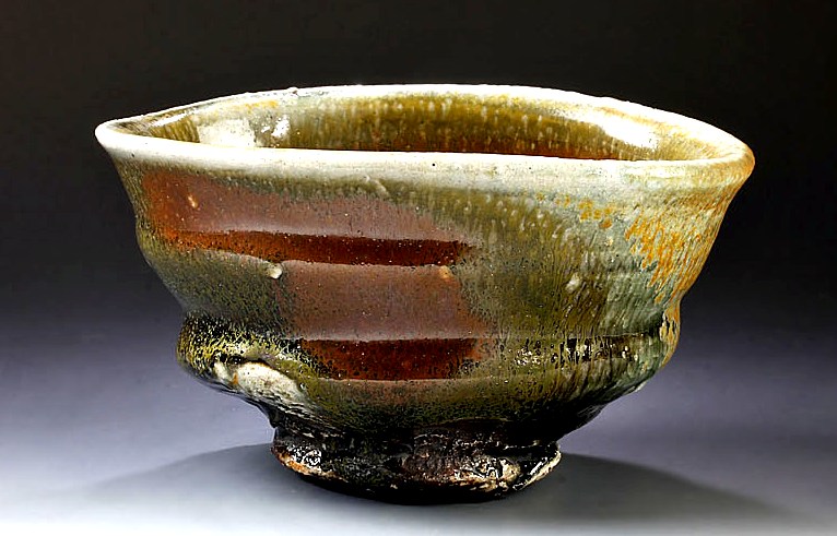
Illustrated is a rather
simply thrown and glazed chawan, at least by Kumano Kuroemon standards. Having
a rather conservative form and posture the surface of this chawan was glazed in
iron and Shino glazes and then the surface was accentuated by the ferocity and
determination of an intense wood firing. The iron accent on the bowl appears
out of the mist of the wispy ash tendrils covering the bowl and the firing has
created a wet surface that highlights the strong and purposeful foot. Though
not necessarily pertaining to this chawan, for much of his work it seems that
his pottery has been assaulted and disciplined by potter and flame to create
evocative works of clay that seem to have a contained brutality and dynamic
intensity trapped within. As with many really good pots it is easy to get
caught up in the use of the poetic and over used superlatives but when you are
dealing with the Herculean appearing works of Kumano Kuroemon is that actually
possible?
Illustrated is an ink wash design
by Mashiko potter and Hamada Shoji student, Kimura Ichiro. Simply inked and
rendered this preparatory sketch of a covered jar shows an elemental decoration
that is intended to repeat around the jar to create a banded and cohesive
sensibility. I have always found the simple and "common" designs of
Kimura say much more with in his work that one would presumably expect because
of the balancing of form, volume and design which he exceeded at. The concept
of the mingei aesthetic always firmly in the back of his mind he made the
practical a bit fanciful especially when you look at his molded geometric
pieces and his fun "football" style henko which he is well known for.
Kimura's work based in the craft of the people's art spared no expense in
creating functional, common and simple work that pleased the eye, lifted the
spirit and had a glint of whimsy spread out about the surface and lines of each
and every pot.
One can debate the merits of
the teabowl in the West where they have many uses from function to simply decorative
but rarely is it used in traditional Japanese tea ceremony. I have been
fortunate and have had a number of my teabowls go to tea practitioners across the
US, Canada, Europe, Australia and even Japan but the bulk of teabowls I
actually make are bowls that have a murky basis on the chawan and are simply
bowls of a certain scale that are intended to be used how ever the owner sees
fit. Toward the end of the summer and early fall, it is usually time to make
the teabowls for upcoming holiday shows, gallery orders and for consignments to
other venues. Illustrated is the first batch of terra cotta teabowls out of the
first two glaze firings, the size and shape of the bowls makes for excellent
space fillers around plates, bowls and covered pieces making for a well packed
kiln. Over the years I have settled on a number of user friendly forms being
careful to stay within the realm of reason in regards to size as I am a bit too
fond of teabowls that end up super sized. This particular group is made up of
my abstrakt resist, "falling leaves" and midnight plum blossoms while
the next group to be fired is mostly composed of tebori carved pieces. "Fill your bowl to the
brim and it will spill, keep sharpening your knife and it will be blunt."
Lao Tzu
There is absolutely nothing
like the strong posture of a chawan by Kawai Kanjiro. The wide, bold foot acts
as a defining pedestal to what at first glance looks like a common bowl form
but with closer inspection it shows its user friendly attributes where it sits
well in the hand, has an appropriate weight and the lip is out turned just
enough to let slip the right amount of liquid. All of these considerations were
honed by Kawai over a lifetime of work and experience, through trial and error
and an eye for the simplest yet often overlooked details, the master creates a
work that has been stripped to the least amount of detail yet creates a pot of
supreme beauty and utility. This wan-gata style chawan has a rich iron temmoku
glaze over areas of thick slip "patted" on to the surface dividing
the bowl in to sections and creating visual depth and movement but born of equal
parts clay, glaze and a little bit of magic. There is mastery and mystery
married in the works of Kawai Kanjiro that has as much meaning and relevance
today as they did over well over five decades ago which can be summed up in one
word; timeless.
Now and again I find my past
finding its way into the present day in relation to my work. As a kid I
remember getting books in the mail now and again that were illustrated by my
cousin, David Czarin (Czarinski), my cousin and godfather who was not only an
illustrator but a well accomplished painter,sculptor andprint artist who was fond of making
mono-prints which thoroughly inrigued me. My wife and I watched him work on
numerous occassions and he would create his mono-prints either as a spontaneous
work or a well thought out and well considered print design. I think this
process rubbed off on me a little and recently I have come back to the
technique taking drying slabs of clay and incising fine lined decoration across
the surface, drying it a bit more with the heat gun and then impressing the
slabs into thrown bowls and jars for a rather quick and direct affect based on
a blend of primitive designs, old Oribe patterns and incised langauge used
through out the ancient world. Though originally created as a "mono-print"
to impress in the bowl, I have since bisque the incised slab to use over again,
I wonder if this is cheating? I recently put this teabowl
up on my trocadero marketplace, please feel free to check it out; http://www.trocadero.com/stores/albedo3studio/items/1341185/item1341185store.html
When ever I see a pot by or
think about the potter Kishimoto Kennin, I can't help but be impressed by the
range and dedication to varying traditions that he has pursued in his nearly
seven decades long career. The sheer diversity and mastery of a wide array of
traditional Mino pottery styles couple with his exquisite kannyu-seiji celadon
pottery would be more than enough if the styles were divided among a half a
dozen potters let alone one, but over his long pottery tenure, Kishimoto has
desplayed a single minded approach to each pursuit until he mastered the
technical and aesthetic boundries of Shino, Ki-Seto, Iga, Seiji and others to
single him out as a true rennaissance potter. Though perhaps best known and
appreciated for his exceptional Iga works, his esquisite celadons blend a true
understanding of form, design, decoration and firing to create stunning and
contemplative pots, some like the one illustrated decorated with a simple
branch and blossom design using underglaze iron (tetsu-e) and copper red
(yuriko).As I look into the celadons of
Kishimoto Kennin it becomes clear rather quickly that it is easy to lose any
sense of time or place lost in the depth of the refractive surfaces.


.JPG)