Friday, November 10, 2023

SNOW & SUN

Looking a bit like soft, drifting snow over cracked ice, this simple Hagi chawan is by Yoshida Shuen. Over the years I have seen and handled quite a lot of his work, some showing the influence of his master Miwa Kyusetsu X, he must have been exceptionally prolific but this is the only chawan I ever held on to for any length of time. The form is simple, just generous enough and with the kodai, fits well in the hand and the landscape speaks to me of a time and a place conjured up in the imagination, where snow, sun and the warmth of the sun coming through the stormclouds paints a vivid picture. Clearly made for use, the details and visual presentation weren't rushed or ignored, probably all you can expect for a chawan though going that extra step is surely a welcome addition.

Wednesday, November 8, 2023

SORRY, ISSAC
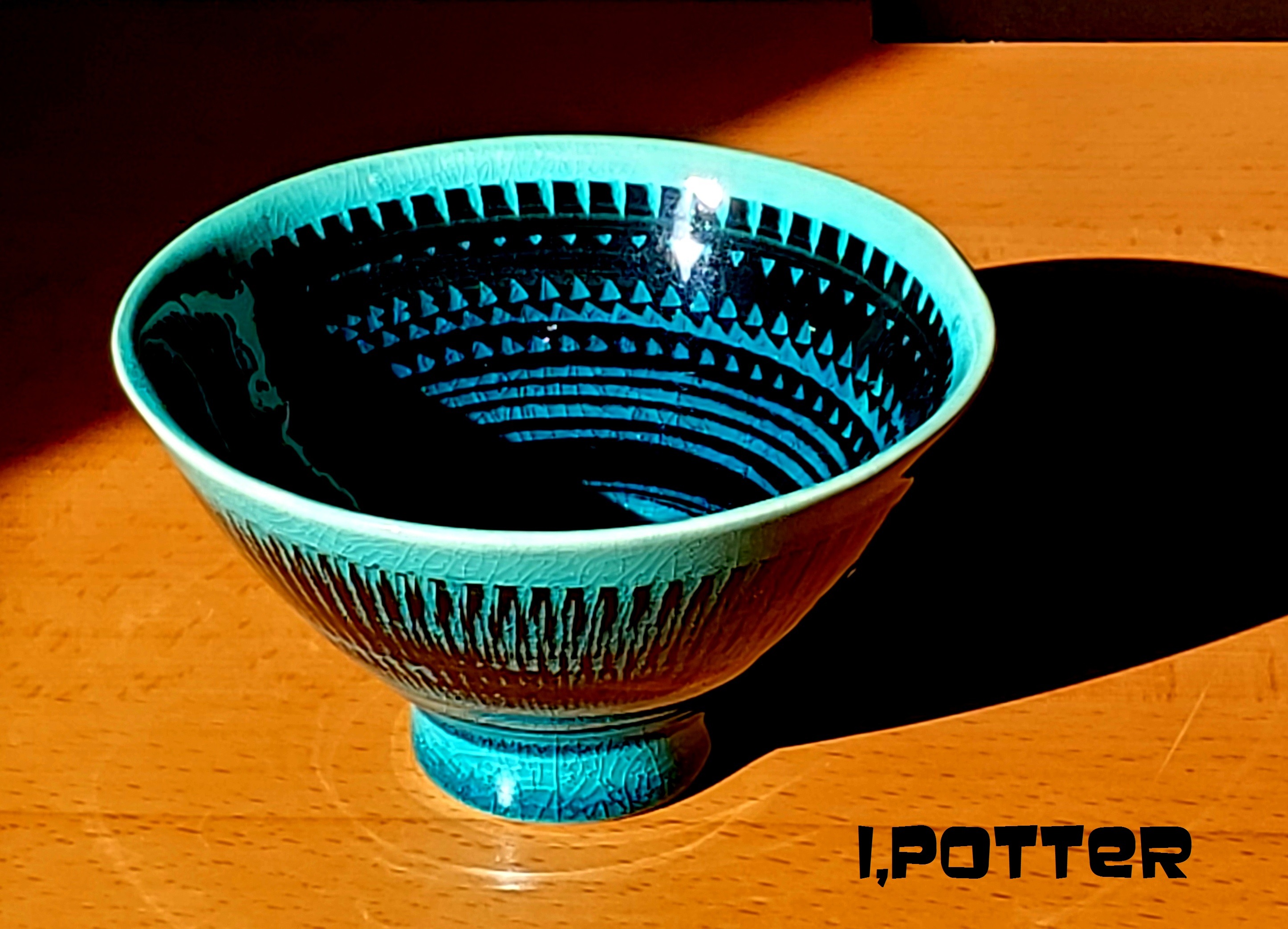
I have this habit of glazing rignt to the very edge of disaster regarding the feet of most of my pots and this chattered teabowl is no exception. Glazing to the edge of the precipice is probably okay if you are using rather stable and stiff glazes but maybe I forgot to mention that I love glazes than move and run to create motion and the combination of such a surface and a risky glazing technique doesn't always go hand in hand. Back to the beginning, this teabowl was made out of a white stoneware and then black slipped and chattered to create a nice decoration to match the conical form. Once bisque the bowl was glazed in the soda blue I am currently working with, from a formula I first used back in the mid-90s. As you can clearly see, though evenly glazed, the glaze has run and built up around the foot almost to the point of imminent failure though perched atop a thin slice of soft brick to minimize a potential catastrophe. Though defying gravity slightly, sorry Issac, the foot ring is now covered over in a rather attractive coat of thick blue, fractured glaze which certainly is a plus despite the potential for failure next time around and it does show quite nicely in the afternoon sunlight. 

I'll take this one as a win as I continue to figure out just what I can and can not get away with at various spots in and around the kiln and though hope is not a brilliant strategy, I can hope that keeping the glaze thickness in the bucket a consistent thickness and the application to the pot as well, maybe the wins will outweigh the loses which in any given firing is the best I can hope for.

Monday, November 6, 2023

THROWBACK

Some while back I posted up a rather nice Iga guinomi by Umehara Isamu and thought to post up a rather strong Mino-Iga vase by the same potter. Clearly based on a late medieval archetype, this rugged vase has a rather purposeful form, with potters marks raked into the surface, classic lugs attached at the shoulder and a waisted in neck and flared mouth completing the pot. The surface is a masterclass in perpetually wet ash in varying tones of brown cascading down the hanaire, some in sheets, others in rivulets terminating at the dark foot touched by charcoal creating a dark and shadowy base. Though born in Osaka where he persued graphic design he became interested in pottery and studied diligently before uprooting and setting up a studio in Mino where he built an anagama to create wood fired Mino-Iga, Setoguro and Shino pottery to very good effect. Though you could assume such a classic and simple wood fired pot could get lost in the shuffle of our modern age, this throwback to an older era holds a rather firm footing in the modern culture of tea and ikebana where the old and new collide, preserving ideas and aesthetics essential to a national cultural identity.

Friday, November 3, 2023

BAKED CLAY

This is a fun clay whistle, a fun Italian whistle to be more specific, crafted from the fantastical imagination of Riccardo Biavati at his Bottega de Stella in Ferrara, Italy but it is more than its desription, it is imagination and life manifest in baked earth. This whimsical manifestation in clay has like many pots been dragged along through various States and moves mostly in the Northeast with the one deviation into Virginia and like many of the pots we have this one also has a back story be it rather simple and mundane. This Biavati whistle, made and signed by the artist was a gift from a pair of dealers at a short lived gallery of curiosities in Akron, Ohio that we had actually met in NYC several years prior. The whistle along with a large format catalogue were samples given by the artist at a show in NYC to the dealers so when we saw the piece on a shelf we inquired about it, received what they knew of the artist and then gave it to us as a parting gift. I guess I didn't mention this was the very last object of any material that we collected while living in Cleveland as the following Monday with all of our belongings in a big U-Haul truck we were off to New Hampshire to start another chapter of our lives. 

Since everything was already packed, this piece was wrapped in a towel and placed in a big blue tuffy and as luck would have it, it made the journey safe and sound and was also the very first piece unpacked in our new house, a bow house in Windham, NH. The body of the whistle appears thrown, having visible throwing rings around the form with the "antlers", ears, eyes, nose, legs and plinth all attached to the form which has an area of decoration to help define the face. The clay is a buff, just off white material and the piece was carefully glazed accentuating each feature to just the right purpose and helping to animate Bavati's sense of whimsy, imagination, dreams and tales told during his youth into three dimensional forms. Referring to much of his work as his own personal archeology, " Biavati’s works positively exude emotions and dreams. It’s part of their charm and you can’t help to feel light hearted and … smile."* (*From RICCARDO BIAVATI; Poems, Dreams, Secrets and Tales)

Wednesday, November 1, 2023

XO PEDESTAL

Pedestal vase based on an amalgam of old Greek vessels and more modern Wedgewood made as a composite piece where the body and the base were luted together. Thrown out of terra cotta, once assembled and small decorative lugs applied the foot was pierced and then covered over in a thin layer of black slip and allowed to set up. After firming up the design was mapped out using ink and then the XO decoration was carved to reveal the clay body. Nothing all that complex here, just a straight forward and simple form and surface that hopefully will spend a very long time fufilling its purpose be it for flowers, filled with sand and used for incense stick or chocked to the brim with candy.

Monday, October 30, 2023

BALANCED

Though this may appear very similar to a few other Persian or Scythian design influenced square platters by Kato Kenji, this one is just a bit different in its scale, it is quite a bit larger and immediately radiates a rather magical presence. The border of this platter is of triangular shapes, flipping in alternative directions and filled with black and white that acts to contain or frame the interior decoration of black and white glaze, rich red and green enamel creating an abstracted floral repeat in the quadrants of the interior. As I pointed out in a previous post, the spontaneous and lyrical brushwork which floats on the balanced black and white glazes breathes life into not only the decoration but the simple and functional form which has also turned its attention to both use and aesthetics. Perhaps one of the hidden features of this platter is the rich breaking iron that acts as the final frame of the edge of this piece which is fully realized bathed in the warmth and light of the afternoon sun. Though probably best known for his various toruko-ao Persian blue glazes I have yet to see a glaze combination or decoration by Kato Kenji that has not made me feel just a bit richer and fufilled for the encounter be it brief or long standing.

Friday, October 27, 2023

DEPTH OF WINTER

When I was a kid growing up on Lake Champlain we would spend a lot of time on the ice, fishing and skating and on one rare occasion cross country skiing from Plattsburgh to Burlington. The ice in the depth of winter would range from being flat and smooth to areas of great upheavals but when you would stop now and again and look through the ice it would have this frosted, cracked appearance that even though it was feet thick would give you a momentary pause concerning your safety. When I first looked into this wood fired chawan by Kowari Tetsuya memories of my youth sprung to mind and gave me that instant emotional rush of near panic and exhilaration at the same time. 

Glazed in a feldspathic Shino glaze, the intensity of the fire has melted the various elements, added in some natural ash and created this fractured floor showing off some patches of frothy white, kannyu seiji style effects and crystals created through the blending of the available materials and temperatures. The bottom, mikomi of this chawan appears far off from the lip, a descent into what looks like a frozen and silent landscape that certainly will bring the viewer back again and again to experience the solitude and solemnity of what a potter and a harnessed conflagration can create.

Wednesday, October 25, 2023

TO THE BRIM

As I was getting closer to finishing an order a while back I realized I was going to have several tall areas that needed filling between four larger and taller pieces, about 16 to 18 inches out of the bisque. Given that I needed some filler I decided to make a few a few taller covered jar forms with slightly exagerated finials to complete the lids and forms. Illustrated is one such example, this covered piece is based on one of my teabowl forms where I have applied white slip impasto style around the pot looking a bit like it has been faceted. The surface may look like it is pinholed but infact I used to left over slurry which had some sand and other debris in it which adds to the texture of the form. On top of the ringed lid I have placed an elongated B.C. (or Prometheus) inspired finial and the whole package is glazed in my Oribe glaze with some Kuro-Oribe accents especially on the finial and the lid. When I loaded the kiln, these taller, narrower forms fit well and helped fill out the space in the kiln and turned out okay to boot. Better to fill the voids to the brim with experiment and fail than to leave any space empty is my mantra for better or worse after all these years of making pots and firing kilns.

Monday, October 23, 2023

PLANNED SPONTANEITY

Illustrated is a small porcelain koro with exacting underglaze and overglaze decoration creating a diminutive tour de force of the enamellist art. Nestled under the wing like collar, this koro is surrounded by four deep indigo blue kanji, this one being makoto or sincerity, also seen used by The Shinsengumi of the Bakumatsu era. Flanking the four kanji are panels of multi-color designs having a rather modern meets traditional atmosphere at some level reminding me of 50s design, the lip and the pierced base is surrounded by bands of black ticked by lines to define the space. Gold is used sparingly but to maximum effect, outlining the kanji, banding various elements of the form and the stylized butterfly on the pierced lid allowing for the incense to escape the interior when the lid is in place. 

Made by one of the stand out porcelain and enamel specialists of the 20th century, Kitade Fujio (1919-2014), he honed his craft under his father Tojiro (1898-1968) and in time and after many awards went on to teach a whole new generation of potter at the Kanazawa College of Art . Many of Kitade Fujio's later ceramics show an unbridled enthusiasm for the use of enamel painting combined with incised decoration work showing off a well planned spontaneity and a rather modern feel. Though this small koro likely fits into the 70s, his exacting attention to detail and precision are clearly on display and at this point the only thing missing is the wafting trails of incense in use.

Friday, October 20, 2023

REMINDERS

When I first saw this covered box form, I was struck by what seemed to be a rather complex geometric puzzle composed of well intersecting planes and angles. Over time I have actually come to realize that like much of Bruce Cochrane's pottery, there is an enticing simplicity where form and surface are the principle players in a thought provoking play, part drama, part comedy and purity of visual message. The wonderful angles of the box are well complimented by the strong, solid base which imitates the form in a slightly exaggerated scale while the piece tilts outward from base to the top where the extremes of the lid and foundation are almost of equal proportions. The top of the lid terminates in a seductive and full curve that breaks up the angulatiy of the form and is a perfect surface for the Shino glaze which was applied very thin and has some areas of flashed iridescence to catch the eye. While a good deal of Bruce's work is devoid of actual decoration there are reminders within the surface of how the clay was constructed, rasped, scraped and sure formed to allow the distilled forms to speak for themselves, cloaked in minimal glazes and wood fired surfaces where if there was ever a more apropos use of the expression, "where less is more", I am not sure I am aware of it.