Illustrated is another Shino slip pot, this
time a robust teabowl with a runny ash glaze on the interior and part of the
exterior. Once the bowl was dipped in the Shino slip, the exterior was dipped
twice, rather quickly to get two thin coats built up in an attempt to control
the running, I was hoping to keep the original dipping line intact and luckily
it turned out as I hoped. I have tried a number of combos with the Shino slip
as a base as a means to explore the options but I have found various ash and
even Shino glazes to be more to my taste than some of the pairings, some of
which are just terrible. Never forget, what has been seen can not be unseen.
Wednesday, March 25, 2015
Monday, March 23, 2015
PALE BLUE MONDAY
Illustrated
is the interior of a chawan by modern Mino potter; Kato Toyohisa (b.1962). Kato
refers to the style of glaze as Murasaki(no)Shino and it appears to be based on
a slightly cobalt richer Nezumi-Shino; though the way the pot is glazed is aggressive
and modern, it is built on the best features of the tradition, making his pottery
speak out. The glaze has a wet, soft appearance and is infused with a myriad of
white speckles and ringed in hues of iron blushes around the mikomi and up the
walls of the bowl, settling into a rich ring defining the lip. The smooth
variations of the glaze are timeless and create an evocative landscape that is
both hard to leave and even harder to forget.
"Recollection is
the only paradise from which we can not be turned out." Jean Paul Richter (1763-1825)
Labels:
chawan,
kato toyohisa,
murasaki(no)shino,
nezumi-shino
Friday, March 20, 2015
SPRING AHEAD
What is more fitting for the first day of
Spring than to spring ahead and think of fall. Illustrated is a elementally
Rimpa style chawan by Wakao Toshisada with falling leaves drifting about the
surface of the bowl. Using his Nezumi-Shino as the basis for the chawan,
silver, iron red and white leaves decorate the bowl and move about the surface that
bring us to reminisce about Fall which as we know comes fast enough. A single
leaf can be seen peering over the lip of the chawan as Wakao makes full use of
his ceramic canvas in a simple and minimal manner. Using flora, fauna and other
natural device, each and ever Rimpa style bowl that Wakao Toshisada makes
conjures up memories and endless possibilities to come.
"The past like the future, is indefinite
and exists only as a spectrum of possibilities." Stephen Hawking
Wednesday, March 18, 2015
GREEN BAMBOO
I like making these larger yunomi-teabowls as
there is something enjoyable in the repetition, throwing and the challenge in the decoration. The form can
easily be manipulated by adjusting the taper/ flare of the bowl and by moving
the bisecting ridge in either direction up or down. As for the decoration and
surface, the possibilities are nearly endless as I have been making these bowls
since about 2000 or so and have yet to run out of ideas. This particular
teabowl has an underglaze black decoration that creates a certain sense of
movement under one of my Oribe glazes; I feel the decoration compliments the
piece but I guess I need you to be the judge of that.
"We judge ourselves by what we are
capable of doing, others judge us by what we have done." Henry Wadsworth Longfellow (1807-1882)
Monday, March 16, 2015
TWO FOR THE ROAD
On
Saturday a package arrived from a retired collector who wanted me
to sell two pots for him. The first pot is a wonderful if slightly bruised
published koro by Kishimoto Kennin (which was illustrated on my blog
previously) and a totemic exhibition piece by Iga renaissance man, Ohira Kazumasa.
The Ohira vase is large at over 15" tall and has a great surface and
landscaped feel to the form with incised and added ginirodori decoration that
flashes from copper to silvery gold hues. Ohira Kazumasa is a man of many talents. Garden designer, sculptor, mural designer and potter, the Iga native is
concerned with the best way to use his materials as well as being highly
considerate of how his work impacts an environment in which it is placed. His
works have been exhibited widely through gallery and museum shows and his works
published in Japan and abroad including in volume 51 of the 100 volume set;
TOH. Though the koro and vase are very different for each other, they share a
common thread in that both were singled out by the potters for exhibition and
as such, both presents the best work of not only the artist but the styles that
each represents
You can see more photos
of the Ohira and Kennin at my Trocadero marketplace or specifically by
following these links;
Labels:
iga,
kishimoto kennin,
ohira kazumasa,
seihakuji
Friday, March 13, 2015
BRIGHT LIGHTS, DIFFERENT PICTURES
I
am constantly amazed at how differently an object can look depending on the
type of camera, light source and filters that may be used, though I think the
biggest unintentional differences spring from variations due to various light
sources. I know when photographing the pottery I make the is a tremendous
difference from florescent, tungsten and natural sunlight and I always tell
customers, take the pot out doors and look at it, that light brings out all
kinds of variations that 'studio" shots can only hint at. The digital
camera I use has adjustments for eight light sources as well as filters which i
use to try to create an image that looks like a pot does when I am looking at
it in ambient lighting. My intent whether photographing my work or a pot by
another potter is to try to stay as true as possible to what a person can
expect when looking at the piece in hand. That is the very best I can try for.
Illustrated
is an exceptional Aka-Shino chawan by Tamaoki Yasuo. This chawan is a classic,
Momoyama inspired bowl with a rich surface and painterly variations which paint
a vivid landscape, this is the beauty that is Shino. The wonderful thing about
glazes is that depending on how they are photographed or displayed, that can
take on a multitude of appearance and the illustration shows how the piece
looks in just two varying light sources. In the catalogue photo, the red is
vibrant and dominating and in my photo, taken using tungsten bulbs with a
tungsten correcting filter, the color is less intense and closer to what the
bowl looks like in person, though in reality, the truth is it is somewhere in between the
two. It is easy to get the bowl more red, just adjust the lighting, but best to
have the bowl appear as it does, just the way the potter made it.
Wednesday, March 11, 2015
FINGER PRINTED DETAIL
It
was pointed out to me that the Shino slip and ash serving bowl photo didn't
blow up very well and they were curious what the piece looked like in greater
detail. I took a shot of the pot that shows the interesting interplay between
the two glazes and the details of the lug where the underlying Shino slip
cracks to define the attachment and creates a surface filled with a vivid
landscape of affects. Also highlighted is the iron blushed halo around the area
where my fingerprints acted as a resist while glazing the pot. Though a simple
glazing job overall, there is a wide array of details and accents that help animate the piece and make a functional pot that much more interesting to use.
"Men
who wish to know the world must learn about it in its particular details." Heraclitus of Ephesus (535-446 BCE)
Monday, March 9, 2015
TWO BLUE
Though
known for his kinrande and kinsai techniques, NIngen Kokuho Kato Hajime (1900-1968) is
perhaps one of the most versatile artist potters of the 20th century. His
ability to make traditional pottery like Bizen, Shigaraki, Seto and many others
was balanced with his outstanding techniques and abilities in varying porcelain
styles, Persian blue and a wide array of Chinese influenced pottery. Few can
match the technical and aesthetic diversity of Kato Hajime and fewer yet the
grace, charm and elegance of his pottery which span the classical, traditional
and modern idioms of contemporary ceramics.
Illustrated
is a decorative tile made by Kato Hajime depicting two large Persian blue
glazed tsubo with underglaze black decoration done in a Chinese style. These
tsubo are perhaps meant to represent pots made by the potter himself as similar
pieces can be seen in several sketches that he has left behind showing the wide
array of ideas, documented pieces and pots he was yet to make over a lifetime
of making pottery and testing new waters.
Friday, March 6, 2015
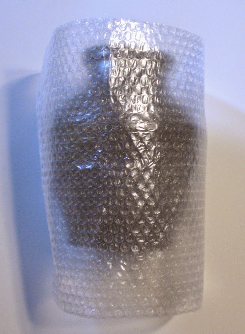
PACKED TO TRAVEL II
STEP ONE;
STARTING WITH A PIECE OF BUBBLE WRAP BIG ENOUGH TO COVER THE POT FROM TOP TO
BOTTOM AND ENTIRELY AROUND THE POT. IF POSSIBLE, DUE TO EXTRA ROOM IN THE WOOD
BOX, 2 SHEETS OF BUBBLE WRAP CAN BE USED TO PROTECT THE POT
STEP TWO;
BEFORE WRAPPING THE POT IN THE SHEET OF BUBBLE WRAP, USE A FOLDED STRIP OF
BUBBLE WRAP TO GO AROUND THE CENTER OF THE POT. THE CENTER OF THE POT IS THE
AREA MOST LIKELY TO COME INTO CONTACT WITH THE INTERIOR OF THE WOOD BOX AND
THIS ADDS AN EXTRA SECURITY LAYER TO THIS WIDEST PART OF THE POT. LIKEWISE, THE
FRAGILE NECK/ MOUTH OF A POT CAN ALSO RECEIVE THE SAME TREATMENT.
STEP THREE; WRAP THE STRIP OF BUBBLE
WRAP AROUND THE POT FOLLOWED BY THE SHEET TO ENTIRELY SURROUND THE POT. USE
TAPE TO SECURE THE BUBBLE WRAP IF NEEDED
STEP FOUR; CUT TWO LONG STRIPS OF BUBBLE WRAP AND PLACE
ONE FROM NOTH TO SOUTH AND THE OTHER FROM EAST TO WEST OVER THE OPENING OF THE
BOX. BY USING THE STRIPS OF BUBBLE WRAP AS SHOWN IN CONJUNCTION WITH THE
PREVIOUSLY WRAPPED POT, THERE IS NOW A MINIMUM OF TWO LAYERS OF BUBBLE WRAP
AROUND THE POT WITH THREE LAYERS AT THE EXTRA STRIP USED AROUND THE CENTER OF
THE POT
STEP FIVE;
TAKING THE POT WHICH IS WRAPPED IN BUBBLE WRAP, PUSH THE POT INTO THE BOX AND
PUSH SLOWLY AND EVENLY, DEPRESSING THE CROSSED STRIPS OF BUBBLEWRAP WHICH WERE
OVER THE BOX OPENING
STEP SIX;
FOLD THE SHEETS OF BUBBLE WRAP OVER THE TOP OF THE POT, THIS CREATES 4 LAYERS
OF BUBBLE WRAP OVER THE TOP OF THE POT FOR EXCELLENT PROTECTION
STEP SEVEN;
TAKING FOUR ROLLED UP SHEETS OF BUBBLE WRAP, PUSH THEM INTO EACH CORNER, ONCE
COMPLETED, THIS WILL HOLD THE POT INTO THE CENTER OF THE WOOD BOX AND HELP
PREVENT ANY MOVEMENT OF THE POT AGAINST THE WOOD BOX DURING TRANSIT
STEP EIGHT;
CONTINUE PUSHING THE FOUR ROLLED UP SHEETS OF BUBBLE WRAP INTO EACH CORNER
UNTIL THEY FIT TIGHT AND THE POT IS SECURED WITHIN THE BOX
STEP NINE;
TAKING TWO SHEETS OF BUBBLE WRAP, ROLL EACH INTO A LONG ROLL AND BENDING EACH
INTO AN "L" PUSH THE BUBBLE WRAP "L" INTO THE OPEN SPACE
AROUND THE NECK OF THE POT
STEP TEN;
CONTINUE PUSHING THE BUBBLE WRAP "L" AROUND THE OPEN SPACE AROUND THE
NECK OF THE POT SO THAT YOU HAVE FILLED THE EMPTY SPACE AROUND THE NECK AND
MOUTH OF THE POT AND THE POT CAN NOT MOVE
STEP ELEVEN;
ANOTHER VIEW OF THE BUBBLE WRAP "L" AROUND THE OPEN SPACE AROUND THE
NECK OF THE POT
STEP TWELVE;
TAKING A SHEET OF BUBBLE WRAP, FOLD IT AND PLACE IT ON TO OF THE POT TO PROTECT
THE POT FROM CONTACTING THE TOP OF THE WOOD BOX,THIS WILL ALSO FILL ANY
EXISTING SPACE LEFT IN THE BOX. FOLD THE PAPER OVER THE TOP OF THE BUBBLE WRAP
AND PLACE ON THE LID AND PROCEED TO TIE THE BOX SHUT.
THE FINISHED
PACKAGING. A GENTLE SHAKE CONFIRMS THAT
THERE IS ABSOLUTELY NO MOVEMENT WITHIN THE BOX AND THE ENTIRE PROCESS FROM
START TO FINISH TOOK LESS THAN 10 MINUTES. THE WOOD BOX IS NOW READY TO BE
BUBBLE WRAPPED AND PLACED IN A BOX WITH EITHER STYROFOAM PEANUTS OF TIGHTLY
PACKED NEWSPAPER AND ALSO SECURED SO THAT THE BUBBLE WRAPPED WOOD BOX CAN NOT
MOVE WITHIN THE CARDBOARD SHIPPING BOX.
IF THE POT
HAS A LID, I WOULD STRONGLY SUGGEST
PACKING THE BODY OF THE POT AS SHOWN AND PACKING THE LID IN BUBBLE WRAP AND
PUTTING IT IN A SEPERATE SMALL BOX TO BE PACKED INTO THE LARGER CARDBOARD BOX
FOR FINAL SHIPPING. THIS PREVENTS THE LID FROM "BANGING" AGAINST THE
POT DURING SHIPPING AND DAMAGING THE CONTENTS. I CREATED THIS TUTORIAL AT THE REQUEST OF SEVERAL COLLECTORS AND A DEALER IN JAPAN, THIS IS NOT THE ONLY WAY TO PACK BUT OVER THE YEARS IT HAS PROVEN TO BE SUCCESSFUL FOR ME AND HOPEFULLY IT WILL DO THE SAME IF YOU DECIDE TO USE IT. HAPPY PACKING!
Wednesday, March 4, 2015
SITTING PRETTY
Illustrated
is a knob, sitting pretty on top of a mizusashi by veteran Iga potter, Imai
Yasuhito (B.1937). Featured in the GENDAI CHATO TAIKAN among a wide array of
other books and catalogues, Imai founded and works at his Renzan-gama studio
making classic and traditional Iga pottery which has a very feudal feel to his
work. This simple and well fired pot has a knob that speaks of function while
being classically dressed as a result of an exceptional firing. I have seen a
number of Imai Yasuhito's pottery and each is a blend of medieval archetype
with a modern sensibility and a very idiosyncratic firing. I can't say you get
the full story from a picture of a lid and it's knob but after all, a picture is
worth a thousand words.
Subscribe to:
Posts (Atom)