Wednesday, June 7, 2017

CLAY & INK

In looking at this E-Shino chawan and drawing rendered on the interior of the storage box lid I think it is easy to see the influence of Arakawa Toyozo in both clay and ink. This chawan was made by long time Arakawa apprentice and Mino specialist, Nakayama Naoki and his blend of his master, Momoyama archetypes and his inner voice are clearly on display with the ink rendering also paying homage to his versatile teacher. The form shows off generous and sturdy proportions which are perfect for the intended function of the bowl while the simple blushed white Shino and direct underglaze iron decoration create a mental picture that most viewers can embrace and understand. Though a simple bowl in design and execution, I have always maintained that there is a deep complexity to simplicity and the simpler the appearance the more difficult the creation where things easily go wrong and are glaringly obvious in their lack of continuity and balance, that is just not the case here. As I study this bowl it is "just so", you can second guess all of the potter's decisions but in the end, everything is just as it should be in both the clay and ink of this classic chawan.
"The art of simplicity is a puzzle of complexity." Douglas Horton

Monday, June 5, 2017

XO-CSB

When I am involved in a cycle that involves carving terra cotta pieces, I like to throw the pieces, tool them the next day and then loosely cover them in plastic and wait a couple of days to carve them. By working in this way, the surface is perfect to carve and the pots stiff enough to handle without them warping from the process and I have found that throwing lidded pieces, in particular on a Thursday, tooling them on a Friday and coming back to them on Monday is the best way to go. The weekend acts as a natural distraction from the pots and under normal circumstances I lack the patience to wait two days before I carve them, this way it is much easier to set them aside both literally and figuratively. The illustrated covered serving bowl was tooled and slipped on Friday and carved this afternoon and you can see in the photo there is just enough wetness to the surface to making the decoration easy to carve but stiff enough that the carving tools can make reasonable cuts in the clay. The exterior of the bowl and the top of the lid are both carved overall with the XOXO pattern while the interiors are left with the unslipped, rich terra cotta surface that looks quite nice once glazed and fired which is also highlighted on the interior of the knob where I have stamped my makers mark on an added wad of clay. I like carving pots, I decide how each one will be carved, set up my work space directly on the wheel, put on some relaxing but not sleeping (!) music and set about carving, making for a good start to the week on another rainy day in Central New York.

Friday, June 2, 2017

HIDASUKI

Illustrated is a large tsubo by Tamba veteran, Ichino Etsuo. Made sometime around 1992 the face of the piece was actually the bottom of the pot while it was being fired, resting on its belly with straw underneath to create the hidasuki style cord markings that look like they have been framed by hiiro and other ash effects. Though this tsubo has a lot in common with the other Ichino Etsuo pot I post a while back, the surface of this is less controlled and shows the nature and ferocity of the fire contained within a wood kiln with a strong, rich coating of ash running across the back of this pot. Over the years I have not seen a lot of Etsuo's work, perhaps two dozen pieces from chawan, mizusashi and tsubo but each one has a strong and simple form accentuated by experience and intuition when using nothing more than clay and flame to create and paint his works.

Wednesday, May 31, 2017

MG&T

Illustrated is a detail shot of the inside of a medieval green and temmoku pasta bowl about 14" of so in diameter. Sometimes as I am going through a cycle, I rush by the past in a hurry and forget about surfaces that are tried and true and compliment what I am doing at the moment and this glaze combination never, or rarely fails me. I thought this detail shot really shows what the glaze looks like and allows the faux oil spotting to stand out rather clearly against the mottled, tortoise style texture of the medieval green glaze with its floating spots of iron balanced against the design. Considering both of these glazes started from nothing except what little I have learned about making glazes over the years, I am pleased with the depth and texture they both present and am happy with the variety that is compounded under varying light sources. Though this is not an Oribe glaze, I am reminded about a quote that I read in which the author/potter mentioned; "why would I need anything but green, the possibilities are endless".

Monday, May 29, 2017

MEMORIAL DAY 2017

"In the world it is not what we take up, but what we give up, that makes us rich." Henry Ward Beecher


Friday, May 26, 2017

UNCONVENTIONAL

I have written about Konishi Heinai II previously who is known for his rather idiosyncratic Shigaraki and Raku wares of which this chawan is a classic and dynamic example. Though Konishi was not part of the Raku family tradition and rarely identified his pieces as such, this evocative chawan was produced using the nearly four century old Raku process where a pot is glazed and then plucked out of the kiln at a fairly low temperature. The rather interesting thing about Heinai's works is that since he is not bound by any strict convention and spent time with another "unconventional" potter, Kawakita Handeishi, his pots have a uniqueness and individuality about them that certainly makes his pots stand out among other chadogu makers. Though well known for what one would or could classify as aka-raku and kuro-raku, it is his less conventional Raku pieces that have quite a bit to say and even more to contemplate as these pieces display a vision intent on its own voice. This particular surface paints an alluring landscape that reminds me of a combination of the Taisho-Showa Nihonga painters infused with a strong dose of the 20th century abstract expressionists, a blend that works well to compliment the rather sturdy and purposeful form. Over the years I have handled and seen a number of Raku (and Shigaraki) pieces by Konishi Heinai II and I am never disappointed with the imaginative, lustrous and thought provoking surfaces that he has plied to his three dimensional canvases.
"Do not seek to follow in the footsteps of the men of old; seek what they sought."  Matsuo Basho  (1644-1694)

Wednesday, May 24, 2017

SLOOP

Sloop; Dutch- sloep, a sailing boat with a single mast and a fore-and-aft rig

Growing up I was always fascinated by the age of the sail and great wooden sailing ships, large and small and took every opportunity to watch all of the classic swashbuckler movies with Errol Flynn, Tyrone Power and many others. Luckily I grew up on Lake Champlain the site of the great Revolutionary War Battle Of Valcour Island and a lake filled with every type of boat you could imagine including fast and sleek sloops populated the water. Later on I spent a decade in Cleveland and Lake Erie and then again in Guilford, CT on the Long Island Sound a gateway to the Atlantic and lots of boats, many powered solely by sail. The point I am trying to get to is that having indirectly been around boats for a good portion of my life and fascinated by great sea battles building pots based on the posture of these vessels only seemed natural.


Over time I have made a number of teapots that were very influenced on sailing vessels from the battleships of WW1 (the Jutland T-pots) to thrown and altered pieces like this piece that borrowed heavily from sloops I saw as a kid and teen and this piece is fully functional and holds enough for two generous cups of tea or what have you. Thrown as a cylinder without top or bottom, the piece was pushed oval and then cut, darted and reassembled into the current form you see here being careful not to disturb the gallery where the lid would fit. Once firm enough, I humped the lid upside down on the gallery, dried it a bit and cut it to fit adding a pulled handle to appear like a banner flowing in the wind. I decided to put together this short video slideshow to help give a fuller account of the proportions and lines of this teapot and hope it helps.


Still surf rockin' after four decades;


Monday, May 22, 2017

MUKUNOKI BLUE

Composed of what appears to be three distinct components, this rich gosu hakeme henko was made by Mukunoki Eizo using a construction technique and surface decoration he learned from his master Kawai Kanjiro. The interesting thing about this particular henko form is that the middle and top components  are made in one mold and the bottom in another, this has afforded Mukunoki the ability to create a number of forms using several separate molds and assembling them in various ways. The last two pieces of this type that I saw, the first was glazed in a rich temmoku  with splashes of tessha and the henko was only the middle and top components and the other had a split, notched foot pedestal as the bottom of the piece which was glazed in a shinsha copper red over some slip trailing around the large central portion of the pot. This henko has been decorated in a thick coat of white slip, hakeme style around the entire surface that once glazed in his own version of the Kawai-den gosu creates a rather active and captivating landscape. It may sound a bit simplistic but how can you go wrong with white slip and a Kawai school gosu?
"The aspect of things that are most important for us are hidden because of their simplicity and familiarity."   Ludwig Wittgenstein ( 1889-1951)

Friday, May 19, 2017

PROPER ORIENTATION


A short while back I had a collector send me a Shigaraki chaire by Kanzaki Shiho and by sheer coincidence a kogo  arrived the very next day also by him. The Shigaraki kogo is quite earthy and has a nice rustic appeal perfect for use in the tea ceremony or with ro or furo for other purposes. The top and some of the sides of the kogo has a nice blanket of ash while the rest has a rich fire color off set by marks made to animate the piece as well as to help establish the proper orientation of the lid to the base. The interior has a pink to reddish blush as does the base where it is prominently marked with the potters signature. Kanzaki Shiho is known for his dramatic, ten day long firings in his anagama wood kiln and this kogo shows some of the effects that his firings have to offer.

Wednesday, May 17, 2017

CONCOCTION

 
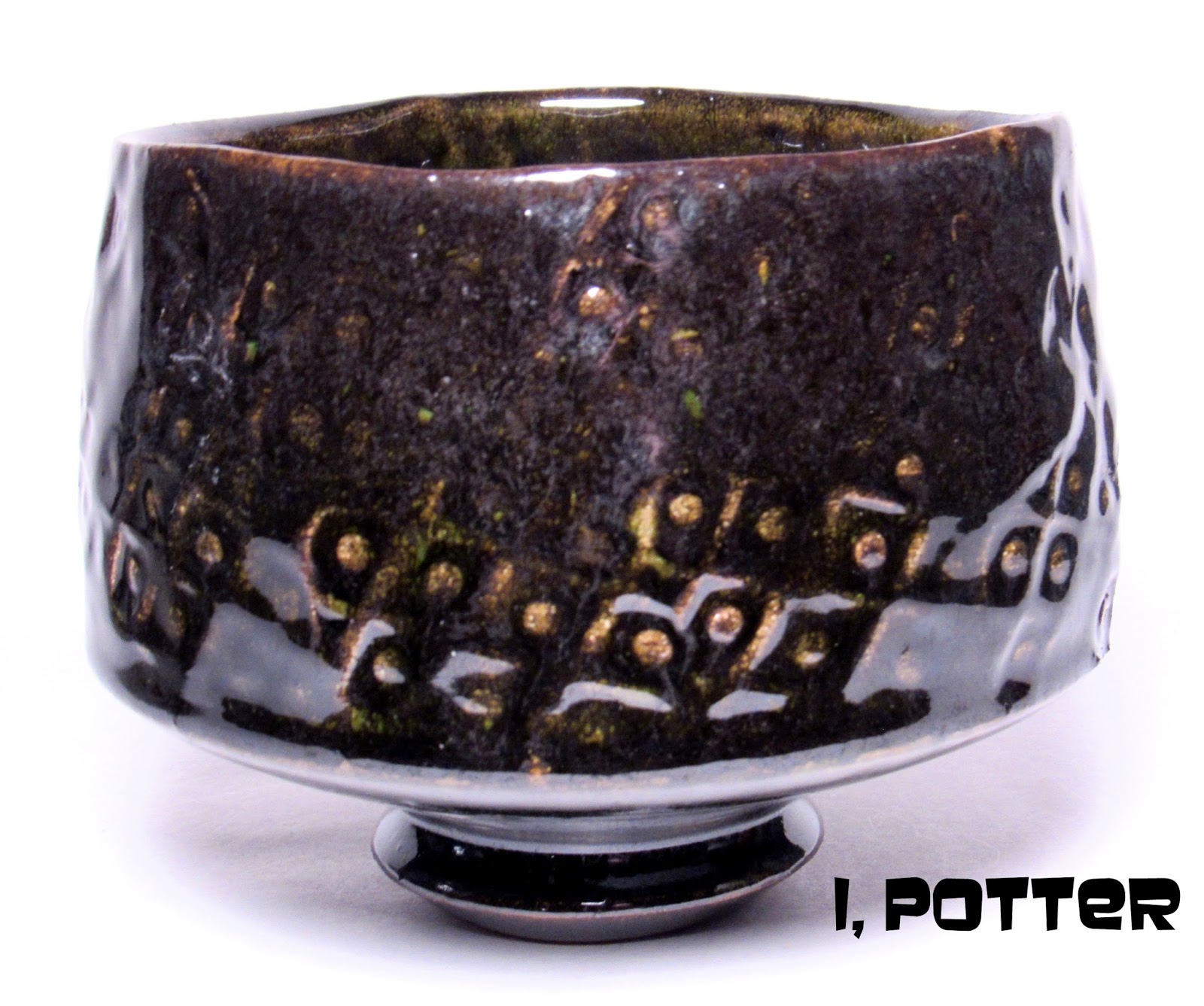
I threw a group of test bowls for my last firing, some were slipped and others were impressed with a texture pattern around the bowl. I have been working on figuring out how my current Oribe surface reacts with glazes and washes put over the surface of which this teabowl is one of the results. Using a heavily textured piece it was first glazed in the Oribe and then had a wash of iron painted on the surface, once dry it was then lightly sprayed with "drifting iron" concoction using a glaze atomizer. The results are a bit difficult to see in the photo though I tried to light up the surface as bright as possible but it is hard to see the metallic sheen and droozy quality that the overglaze had on the piece. The surface runs from the bright green of the Oribe to areas of rich dark black suffused with reddish iron areas and hints of metallic grey and deep burgundy brown areas under the right light which you can catch a glimpse of around the lip. In truth, I got much more than I bargained for or expected and think these tests are worth the time, clay and energy it takes to work them out. I am not sure what the next course of action will be but since there is so many more possibilities; another cycle, another group of tests.