
Monday, August 1, 2016
RAPHANUS SATIVUS II

Friday, July 29, 2016
NEITHER FIRST NOR LAST

Illustrated is a rather
unique tetsuyu (temmoku style) form that I would call anything but ordinary.
Thrown out of a buff, sandy, plastic clay and then painstakingly manipulated to
this involved form, the corners of the first tier shoulder had small appendages
attached to add visual cues to the pot. The surface is glazed over in a rich
and deep blackish iron glaze over which a rusty accent was applied for great
contrast creating wonderful streaks running down the sides aided by the intense
heat of the kiln and no doubt helped just a bit by gravity. Made by Mino
veteran and tetsuyu specialist, Manten Totatsu (b.1940) he has dedicated a
large portion of his life to working with iron glazes and manipulating them to
his will and purpose which can also be seen in a long line of the awards he has
received from varying organizations for his body of work. I have seen quite a
few pieces by Manten Totatsu from guinomi/tokkuri, serving pieces, large hachi,
vases and chawan but I have never seen a piece of this form before but based on
the skill of execution and exceptional way the glaze works on the form, I
suspect this wasn't the first pot of this type and certainly not the last.
"Tetsuyu develops variations depending on tiny changes in the kiln firing, temperature and in the shading of the glaze. Using an ordinary shape, by completely eliminating the surface works and by changing the glazes, I have worked to search for contrasting blacks and browns and to develop power and volume." A quote from Manten Totatsu on his study and research into iron rich glazes.
Wednesday, July 27, 2016
IF

If you like Shigaraki pottery and if you like
guinomi and if you like sake, how can you not be satiated by this little gem?
Like Old English style Slipware is no longer just relegated to the confines of
England, this Shigaraki guinomi was made in Niigata by Tsuji Seimei deshi, Kon
Chiharu showing off some of the best his firings have to offer. Though thrown,
this little pot has the appearance of being hacked out of a block of clay with
angles and jagged lines high lighting the surface and breaking clear of the
molten ash that covered this piece. I will admit I am not a huge sake drinker
preferring western spirits, it would be hard to pass on especially served in a
guinomi as appealing as this one.
"There can't be good living where there isn't good drinking." Benjamin Franklin
Monday, July 25, 2016
SHAMAN

Friday, July 22, 2016
FAIT ACCOMPLI

Last
week I showed a square plate being made on a hump mold and thought to show one
just recently slip trailed. This particular piece is larger than the one shown
and I have attached lugs to the rear so that the tray can hang on the wall.
After the form was pulled off the mold and fine tuned I first coat the surface
with black slip and after about an hour I go back in and slip trail the design,
in this case a pair of fish. As I have probably mentioned I came by the slip
trailing kind of naturally working with Bill Klock way back when as he was
influenced by Bernard Leach whom he studied with and by Michael Cardew who he
took every opportunity to visit while at the Leach pottery. I have tried to
impart a casual look to my slip trailing and this is aided by the simple fact
that you only have one shot at the decorating part of the process, if you screw
up, it shows, its just a done deal.
Moving
in to the weekend, here is a novel cover of one of my favorite tunes of the
1990s;
Wednesday, July 20, 2016
I WONDER
Every year on July 20th I take a moment to remember a remarkable potter who though he left behind a rich and diverse body of work, I wonder how much better his pots would be today. I was lucky to have known Furutani Michio and visited his home and studio on a number of occassions always leaving with a great feeling and a nice pot or two. I put together this short slideshow video out of a group of old photos and hope it still gives a sense of the strength and feudal spirit of this simple pot that stands empty with a window in to all things that is the Shigaraki of Furutani-san.
Monday, July 18, 2016
COVER SHOT

Friday, July 15, 2016
WHAT'S IN THE BOX II

"Anything worth doing, is worth doing right." Hunter S. Thompson
Wednesday, July 13, 2016
ANOTHER HUMP DAY
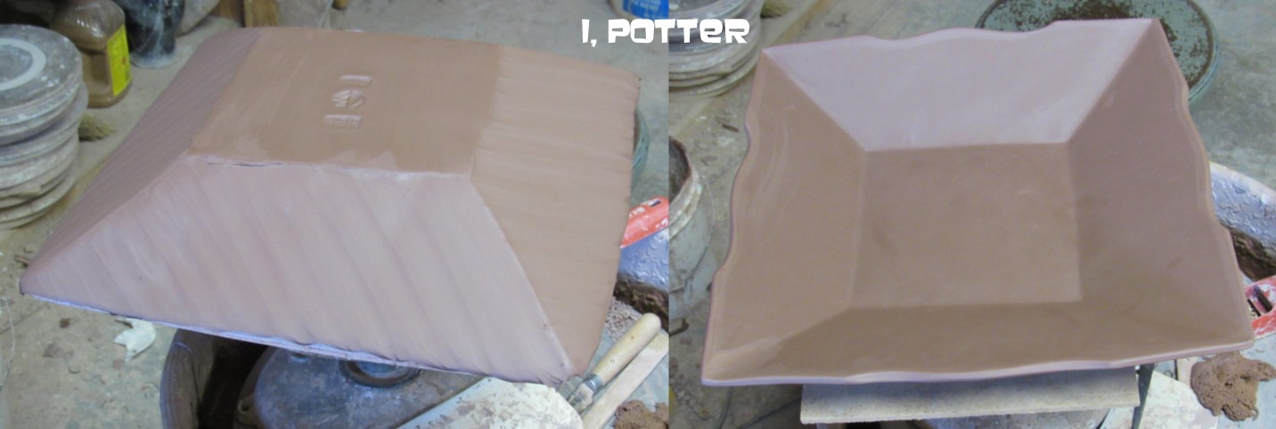
I just started a new cycle on Monday dedicated to terra cotta after having cleaned up the studio and prepared a group of slips over the weekend. I will be making carved tebori, falling leaves, abstrakt resist and black and white slip pieces for several galleries and two (?) shows which will be made up of primarily thrown pieces with a handfull of molded forms to fill out the groupings. I don't tend to make too many pieces using molds but honestly slump and hump molds do come in handy for some forms that are just to labor intensive to throw and alter and I have added oval, square and rectangular tray/plate pieces to my repertoire which fits quite nicely with the thrown pots. Illustrated is a square plate on and off a hump mold, after the form has been fine tuned, I covered the piece in black slip and will wait again until it is firm enough to carve. If I start early enough in the day and have the right music on the cd-player I can usually get four square plates made during the course of the day with the intervals of dealing with them filled with throwing, tooling and decorating (carving or slip work) making the whole process flow rather smoothly even if it is another hump day.
Postscript; Terra Cotta and humidity just don't mix and at the very least are certainly odd bedfellows.
Monday, July 11, 2016
UNMISTAKABLE

"Grace is savage and must be savage in order to be perfect." Charles A. Stoddard
Subscribe to:
Posts (Atom)

