Monday, December 6, 2021

SILHOUETTE(S) III

It has been a while but every now and I again it is enjoyable to make some more playful pots and the silhouette pieces fit that bill. Illustrated is a pair of silhouette tebori covered jars made of terra cotta, covered in black slip and then hand carved to various effect. In this case the subject matter is of Woof the dog both of which are accompanied by large silhouette knobs of  Woof to stand in as knobs for the pieces. There is not much different between the normal lids with tooled knobs and these exaggerated handles that are also slip covered and carved to match thematically with the rest of the pot beyond the addition of a cut out slab and ten minutes additional working time. As is easily imaginable the possibilities are endless and also mired in corny aphorisms but they are meant to be playful so why not commit 110%.

Friday, December 3, 2021

F.R.T.

I think there are times when you look at a pot and just think, "classic" and this is one of those times, a pot that has that medieval presence but is modern in its creation. Perhaps it is the combination and balance of simplicity, honesty and the natural surface that makes this a classic pot where the distillation of vision, technique and surface speak volumes without the superfluous detail to interfere with the experience. This is one of those pot photos that came by way of a fellow Northern collector, large, elemental and positively medieval in appearance made by Nishiura Takeshi this pot is spotlighted by sunlight showing off many of the characteristics of modern Echizen. 

This full round tsubo has a powerful form that has a coating of somewhat carburized greyish ash together with rich areas of brown tamadare running down the surface adding movement and animation to the piece as it moves through varying other areas of the ashy surface while the ever so slightly meandering lip creates a tranquil and casual focal point. This landscape makes a rich contemplative environment and one can only envision the number of locations both real and imagined that arise as the viewer moves around the pot. It is clear from this photo that the sun certainly adds to the conversation with this Nishiura tsubo which clearly is classic in almost every sense of the word.

Wednesday, December 1, 2021

AKI-HENKO II

I put up a blog post back on 10/22/2021 regarding this fall themed Rimpa influenced Aka-Shino henko by Hori Ichiro and finally got around to putting together a quick video slideshow of the pot. I had taken quite a few pictures of this piece along with a number of detail shots and distilled them down to this 3:14 video that I show off the piece well enough to give a clearer sense of the presence and volume of the henko without having the opportunity to sending it around to everyone that would like to handle it after all the postage costs would accumulate rather quickly. As I mentioned in my previous post this pot as with most by Hori Ichiro is a combination of the element of fire, air, earth and water but I may have forgotten one of the most essential and overlooked, that of curiosity and creativity of which this potter has in abundance. Enjoy the video.


Monday, November 29, 2021

"OF TWO COLORS"
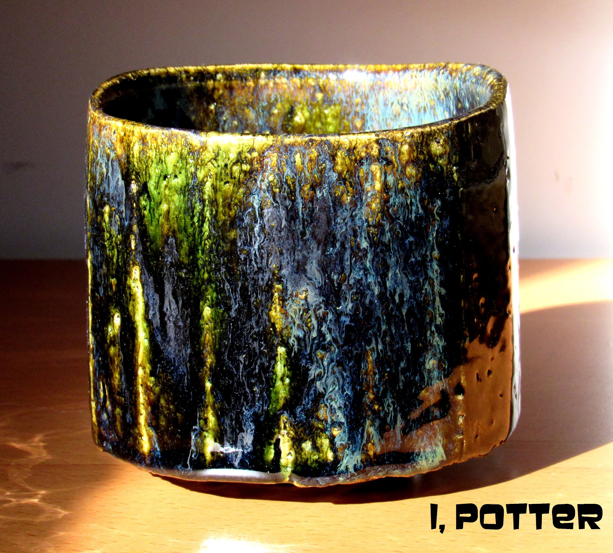

I am not sure that the term dichroic applies to this faceted Kuro-Oribe style surface but it definitely has two rather distinct appearances and a few others depending on the light source creating a different vision of the work. In this first picture utilizing only natural sunlight the green is quite easy to see showing off the wonderful clay texture underneath with areas of flowing blue, black and white all cascading down the surface complete with dramatic built up areas of glaze at high points further accentuating the varying effects. In the second photo this bowl takes on an entirely different demeanor and presence where the tungsten light source has turned the green into a rich deep amber with areas of almost black with swirled blue-white residing within.    

I should also mention that there is actually a third appearance which is quite interesting, if the bowl is resting on a particular shelf just before sundown, the surface starts out as a visible green but as the sun sets and the incandescent lighting takes over the bowl slowly shifts from green to the amber tone. With my limited skills I have tried photographing this effect to zero success, the camera either reads it as all green and shadow or amber and shadow but to the eye it is both. So my conclusion is this is a dichroic effect where the different light wave lengths are interfered with by the surface of the glaze and/or dispersed differently causing  two distinct yet related appearances, one showing off the copper and the other making full use of the iron. I am reasonably sure this is what is happening but if somebody that has an indepth knowledge of this principle feels otherwise, please let me know.

 "Vision is the art of seeing what is invisible to others." Jonathan Swift

Friday, November 26, 2021

CHISELED

Over the years it has been fascinating to watch the works of Matsuzaki Ken change, even mature from how he sees form, decoration and especially the firing process. This wood fired, chiseled surface henko falls in to the end of his second phase of pottery making where form and firing are married for maximum effect. Dating to 2004, this henko was coil built creating a slightly thick form that was then "decorated" by using a chisel to create the visual texture of the piece that once wood fired was  both softened a bit yet further accentuated by ash for a dramatic effect. There is a wide array of surface effects on this henko and I choose this side to showcase as it is the side illustrated in Andrew Maske's book, KEN MATSUZAKI; Burning Tradition, I should also note that this is illustrated in an exhibition catalogue from the same year (2004) in Japan. As for the form, it has a primal appearance, elemental and rather stoic that makes the mind work for all the various associations possible; simple form, excellent execution and perfect surface, the pottery trifecta.

Wednesday, November 24, 2021

JUST "BEING"

Illustrated is a whimsical, playful set of katakuchi and guinomi made by Kowari Tetsuya. I was contacted by a fellow collector in Europe regarding our shared interests in Japanese modern pottery and Kowari Tetsuya in particular and as we started sharing photos back and forth I received a treasure trove of photos, most of pots that I had never seen and was thankful for the opportunity. This particular pairing is of a vivid Shino glazed katakuchi tokkuri pouring vessel and a dancing guinomi both showing areas of iron and of course all natural ash deposited during the intense process of wood firing. As with most of Kowari's work both pieces are casually thrown with a spirited defiance to convention and perhaps a slight disregard for all that gravity has to offer. However you respond to Kowari's work, I find the slightly eccentric nature of his pieces to be warm, genuine and welcoming and in this case, each seems to bid the viewer to participate in the "being". Enjoy the whimsy, freedom and spirited nature of these pieces which at the end of the day it is all of these attributes that make Kowari's pots stand out in a crowd.

Monday, November 22, 2021

T'ANG DRAGON

It has been quite some time since I have used any of my appliqué stamps which took some searching as they were hidden away in a box in bubble wrap and buried on a seldom accessed shelf with small bags of chemicals stacked in front. Once recovered I decided on making some pieces loosely based on a T'ang style dragon, by way of a Danish skonvirke brooch to be applied on to a coarse and sandy white stoneware clay body of my own formulation. The picture shows the end result where I tried to create a T'ang sancai effect on each of the medallions while the remainder of the teabowl was glazed in a clear and my AO+ glaze. The teabowl has three medallions around the almost straight sided form that has its surface broken up by the small pits and sand punctuating the surface while the medallions are made of the same clay body minus the sand and small stones. In the end for a quickly rendered piece among a group of five or so pieces used with glazes not even tested for this technique the first group came out surprising well and none of the appliqué medallions exploded off the pots which is a plus in my book.

Friday, November 19, 2021

PERFECT

Now admittedly, I don't really drink a lot of sake, my palette tends to run more towards good whiskeys and bourbons but that being said, I have long considered this pot to be a perfect tokkuri. Undoubtedly, every collector and sake aficionado believes they have or know of the perfect one but this one is mine, this tokkuri was made by Koyama Fujio back in the 1960s and was a gift from a dealer that I have had a long relationship with and was a very welcome surprise when it arrived. Broadly speaking this piece is Shigaraki in style and it is clear to see that it embodies the very essence of feudal pottery, the archetypes that Koyama was so keen to study and emulate during his days divided  between being a part-time potter and one of the foremost pottery authorities on Japanese and world ceramics and despite his skill level with clay, his knowledge of what was what in terms of pottery was second to none. Though there is really no such thing as a perfect tokkuri I have drawn my conclusion based on a number of factors all blended together to make this little pot; thoughtful form, well considered size, aesthetic appeal, ideal volume, purposeful form and mouth, utilitarian at its core and just a joy to hold and use. Perfect is certainly a high bar especially for some rough, wood fired irregular little pot but it is how we decide to see things that ultimately make the decisions as to how we qualify an object and I have no problem saying this imperfect tokkuri is just perfect for me.  

"Almost all powerful ideas in history go back to archetypes."  Carl Jung


Wednesday, November 17, 2021

ANOTHER ECHIZEN TOKKURI

Illustrated is another Echizen tokkuri  a classic yuteki-temmoku piece shrouded in shadow and basking in bright sunlight perhaps bearing a classic Chinese glaze surface while being distinctly Japanese in origin and purpose. This sunlit tokkuri was made by Echizen potter, Sasaki Yuzuru, pupil of Kimura Morikazu who specializes in iron glazes of a wide variety including the oilspot technique with a yellow background that I have posted up previously on my blog. This yuteki temmoku tokkuri is stout and solid with a friendly demeanor and a rather utilitarian form including the neck and mouth that make it easy to grasp and pour from. As for the surface, the background is a dark, almost intense bluish black covered over in varying size spots that are like small rings or halos within even more composed of several colors and looking a bit like electrons circling the nucleus of some as yet unidentified atom. What I end up taking away from seeing a number of pots by Sasaki Yuzuru may sound cliché but form really does follow function in totality and the surface is never a secondary consideration from the moment he puts the clay on the wheel.  


Monday, November 15, 2021

STARTING WITH THE BONES

In a recent series of email exchanges regarding teabowls (chawan) with a fellow collector and tea person, I started thinking about getting back to basics, simplifying the form and starting with the bones without considering the glaze surface. In an effort to try to get the lines of the form right, I decided to use an Edo period Raku chawan as a jumping off point  to create a rather practical form and size bowl. I opted for a rather low foot with just enough lift to animate the bowl and create a suggestive shadow line and the piece(s) were softly thrown to allow the lip to undulate naturally and finished with a simple foot that is stable and like the bowl, simple in execution.    

Once set up, the teabowl(s) were tooled  allowing the surfaces of the clay to be dealt with by using faceting to better define the form while creating movement and decoration at the same time. The secondary purpose of the faceting is that it opens the clay exposing the texture and sand to good effect once glazed adding more dimension to the finished, fired work with the right choice of glazes. Though still quite wet, once bisque the plan is to go with the Kuro-Oribe style surfaces to accentuate the facets and vertical quality of the bowls and still give an intimate picture in to the clay texture underneath. I only threw two teabowls in this style, having other things to do and wanting to see what the fired results end up like but I think they came out the way I saw them in my mind and now need to wait and see what the end results end up like.