Friday, March 13, 2015

BRIGHT LIGHTS, DIFFERENT PICTURES

I am constantly amazed at how differently an object can look depending on the type of camera, light source and filters that may be used, though I think the biggest unintentional differences spring from variations due to various light sources. I know when photographing the pottery I make the is a tremendous difference from florescent, tungsten and natural sunlight and I always tell customers, take the pot out doors and look at it, that light brings out all kinds of variations that 'studio" shots can only hint at. The digital camera I use has adjustments for eight light sources as well as filters which i use to try to create an image that looks like a pot does when I am looking at it in ambient lighting. My intent whether photographing my work or a pot by another potter is to try to stay as true as possible to what a person can expect when looking at the piece in hand. That is the very best I can try for.

Illustrated is an exceptional Aka-Shino chawan by Tamaoki Yasuo. This chawan is a classic, Momoyama inspired bowl with a rich surface and painterly variations which paint a vivid landscape, this is the beauty that is Shino. The wonderful thing about glazes is that depending on how they are photographed or displayed, that can take on a multitude of appearance and the illustration shows how the piece looks in just two varying light sources. In the catalogue photo, the red is vibrant and dominating and in my photo, taken using tungsten bulbs with a tungsten correcting filter, the color is less intense and closer to what the bowl looks like in person, though in reality, the truth is it is somewhere in between the two. It is easy to get the bowl more red, just adjust the lighting, but best to have the bowl appear as it does, just the way the potter made it.

Wednesday, March 11, 2015

FINGER PRINTED DETAIL

It was pointed out to me that the Shino slip and ash serving bowl photo didn't blow up very well and they were curious what the piece looked like in greater detail. I took a shot of the pot that shows the interesting interplay between the two glazes and the details of the lug where the underlying Shino slip cracks to define the attachment and creates a surface filled with a vivid landscape of affects. Also highlighted is the iron blushed halo around the area where my fingerprints acted as a resist while glazing the pot. Though a simple glazing job overall, there is a wide array of details and accents that help animate the piece and make a functional pot that much more interesting to use.
"Men who wish to know the world must learn about it in its particular details."  Heraclitus of Ephesus (535-446 BCE)

Monday, March 9, 2015

TWO BLUE

Though known for his kinrande and kinsai techniques,  NIngen Kokuho Kato Hajime (1900-1968) is perhaps one of the most versatile artist potters of the 20th century. His ability to make traditional pottery like Bizen, Shigaraki, Seto and many others was balanced with his outstanding techniques and abilities in varying porcelain styles, Persian blue and a wide array of Chinese influenced pottery. Few can match the technical and aesthetic diversity of Kato Hajime and fewer yet the grace, charm and elegance of his pottery which span the classical, traditional and modern idioms of contemporary ceramics.
Illustrated is a decorative tile made by Kato Hajime depicting two large Persian blue glazed tsubo with underglaze black decoration done in a Chinese style. These tsubo are perhaps meant to represent pots made by the potter himself as similar pieces can be seen in several sketches that he has left behind showing the wide array of ideas, documented pieces and pots he was yet to make over a lifetime of making pottery and testing new waters.

Friday, March 6, 2015

PACKED TO TRAVEL II

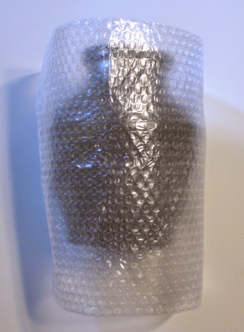
STEP ONE; STARTING WITH A PIECE OF BUBBLE WRAP BIG ENOUGH TO COVER THE POT FROM TOP TO BOTTOM AND ENTIRELY AROUND THE POT. IF POSSIBLE, DUE TO EXTRA ROOM IN THE WOOD BOX, 2 SHEETS OF BUBBLE WRAP CAN BE USED TO PROTECT THE POT
 
STEP TWO; BEFORE WRAPPING THE POT IN THE SHEET OF BUBBLE WRAP, USE A FOLDED STRIP OF BUBBLE WRAP TO GO AROUND THE CENTER OF THE POT. THE CENTER OF THE POT IS THE AREA MOST LIKELY TO COME INTO CONTACT WITH THE INTERIOR OF THE WOOD BOX AND THIS ADDS AN EXTRA SECURITY LAYER TO THIS WIDEST PART OF THE POT. LIKEWISE, THE FRAGILE NECK/ MOUTH OF A POT CAN ALSO RECEIVE THE SAME TREATMENT.
 
STEP THREE; WRAP THE STRIP OF BUBBLE WRAP AROUND THE POT FOLLOWED BY THE SHEET TO ENTIRELY SURROUND THE POT. USE TAPE TO SECURE THE BUBBLE WRAP IF NEEDED
 
STEP FOUR;  CUT TWO LONG STRIPS OF BUBBLE WRAP AND PLACE ONE FROM NOTH TO SOUTH AND THE OTHER FROM EAST TO WEST OVER THE OPENING OF THE BOX. BY USING THE STRIPS OF BUBBLE WRAP AS SHOWN IN CONJUNCTION WITH THE PREVIOUSLY WRAPPED POT, THERE IS NOW A MINIMUM OF TWO LAYERS OF BUBBLE WRAP AROUND THE POT WITH THREE LAYERS AT THE EXTRA STRIP USED AROUND THE CENTER OF THE POT
 
STEP FIVE; TAKING THE POT WHICH IS WRAPPED IN BUBBLE WRAP, PUSH THE POT INTO THE BOX AND PUSH SLOWLY AND EVENLY, DEPRESSING THE CROSSED STRIPS OF BUBBLEWRAP WHICH WERE OVER THE BOX OPENING
 
STEP SIX; FOLD THE SHEETS OF BUBBLE WRAP OVER THE TOP OF THE POT, THIS CREATES 4 LAYERS OF BUBBLE WRAP OVER THE TOP OF THE POT FOR EXCELLENT PROTECTION
 
STEP SEVEN; TAKING FOUR ROLLED UP SHEETS OF BUBBLE WRAP, PUSH THEM INTO EACH CORNER, ONCE COMPLETED, THIS WILL HOLD THE POT INTO THE CENTER OF THE WOOD BOX AND HELP PREVENT ANY MOVEMENT OF THE POT AGAINST THE WOOD BOX DURING TRANSIT
 
STEP EIGHT; CONTINUE PUSHING THE FOUR ROLLED UP SHEETS OF BUBBLE WRAP INTO EACH CORNER UNTIL THEY FIT TIGHT AND THE POT IS SECURED WITHIN THE BOX
 
STEP NINE; TAKING TWO SHEETS OF BUBBLE WRAP, ROLL EACH INTO A LONG ROLL AND BENDING EACH INTO AN "L" PUSH THE BUBBLE WRAP "L" INTO THE OPEN SPACE AROUND THE NECK OF THE POT
 
STEP TEN; CONTINUE PUSHING THE BUBBLE WRAP "L" AROUND THE OPEN SPACE AROUND THE NECK OF THE POT SO THAT YOU HAVE FILLED THE EMPTY SPACE AROUND THE NECK AND MOUTH OF THE POT AND THE POT CAN NOT MOVE
 
STEP ELEVEN; ANOTHER VIEW OF THE BUBBLE WRAP "L" AROUND THE OPEN SPACE AROUND THE NECK OF THE POT
 
STEP TWELVE; TAKING A SHEET OF BUBBLE WRAP, FOLD IT AND PLACE IT ON TO OF THE POT TO PROTECT THE POT FROM CONTACTING THE TOP OF THE WOOD BOX,THIS WILL ALSO FILL ANY EXISTING SPACE LEFT IN THE BOX. FOLD THE PAPER OVER THE TOP OF THE BUBBLE WRAP AND PLACE ON THE LID AND PROCEED TO TIE THE BOX SHUT.
 
THE FINISHED PACKAGING.  A GENTLE SHAKE CONFIRMS THAT THERE IS ABSOLUTELY NO MOVEMENT WITHIN THE BOX AND THE ENTIRE PROCESS FROM START TO FINISH TOOK LESS THAN 10 MINUTES. THE WOOD BOX IS NOW READY TO BE BUBBLE WRAPPED AND PLACED IN A BOX WITH EITHER STYROFOAM PEANUTS OF TIGHTLY PACKED NEWSPAPER AND ALSO SECURED SO THAT THE BUBBLE WRAPPED WOOD BOX CAN NOT MOVE WITHIN THE CARDBOARD SHIPPING BOX.
IF THE POT HAS  A LID, I WOULD STRONGLY SUGGEST PACKING THE BODY OF THE POT AS SHOWN AND PACKING THE LID IN BUBBLE WRAP AND PUTTING IT IN A SEPERATE SMALL BOX TO BE PACKED INTO THE LARGER CARDBOARD BOX FOR FINAL SHIPPING. THIS PREVENTS THE LID FROM "BANGING" AGAINST THE POT DURING SHIPPING AND DAMAGING THE CONTENTS. I CREATED THIS TUTORIAL AT THE REQUEST OF SEVERAL COLLECTORS AND A DEALER IN JAPAN, THIS IS NOT THE ONLY WAY TO PACK BUT OVER THE YEARS IT HAS PROVEN TO BE SUCCESSFUL FOR ME AND HOPEFULLY IT WILL DO THE SAME IF YOU DECIDE TO USE IT. HAPPY PACKING!


Wednesday, March 4, 2015

SITTING PRETTY

Illustrated is a knob, sitting pretty on top of a mizusashi by veteran Iga potter, Imai Yasuhito (B.1937). Featured in the GENDAI CHATO TAIKAN among a wide array of other books and catalogues, Imai founded and works at his Renzan-gama studio making classic and traditional Iga pottery which has a very feudal feel to his work. This simple and well fired pot has a knob that speaks of function while being classically dressed as a result of an exceptional firing. I have seen a number of Imai Yasuhito's pottery and each is a blend of medieval archetype with a modern sensibility and a very idiosyncratic firing. I can't say you get the full story from a picture of a lid and it's knob but after all, a picture is worth a thousand words.

Monday, March 2, 2015

FINGER PRINTED

Illustrated is another serving bowl using a Shino slip with an ash glaze over. It is a practical shape with heavy lugs and meant for everyday use; a simple form for a simple function and geared more for a small gathering than a large one. I enjoyed the way the rich red slip shows through like finger prints where I held the bowl to dip it in an ash glaze and was pleasantly surprised by the halos that appeared around the finger marks though I am not 100% sure what created them. I enjoy making straight forward and functional pieces, there are great rewards for knowing that my pots are being used and are part of the new owners simple daily routines. I read a statement a long while back about a mug that could save the world, perhaps it was truly meant to be a humble bowl.
"Form follows function, that has been misunderstood. Form and function should be one, joined in a spiritual union." Frank Lloyd Wright

Friday, February 27, 2015

THIRD TIME A CHARM


Using a group of photos that I had taken a while back, I assembled this slideshow video of a classic and well fired Oni-Shino hanging vase by Tsukigata Nahiko. There is a wide variety of surface elements to be seen on this piece from a rich interplay of iron and Shino to the effects created from the natural ash that has painted the surface of the vase.  The gourd form is highlighted by a strong form, visible throwing marks and two carved areas on the front of the pot, top and bottom. I have written about this vase in two previous blog posts regarding Tsukigata and hope the third time is the charm.

Wednesday, February 25, 2015

SEIJI-SHINO

Having the form and posture of a well worn wooden mallet, this Shino pot is by veteran Mino potter, Yamada Seiji. The form is classic and well conceived with the flaring outward base and the same in reverse for the neck of the pot. The glaze, which I refer to as Seiji-Shino is wonderful with rich tones of reddish orange punctuate the form from top to bottom and the texture created by varying thickness of glaze with cells, fissures and pocks creating a distant and  somewhat alien landscape. Though many potters make and use Shino and many of their glazes look similar, there is a uniqueness to Yamada's glaze, a blend of the shiny and muted within the feldspar surface and textures that are recognizable as his work. The real beauty of the pots of Yamada Seiji is his ability to make simple pots crafted with careful details and beautiful glazes that have a great deal to say when filled with tea, flowers and food.
"Good Vases have free style shapes. They also make flowers much more beautiful and lively. Every time you arrange flowers with them, you can get new excitement." A quote from THE BEAUTY OF SHINO by Yamada Seiji

Monday, February 23, 2015

BLUE IS BLUE

Illustrated is a prototype of a blue on blue (blue2) cup with a bottom heavy foot that I made at the request of a customer. The intent was that it could sit well and the extra weight would keep the conical form from tipping over. The walls of the bowl are rather thin and even with liquid in the pot, it is rather steady and sure footed. The blue2 is not exactly 100% accurate as the vellum glaze is made using copper and the streaky, runny blue is made using cobalt, either way, they both turn blue in the firing. I always enjoy making copper blues in oxidation from Persian blues to these vellum blues making for a range of blues that run from the soft tones to the harsh and they are a fraction of the price of using cobalt. In the end it doesn't matter how you get there, blue is blue.

Friday, February 20, 2015

IT'S COLD

It is cold, how cold? Well it is too cold to work in the studio with temperatures hovering at -10 at night and +7 during the day. It has made it as low as -21 at the house with the official temperature listed at -20 and yes I am aware this is a widespread situation and not solely concerning my neck of the woods. The issue is that my studio is under our house which is built into the side of a hill and is totally unheated. The temperature normally stays between 58 and 65 all year round and for use during the winter, I have two small electric/oil space heaters which work fine. However when it stays this cold for this long the temp drops into the mid-40s making it too difficult to work with wet clay and your hands constantly in water. The cold also dramatically affects the drying cycle and knobs crack, attachments crack, some s-crack and others warp. It is officially a no-clay zone until it warms up a bit.
I have a friend who recently uprooted from the mid-west and moved to San Diego. In an attempt at internet humor and possibly just a bit to annoy, he send along photos of the weather, flora, ocean and magnificent sunsets to let everyone know, San Diego is the greatest place on earth and to rub the cold weather in my face as well. He has kept up on the current northeast weather and is also sending along Henny Youngman caliber cold jokes and jpegs of San Diego basking in the sun along with some of the unusual sights he encounters on his walks. Sometimes, it just doesn't pay to have a friend with a similar sense of humor.
(Photo courtesy of a San Diegan)