Up
until a couple months ago, I had never had any chaire by Mizuno Takuzo come my
way and just recently, a collector sent me two more to help find a new home
for. Do chaire follow the "rule of threes"? The first one that came
my way was a rather nice Oni-Shino style chaire, the recent two are Aka-Shino
and Seto-Guro and I can see why they were collected together as both exhibit very
similar characteristics in their presentation. The Aka-Shino piece has a tall
and graceful form with two tiny additions to the shoulder with a rich and thick
glaze with dark accents around the shoulder and a thick and foamy trail down
the face of the pot. The Seto-Guro chaire also has a tall and noble posture
accented by a dark, rich and textured surface with mimi-tsuki style additions
running down from the shoulder and in both examples there is just enough clay
showing to create a nice contrast with the glazed surface. It has been a
pleasure to have all three of these chaire in hand to study and for the future,
I can only hope the "rule of threes" always applies when it comes to
pottery.
Friday, December 26, 2014
Wednesday, December 24, 2014
HAPPY HOLIDAYS
Wishing
everyone out there who is inclined to celebrate a very Happy Holidays, Merry
Christmas, Happy Chanukah, Happy Kwanzaa and certainly a Festivus for the
Rest-of-us to one and all.
Monday, December 22, 2014
IRON MUGS
I
really like this kaki glaze that is on this pair of lobed iron glazed mugs and
have been using it since the mid-90s. It is rich and active and breaks well on
lines and sharp accents. It really is a glaze that can be used all by itself on
a well thought out pot and is rather dependable to boot. The close-up shows the
active crystalline structure of the surface and the mugs look different from
every vantage point and in differing lighting. I honestly can not for the life
of me remember where I got this glaze but I suspect I owe someone a hearty
thank you; I'll be thinking about that person next time I am having a cup of
tea!
Friday, December 19, 2014
CONUNDRUM
The
chawan illustrated is from an old Tsukigata Nahiko catalogue, it is Oni-Shino
though somewhat dark and ominous and punctuated by the bold kintsugi repair now
holding the bowl together in bold and perfect imperfection. I have often looked
at this illustration and the conundrum it poses; what it was about this
particular chawan that made Tsukigata go through the herculean effort to
salvage and repair the pot? I have seen a number of pictures where he is
purposely breaking pots with a hammer so his typical sense of "quality control"
seems to have eluded this bowl, the question still remains, what is it about
this chawan that he felt compelled to save and re-envision the pot. I doubt I
will ever get a thoroughly satisfying answer but every now and again I go back
and study the photo with an eye to understand how this pot stood apart from
others that found their way in to a pile of shards.
Labels:
chawan,
conundrum,
kintsugi,
oni-shino,
tsukigata nahiko
Wednesday, December 17, 2014
JUST A BOWL
Illustrated
is an ovaled and lobed serving bowl with pulled handles opposite each other
that aid both visually and functional. Using a Shino slip that I got somewhere
along the way and an accent of black glaze around the top half of the bowl, this
pot is typical of serving pieces I like to make now and again where I try to
strip the pot to the fundamentals and let the form and minimal decoration tell
the story. The close-up shows the richness of the flashed orange surface
together with the deep, wet accents of the iron glaze. I like pots like this,
thrown, pushed just a bit oval and then lobed and notched though never hiding
the fact that the piece started out round on a potter's wheel. It is a simple piece to my eye, after all, it
is just a bowl, one of many.
Monday, December 15, 2014
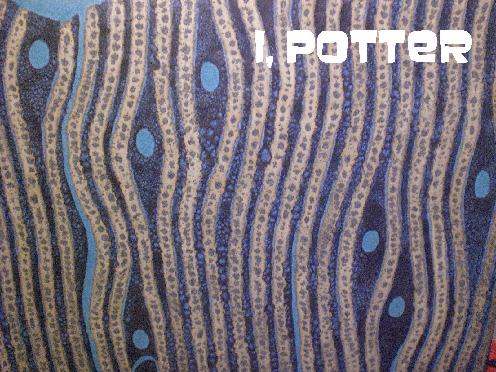
ANY GIVEN BLUE MONDAY
I have
had this detail shot on my computer for a while now and thought to use it on
any given blue Monday and thought today was that day. Illustrated is a close-up
of a large and award winning henko vase by the multi-talented Morino Taimei
(b.1934). This vivid detail shot gives and insight in to the complexity of the
glaze surface that was exactingly planned out but the artist allowed room for the
surface to soften and move ever so slightly to create a more naturalistic
design. There is a crystal effervescence to the surface where layered and
resisted glazes work with each out with underlying glaze bubbling through each
other. There is a wonderful balance of complexity and simplicity to the surface
that when viewed as a whole creates a vivid, timeless and contemplative vessel
that few can create and which Morino excels at. It is little wonder that this
piece was singled out for award among a broad array of pottery at the 1993 Nikko-kai
exhibition.
The
original post with the full pot illustrated can be seen here;
Friday, December 12, 2014
ADDED TOUCH
A
friend sent me a file filled with Japanese pottery pictures the other day and
in it were two pictures of the same chawan that I put together as a single
photo. Illustrated is a E-Shino chawan by Hayashi Kotaro (1940-1981), brother
and mentor of Hayashi Shotaro and one of the original post-war Mino stand outs.
His work is clearly and firmly rooted in the Momoyama revivalist mode and
though conservative, it is both fresh and invigorating. The surface and
painting are just right for this generous bowl which is accompanied by an added
touch of a thoughtful and considerate potter; a wrapping cloth with both
painted image and signature to help protect the bowl. There are a number of
potters who provided painted or elaborately signed cloths and shikishi (even kakejiku)
with some of their best and exhibition pieces and others who do so on the
request of a patron or collector or just on a whim. Either way the added touch
goes a long way to tell the viewer, "I care about this pot and hopefully,
you will as well".
Labels:
chawan,
e-shino,
hayashi kotaro,
hayashi shotaro,
shino
Wednesday, December 10, 2014
TWO SIMPLE CUTS
Each
and every chawan dictates what type of kodai that is appropriate to finish off
the piece. When it comes to kodai, it is the less is more style that
impresses, no muss, no fuss and the finished foot is fresh, casual and
spontaneous. That being said, I love a strong yet casual pot with a casual
kodai that looks like it was cut in two simple cuts and in the case of this
Suzuki Goro kodai, that is exactly the case. Using a broken off piece of wood,
shaped like a chisel, the fist cut goes around the outside of the foot to
define it and the interior cut flows quickly removing the excess clay to finish
the kodai. This photo is a screen capture from a DVD on Suzuki Goro and the
whole process is fast, bold and an exercise in total commitment. The end result
is a kodai that matches well with the bowl shape and is probably the result of
50+ years of making thousands of chawan; at some point one is bound to get the knack
of it.
Monday, December 8, 2014
CONTRASTING TEXTURES
Illustrated
is a close up of a kaki glazed molded octagonal tray form with accents of Kawai
green and a chun like nuka glaze. I have used this combination over the years
and the surface is rarely ever the same with contrasting textures that vary
just a small amount to wildly. In this piece there is a nice amount of visual
and tactile contrast making for a fun to use piece.
Friday, December 5, 2014
DREAM
Illustrated
is a bold sometsuke plate by eccentric calligrapher, painter, potter, lacquer
artist and exploiter of various other mediums; Sato Katsuhiko. Painted in rich,
deep cobalt gosu, the porcelain plate was provided and Sato created a dreamy
kanji, yume which means dream. Considering his background, his ability to merge
2-D and 3-D is nothing short of impressive but it is the wide array of works,
styles, imagery and eccentricity that makes the works of Sato Katsuhiko so impressive
and dynamic.
Subscribe to:
Posts (Atom)