
Wednesday, December 21, 2016
PACKAGE DEAL

Monday, December 19, 2016
SLIPWARE POTS

Illustrated
is a large thrown black and white slipware plate with a trio of slipware pots
decorating the surface. All three of the slip pots are pieces that I actually
make though it was far easier to slip them on to the surface of the plate than
to make them in three dimensions. The plate was about 24" across and
thrown out of my terra cotta on to which the black and white slips were applied
and then a clear glaze once bisque. I like making slipware as I have mentioned
before, there is no real room for hesitation, it is direct and creates a vivid
and dimensional decoration. The real bonus of the slipware pots is that once
decorated, they just need to dry, bisque and get glazed, a bit easier than some
of the processes needed to get other pots completed and in this particular case
I get three pots and a plate finished all at the same time.
Friday, December 16, 2016
PLEASE SIR, MAY I HAVE ANOTHER

Though
not exactly the correct quote from OLIVER TWIST, I suspect you get the idea and
it is a fitting sentiment when it comes to ink paintings, washes and
calligraphy by potters, a medium I am particularly fond of as I suspect it give
you a glimpse of how they see their work. In this case I found another
landscape chawan ink wash by Juyo Mukei Bunkazai, Arakawa Toyozo depicting one
of his famous E-Shino style teabowls with a Momoyama-esque underglaze ink
painting rendered in what would appear to be iron pigment. Like the others of
this style that I have seen, the painting is fast, direct without any waste of
superfluous details to capture the true spirit in ink what his clay does for
his pottery. I have seen several chawan with accompanying kakejiku scrolls over
the years and though this seems to be more of a generalized chawan as a two
dimensional rendering, I am still holding out hope that just one of these days,
Santa or some other questionable figure will put me and a similar three
dimensional chawan at the same place at the same time (as in ownership!); well one can hope
anyway.
Wednesday, December 14, 2016
RANGE IN MOTION
A
while back I wrote a blog post entitled; GONE YESTERDAY, HERE TODAY, which
chronicled (!) the sheer coincidence in making two posts about two very
different pots and in a rather short period of time we were able to collect one
exceptionally similar pot and in the other case, the exact pot we wrote about.
I put together this short video slideshow to try to give a fuller depth and
dimension to the piece because in hand it is just wonderful. The glaze surface
is cool and smooth while the heavily crazed surface adds a sense of intensity,
warmth and conflict to the bowl while the iron and underglaze red flower adds the tranquil element which both
ties in the opposing elements and draws the eye in to the rather harmonious whole.
Enjoy the slideshow and thoughts and comments are always welcome.
Monday, December 12, 2016
RAPUNZEL
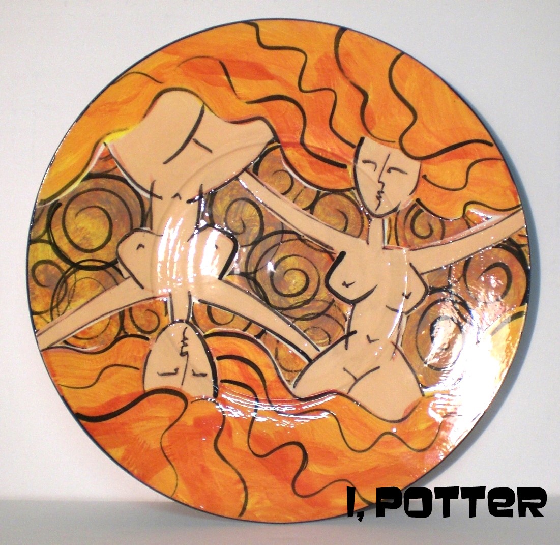
I
started using nudes as part of my decoration on pots during my last year at
Cleveland State. I am not 100% sure how or why but I used old myths and fables
as the basis for the designs and even turned traditional male antagonists and
protagonists into female figures, it somehow just worked on the pottery and I
think they portray a rather fun and positive imagery. Along the way I came up
with a single and mirrored image of Rapunzel that with her flowing red-blonde
hair articulated the surface of plates and open bowls rather well and over time
the design has found its way on to pieces ranging from six inches to almost
three feet across and on pitchers that have been as tall as two feet plus. The
illustrated plate is roughly 14" across and shows the stylized mirrored
Rapunzel design with a turbulent and stormy sky as the backdrop. I can say from
a long time of experience, there are always designs and decorations that can
get tiresome and even stale, for me, this is not one of them.
"Rapunzel.
Rapunzel, lass deine Haare fallen damit
ich goldene Treppe steige."*
(*
I apologize to any German readers if this is not the correct translation, I do
my best!)
Friday, December 9, 2016
ANOTHER MALLET VASE

I
was searching around on the web and came across this picture of a nice Shino
mallet vase by Mizuno Takuzo, my original search didn't pan out despite
searching for some time so in some ways this vase is a consolation prize of
sorts. The form is certainly deliberate in nature with the type of inward taper
moving toward the shoulder with the neck flaring out as it goes up giving the
mallet just the right sense of proportions and geometry that appeals to me.
Though there doesn't appear to be any iron slip applied, the Shino surface has
blushed to pinks and orange flashes from top to bottom and coupled with the
excellent texture makes for a rather visually engaging pot. I would be remiss
if I didn't mention the shallow depression that moves from the shoulder to the
neck which is highlighted by a spiraling texture that goes around the pot and
is dusted with just a hint of wood ash especially in the depressions. I think
if I was pressed I could come up with a reasonable explanation of what it is
about the mallet form that interests me, but the short cut to the answer is simple,
it appeals to me at a visceral level, I respond to the borrowed purpose and
weathered aesthetic that is imparted on pots just exactly like this piece by
Mizuno Takuzo. There is little more that I can ask or expect from a pot.
Wednesday, December 7, 2016
HALF & HALF II
I put together a short video slideshow of a chaire by Yamada Masakazu who
specializes in wood fired Shino, Oribe and Haiyu glazes. The small lidded
chaire is glazed just over the shoulder and the rest of the effects are all
natural from the wood firing making for a half and half blend of all natural
and applied surface. Appearing feudal in its origins, this pot is a
purposefully made chaire ready for use in the tea ceremony or equally at home
on a shelf on display; enjoy the video.
You can see more of this chaire over at my Trocadero market place;
http://www.trocadero.com/stores/albedo3studio/catalog/
You can see more of this chaire over at my Trocadero market place;
http://www.trocadero.com/stores/albedo3studio/catalog/
Monday, December 5, 2016
SOMETHING'S FISHY

Illustrated
is a green ware terra cotta tray form with opposing carved fish decorating the
interior. Loosely based on the Pisces zodiac design, I wanted the fish to
appear to be in motion to help animate the long form and added spiral bubbles
to help fill in the left over negative space. I have spent a lot of time
looking at and studying Japanese painting from the Momoyama to Edo periods and
the undecorated space has as much to say as does that with the actual painted
design. It may not appear to be influenced by Japanese woodblocks and ink
paintings but if you think of the interior of the form as a long panel, just
like that of a hanging scroll, the border or boundary is the frame that focuses
the attention of the narrative while striving to have a playfulness that
interests the user whether as a decorative accent or a functional object.
Friday, December 2, 2016
KAWAKUJIRA

Illustrated
is a broad and generous Karatsu-kawakujira (whale's mouth) decorated guinomi by
Ikai Yuichi (b.1963). Ikai, a native of Kyoto and the Gojo-zaka
area first studied with Shimizu Yasutaka and then Ningen Kokuho, Shinizu Uiichi
before moving north of Kyoto to set up his Kihei-gama noborigama kiln where he
has honed his skills in both celadon and ash glazes. At just about four inches
across this guinomi is a handful and the pebbled, kairagi crawled surface just
adds to the pot making for a blend of sight, touch and taste while in use. With
many pots the sense of touch is overlooked but with a guinomi like this, Ikai
hasn't failed to include any of the senses from the view of the pot, the smell
and taste of the sake, the feel of the surface and the sound of the ubiquitous
toast; kanpai!
Wednesday, November 30, 2016
STILL NOT A SUGAR BOWL
I
put together a rather short video slideshow of a small covered pot finished off
with combed slip and my current go to Oribe glaze. This is another of the
smaller pots that I have been making, Western style tea caddy to fill in spots
around the kiln for the glaze firing that I fired several weeks back. This
caddy measures about four and a half inches tall and though good for tea, it
can be used for just about anything one's mind can conjure up. Since I am
trying to do something, Khan (the feline studio assistant) is sitting in my lap
as I type and thinks it is perfect for cat nip, we will see.
Subscribe to:
Posts (Atom)
.JPG)